
No7 launched in 1935 and still growing in popularity in the 21st century, has become one of the nation’s most loved beauty brands. So to redesign such a trusted cosmetics range requires a bold creative vision, combined with real respect for nearly a century of tradition.
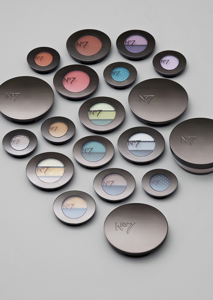
Having won the pitch in 2008 this relaunch is the fruit of a four-year collaboration with the brand. Two Create were challenged to modernise the aesthetic to appeal to No7’s existing loyal followers whilst opening the doors to new. They were also asked to consider global appeal, as No7 is now sold in nineteen international markets worldwide. In addition, the designers were asked to add more coherence across sub-categories, to improve navigation at the point of sale and in use, addressing functionality and practicality where necessary.
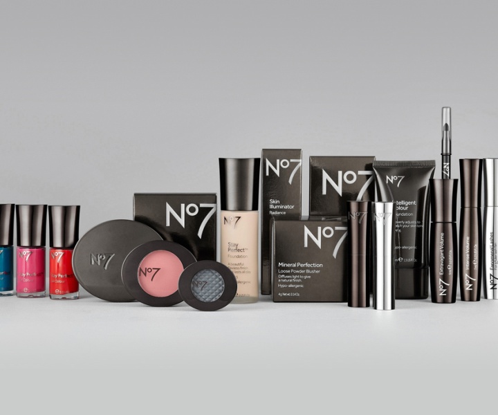
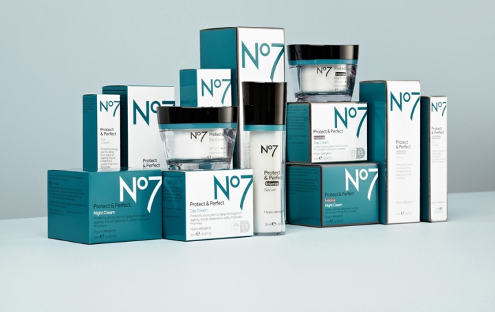
Their vision was to create a more youthful and confident No7 for 2012 and onwards. Following extensive market research, Two Create designed a signature form for No7 with cleaner curves and sharper edges, and a series of brand principles and guidelines. Each of the 70 pack formats was then re-designed in line with the new form and rules.
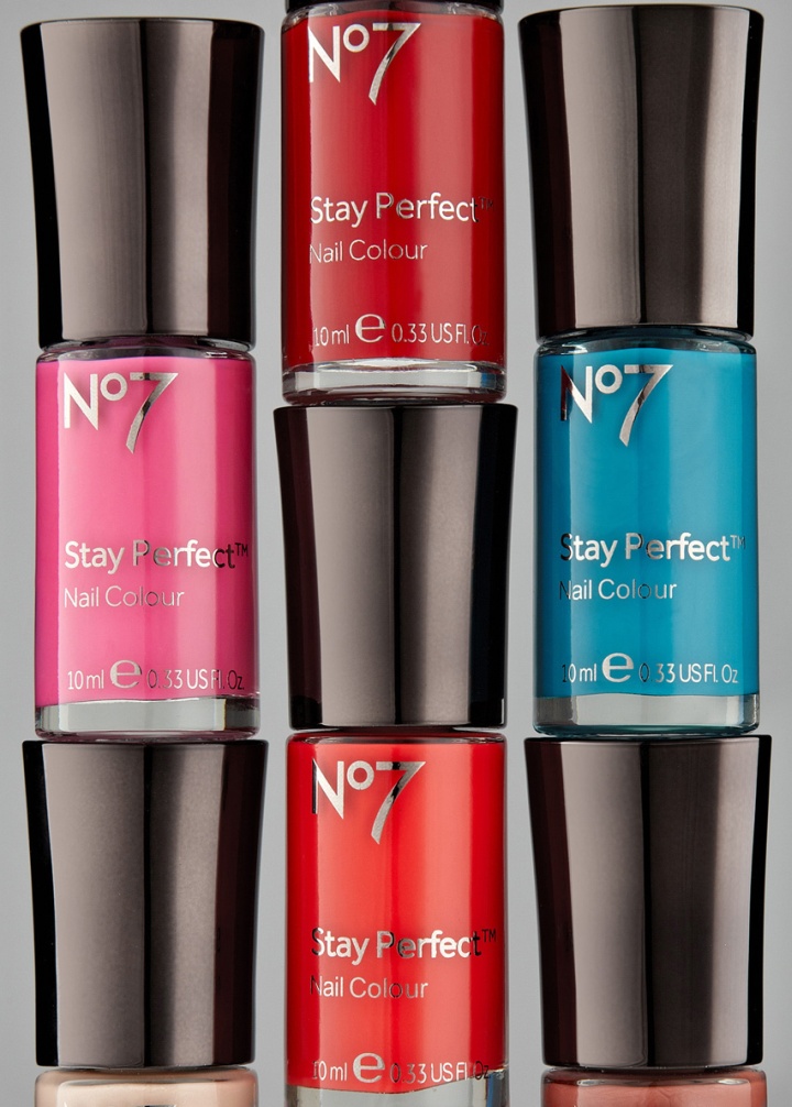
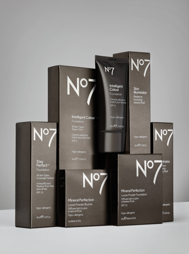
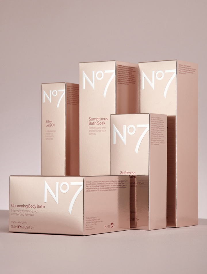
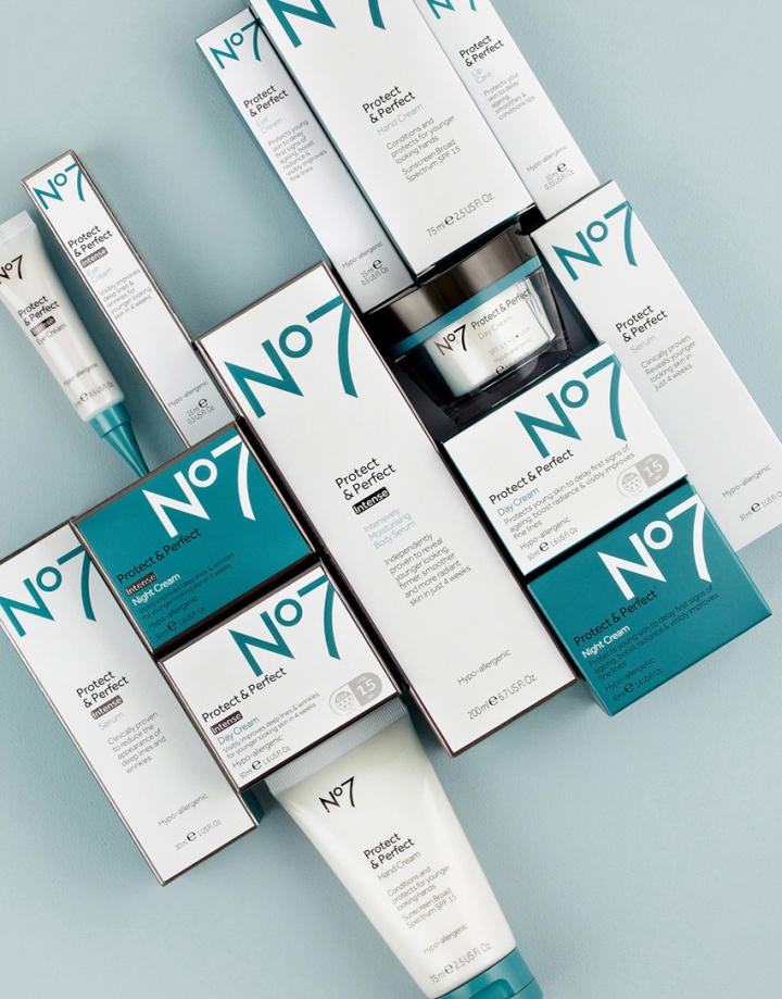
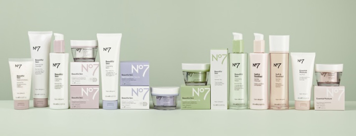
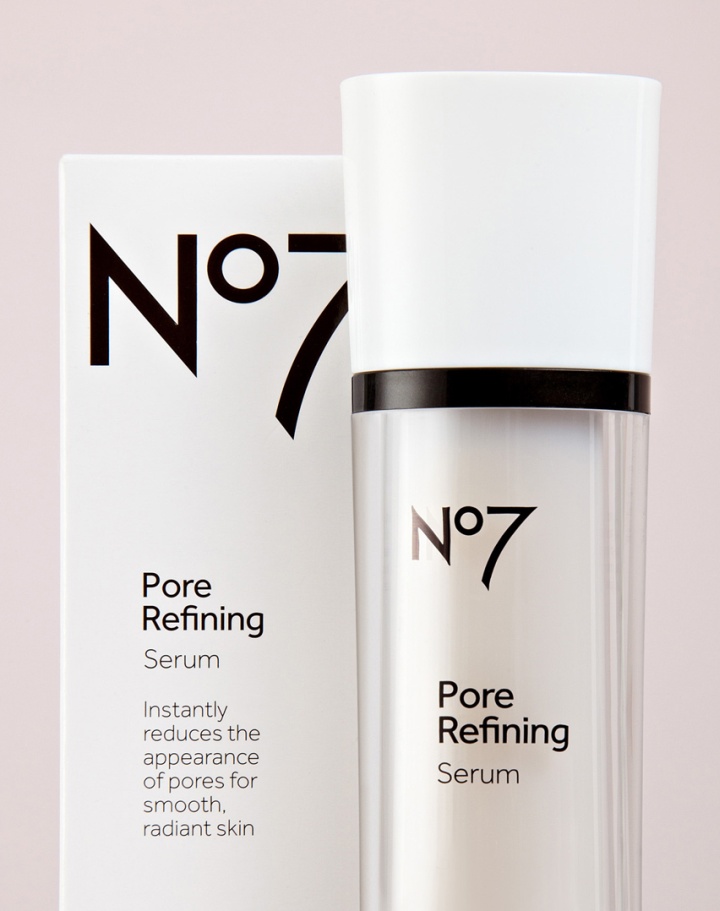
Pewter replaced the current gold on pack and a subtle range of colours was introduced to aid navigation between skintypes and product category. The No7 logo was scaled up and cropped on cartons, reflecting the new bolder and more confident voice of the brand. A new typeface was chosen for pack copy, and the logo and copy then left aligned to feel more modern.
In addition to the core skincare and cosmetic lines, Two Create re-designed No7’s Washing & Bathing range to be more luxurious and sensual, whilst No7 Men’s has become cleaner, more professional and more masculine. In contrast to the Women’s lines, No7 Men features stronger, energising colours and uppercase characters.
No7 users were involved throughout the entire design process, which gave the team a real insight. The research not only steered elements of the structural packaging design, but also gave an insight into the way women navigate beauty products in-store and at home. This allowed the designers to devise new systems for the range. Two Create continue to work with No7.





Add to collection
