
holyfields, a wholly new restaurant chain concept, commissioned our studio to develop a modular, scalable space system with a distinctive look and feel. The new brand promises a high-end restaurant experience at good value for money, while respecting today’s need for simplicity and speed. The brand’s claim ‘time to eat’ describes an innovative concept based on a sophisticated ordering system that gives diners more time to eat. Because holyfields wants you to relax at your table rather than wait in a queue. The restaurant guest orders at one of ten touch screens in the entrance area, which show the menu in image and video format. He then takes an electronic signaller with him to his seat. This emits a signal when the food is ready to be collected from a central counter. The new restaurant chain addresses an urban clientele that have little time on their hands and wish to exploit break times to the max, while savouring good design and a pleasant atmosphere.

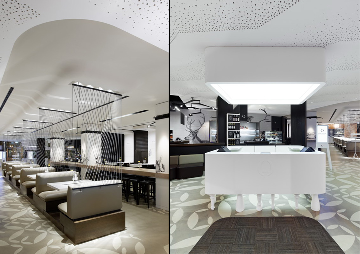
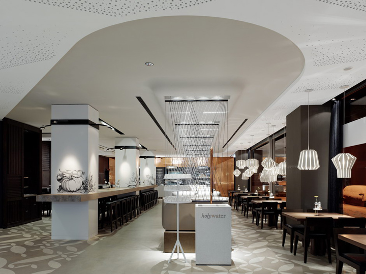
holyfields offers a unique, vibrant yet cosy environment, based on a highly differentiated haptic world. The guest is guided through the space with precise choreography. He is greeted by a white host counter supported on a multitude of different table legs. The illuminated ceiling element above designates this station as the pivotal point of the room. To the immediate right are terminals with large touch screens set in white, steel plate casing that strike a somewhat anthropomorphic note as they stand in wait for your order. Their four sturdy legs conjure up a whole spectrum of associations from waiting staff ready to proffer their services to antique furniture. The dining room contains a wide variety of seating, offering guests different options depending on their mood. Seating is staged in four tiers that are staggered in height from the front windows to the rear wall. A band of wooden tables with four chairs creates a classic restaurant situation immediately adjacent to the windows. Specially designed pendant luminaires add a touch of intimacy here. The next tier is created by a row of white tables with upholstered, two-seater benches. These five table groups are further demarcated by the slightly raised, dark-wood plinth and the gently lowered ceiling above. A net of taught rubber laces separates the individual booths without impeding the view across the space. The next tier offers guests a seat at a long, bleached oak bar table, contained between columns, in the very busiest area of the restaurant. Finally, four white, six-seater tables at the same height as the long bar table are aligned with the rear wall, which is executed in dark wood slats. Capacious U-shaped enclosures give a final parenthesis to the space. This area affords the best view across the entire room from a slightly more retired position.

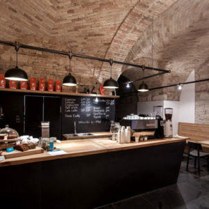
The open-plan space means the visitor can see the far end of the longitudinal axis from the entrance area. This far wall is home to the food counter, prominently encompassed by a funnel-shaped, floor-to-ceiling copper wall. In front of this backdrop stands a broad stainless steel counter. Its front surface is printed with the folds of an imaginary white tablecloth, while its mirrored pedestal reflects the motif of contrasting table legs first encountered in the host counter. The food counter is more like the buffet at a party than a traditional serving counter. Here food distribution is celebrated in style. Kitchen hatches and glass rear walls give the guest a glimpse of the busy bustle of the kitchen. The prominence of the food counter is further enhanced by three illuminated ceiling elements like airport signs that give names to the three serving counters below: Peter, Paul and Mary. The guest receives the name of the respective counter on his electronic signaller and so knows exactly where to go to pick up his order. A fountain of white terrazzo stands in the entrance foyer. Here guests can help themselves to a glass of water free of charge. Drinks and desserts can also be ordered separately from your main food order at the bar. The bar counter is crafted from dark-stained oak with a black leather-clad front. It contrasts strikingly with the white-tiled rear wall, printed with animal motifs recalling antique engravings. The bar opens onto the dining room, but also caters to a smaller lounge located on the other side of the host counter, which invites guests to stay a while at the end of their meal or take a short coffee break. The lounge consists of a modular system of armchairs and poufs in different warm leather tones, complemented by occasional tables with integrated textile lampshades.

The restaurant concept is complemented by a take-away area. This area is accessed via a separate entrance and is divided from the lounge by large glass shelves. It thus functions independently, yet still feels an integral part of the space. Mirrored display refrigerators are integrated in the tiled wall leading to the bar. The glass shelves with baskets in front offer many ways of presenting goods in both directions, both for the take-away area and restaurant merchandising. Much attention was invested in the acoustics of the dining room. A specially commissioned acoustic ceiling with geometrically patterned holes guarantees good acoustics. It also creates an attractive visual counterpoint to the raw concrete, floral patterned floor that runs throughout the space, serving as one of the main key visuals of the new restaurant. With its innovative food concept, holyfields sets new accents in system gastronomy for a discerning, urban clientele. It satisfies the need for fast and delicious, great value food, as well as providing a visual and atmospheric dining highlight. The differentiated range of seating zones caters towards the different needs of its guests, who are certain to find the right setting for anything from a quick snack to a meal out with friends or a bigger celebration. The first holyfields branch in Frankfurt’s Kaiserstraße will be followed by new openings in premium locations in other German cities such as Berlin, Stuttgart and Hamburg.
Designed by Ippolito Fleitz Group
Photography by Zooey Braun
http://design-aggregator.com/holyfields-restaurant-by-ippolito-fleitz-group/

