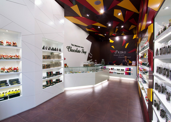

‘The Sweetest Little Chocolate Shop’ at Sylvia Park, Auckland is the third and now flag ship store for the franchise, but represents a new direction. The client gave us a budget of $150k for this 45sqm space and a short brief stating they wanted something unique, innovative and totally different to their competitors to feature both The Sweetest Little Chocolate Shop brand and their new ‘in house’ brand of Kāko chocolates.

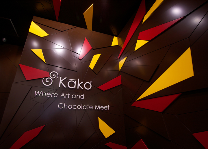
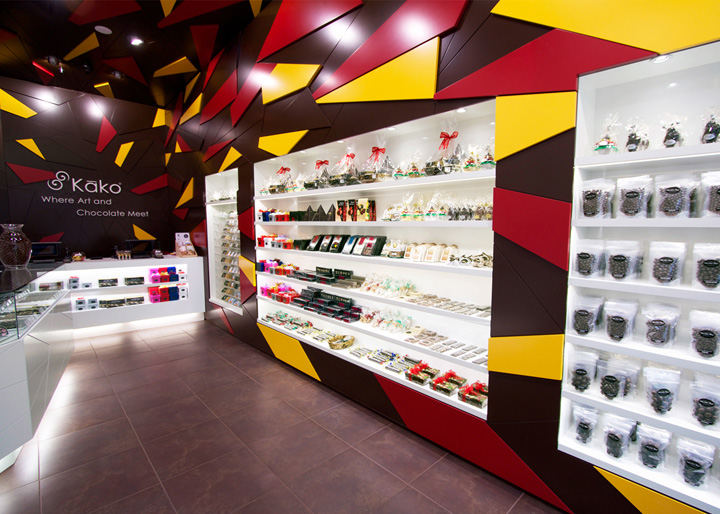
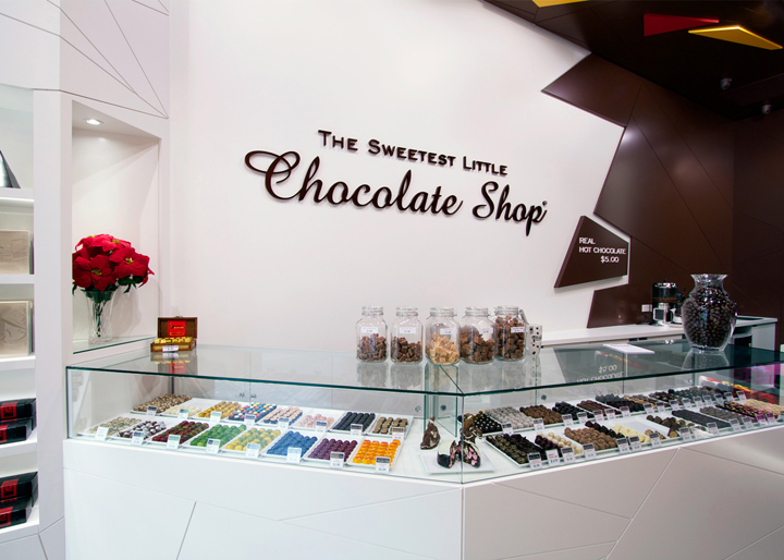
Our inspiration came from our clients own range of colourful artisan chocolates, which lead to a shop that is literally an explosion of chocolate, colour and taste to capture customers attention and ignite their senses. The rear dark chocolate wall explodes outward from the Kāko logo towards the customer, across the sloped ceiling and retail walls. Fracturing into irregular coloured three dimensional shards becoming larger and more frequent towards the front.

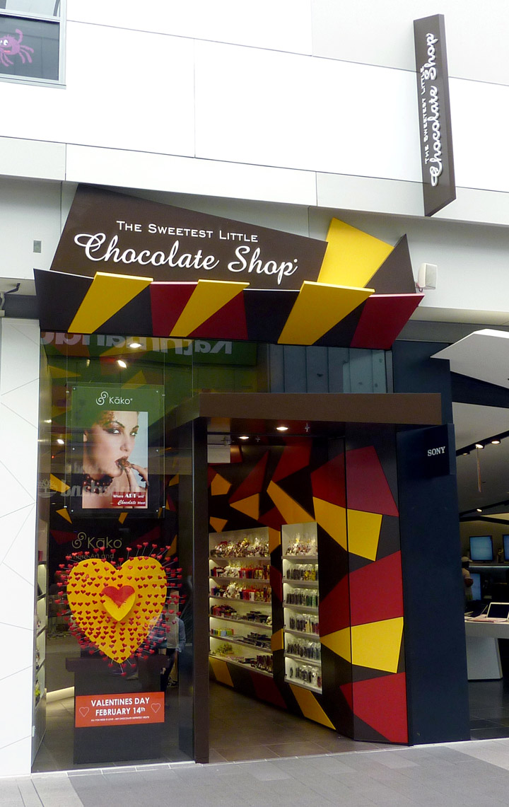
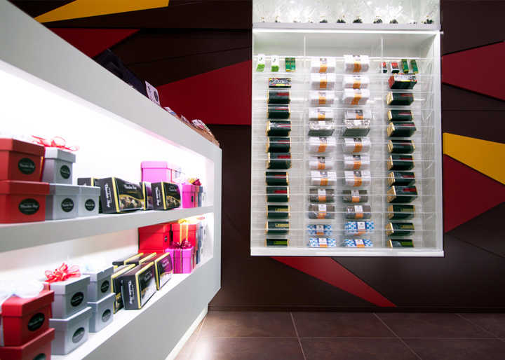
The right side is bright, colourful and fun to attract customers to a large variety of candy and chocolate. By contrast the left side is more neutral in broken white angled panels and a glass showcase to feature premium boxed and loose chocolates. The shop front is tall and dramatic, with 3D colour shards, extending over a canopy, with strong signage and window displays. Colour selection and lighting were critical to compliment the merchandise, matching brown, yellow and red to the most popular Kāko ‘Passionfruit heart’. As well as a neutral warm white as a back drop to all merchandise. A combination of LED shelf lighting and metal halides in the ceiling were used to create ambient and accent lighting.

With careful layout planning, despite its small size, the shop feels spacious and customers naturally flow past all merchandise towards the rear sales counter. The store design starts with chocolate brown shards exploding from the rear of the shop. They fracture to irregular shaped shards with white on the left side leading to a softer colour palette and feature a more premium range of loose and boxed artisan chocolates as well as ‘The Sweetest Little Chocolate Shop’ WORD behind the showcase. On the right starting from the rear wall behind the sales counter Kako explodes forward and across the sloped ceiling and retail wall with colour shards becoming larger and more frequently towards the entrance.

The 45sqm space being long and narrow presented some physical challenges. The shop front features a high canopy extending out from the sloped ceiling. This combined with the window displays and poster help reduce sunlight on stock. The design of all the fixtures ceiling and signage is irregular in shape, 3 dimensional and careful selection of colours and lighting were made to compliment the merchandise.

A combination of lacquered MDF and high and low pressure laminates were used to create various effects with a ceramic tile floor throughout. The store design starts with colours exploding from the rear of the shop in chocolate brown and fracture in to irregular shaped shards with white on the left side leading to a softer colour palette and feature a more premium range of loose and boxed artisan chocolates as well as ‘The Sweetest Little Chocolate Shop’ WORD behind the showcase.
Customers enter to the right and are immediately introduced to the ‘snack packs’ at the front followed by a variety of products on a colourful feature wall with LED lighting to all shelves. The left side is intentionally calmer in broken white angled panels to display premium and boxed chocolates. Leading to an irregular angled showcase to display loose chocolates withy Kako’s colourful range featured at the front.
The project is designed by indesign and also the 2013 Red Awards Divsional Winner and Finalist in the 2013 Dulux Colour Awards.
