Zu-Elements, Milan
posted by retail design blog on 2011-04-19
Add to collection
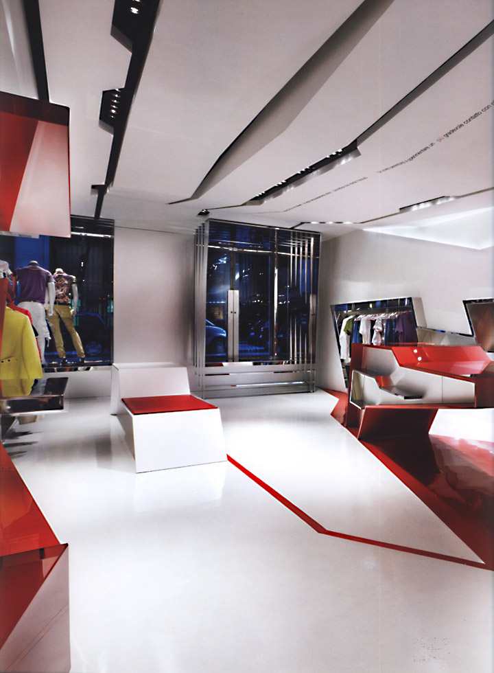

The store entrusted with affirming the first retail outlet of this fashion label is a kind of landscape of tectonic plates translated into architectural form. The criteria applied to the restructuring of the premises, and to completely revising the sense of the existing building shell, express an uninhibited approach that artfully dovetails architecture and graphics with elements of sculpture and set-design.

These ingredients are advertised from the outside through the highly original arrangement of the storefront and the entrance, which are designed as glistening cages cut in sharp lines and suspended flush with the inside floor running slightly below street-level.

The markedly elongated floor plan of the space is endorsed and even amplified by the design, starting with the long deep tracks gouged in the ceiling which harbor the illumination and converge at the end of the store in the cross-shaped brand ensign, or alternatively they continue apparently without end owing to the mirrors that terminate the perspective down the store.

The sculptural effect of the dropped ceilings is just one of the devices applied to destructuring the space. A red band set into the pale floor seems to indicate an asymmetrical axis, but then shifts to align itself with the sculptural ceiling pattern, threading along the zigzagging circulation routes and into a deep gash cut into the wall, or merging with a large field of red that appears like a one-dimensional extension of the cash desk, which is in turn skewed as if unstable.

Furthermore, the display shelves and suspended racks on the opposite wall, dissolving in the continuous mirrors, present a staggered sequence of sloping, clean-cut units expressed in the brand’s trademark red and white. The writings on the ceiling refer poetically to the brand identity and endorse the interior design’s emblematic expression of the corporate message but also confirms the reciprocal cross-pollination between the new architecture and graphics adopted.

design: Giorgio Borruso Design


Add to collection