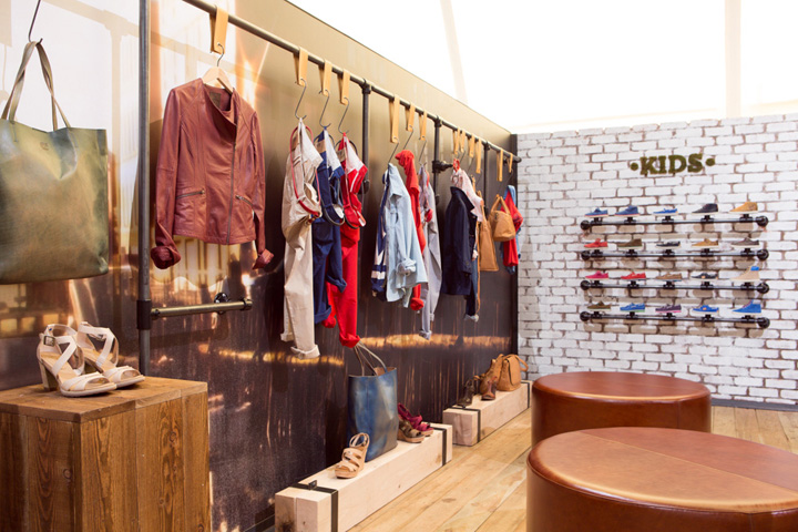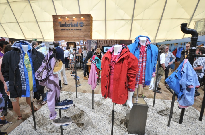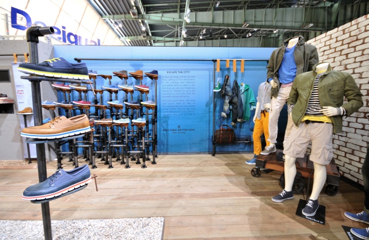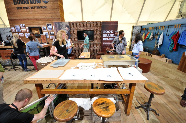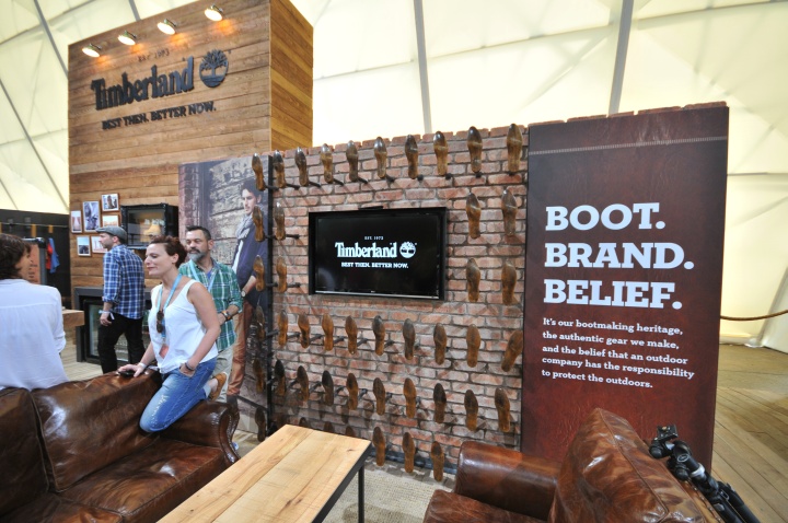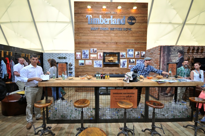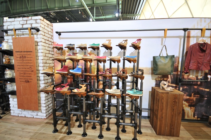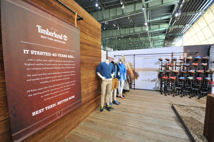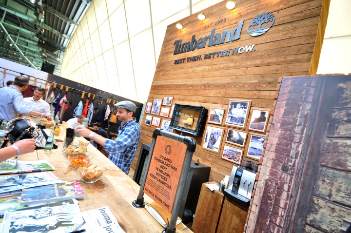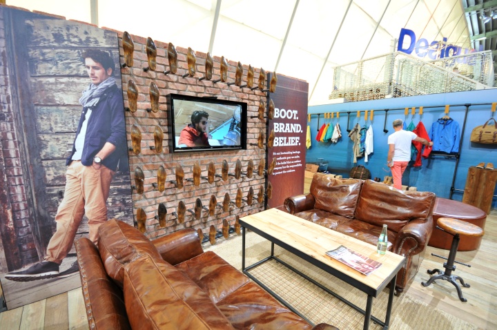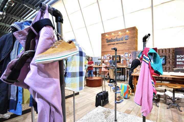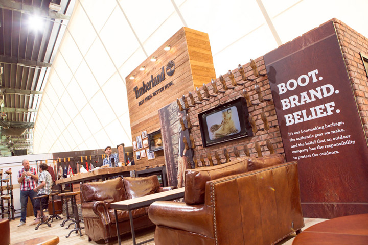
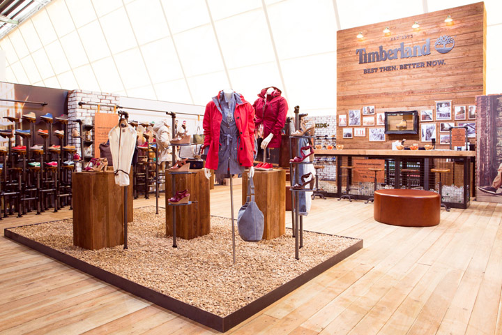

Green Room were appointed following a competitive pitch for Bread and Butter stand design (and subsequently delivery) to create a space which celebrated Timberland’s 40th Anniversary (promoted through the #TBL40 hashtag) and conveyed heritage, sustainability and presented the SS2014 range.

In order to communicate heritage, authenticity and style, as well as innovation, the design concept was developed to bring the ‘Best Then, Better Now’ campaign to life, as well as the two seasonal product stories. We also wanted to integrate the idea of craftsmanship, design and an element of the unexpected to draw passing traffic.

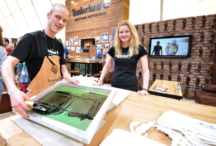
‘Best Then’ was championed by creating a familiar focal point at the back of the stand that reinforced quality, authenticity and the brand’s rugged outdoor heritage, drawing on style and performance elements from the seasonal stories. We reflected the ‘Better Now’ message by leading with the unexpected through showcasing new styles and innovations at the front of the space, as well as introducing elements of customisation.

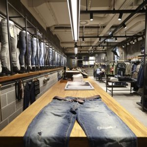
We also increased dwell time through hospitality and interactive elements, with the design creating changes of pace within the stand layout. High level walls gave a feeling of exclusivity and intrigue from passing traffic, whilst the use of authentic materials such as natural wood, brick, G Clamp fixtures and even real moss lettering helped to reinforce heritage and authenticity. Having worked on various stands at Bread and Butter projects previously, we used a trusted local partner to help execute the stand within a very short time frame.
Images courtesy of Green Room & Retail Design Blog
