

Gabor stores by D’art Design Gruppe, Frankfurt am Main – Germany
posted by retail design blog on 2014-08-30
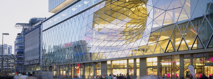
Frankfurt am Main
Add to collection


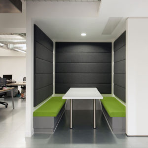
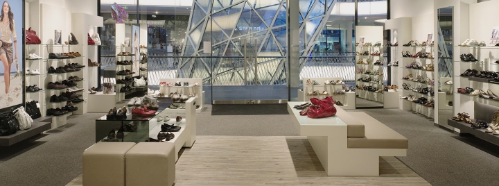
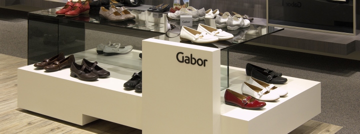
For a store design for Gabor, a company with a longtime tradition, the objective is to mirror the target group’s demands so that the customers experience an emotional brand adventure. Thus, the products are the emotionalizing protagonists, which have to be placed in the spotlight. The task for the D’art Design Gruppe was to arrange the design of the mono stores in such a way that it turns into a brand adventure, even in a smaller shop-in-shop solution situation. Here, the architecture is the context and frame that communicates the brand name and the related brand values.

Harmoniously and rich in contrast, the product presentation blends into the brand architecture: In bright white it clearly stands out from the rest of the context, which is kept in warm brown hues and thus constitutes the bright counterpart. Additionally, the brown and white hues create an delimitation of the different areas of the brand composition, product world and highlight presentation. The D’art Design Gruppe has arranged the international brand appearances of the renowned shoe manufacturer since 1999.
Photography by Jörg Hempel


Add to collection