

Modern and classic tones are blended, while a neat and elegant graphic design is mixed and integrated into the company’s office center for the coexistence of atmosphere and grandeur. In addition to using vision to portray creativity and beauty to the audience, the performance of functionality is even more focused.

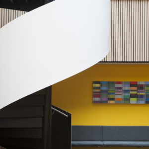
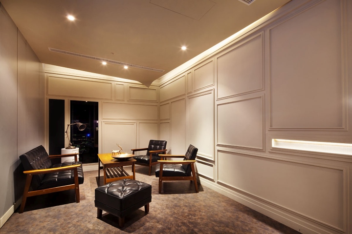
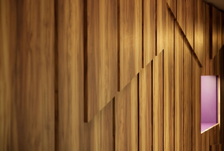
The entrance has classical vocabulary with a strip board material, which is connected through the hallway to form the main route. The seating area is decorated with an elegant concept with a white base tone and three-dimensional lines. The ceiling corners are designed with a folding angle to create the feeling of opening origami, which is symbolic of the enterprise, which is a creative company using paper and vision. The ceiling is not excessively decorates, but rather uses custom lighting in the top of the office area to echo the strip lines. The combination of the lighting and book shelves presents decorative practicality.
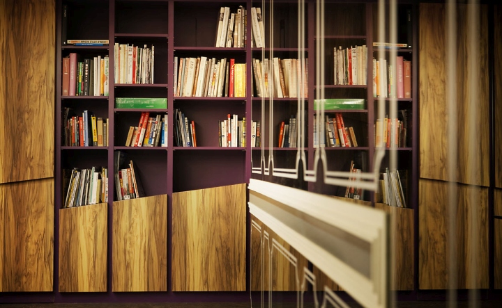
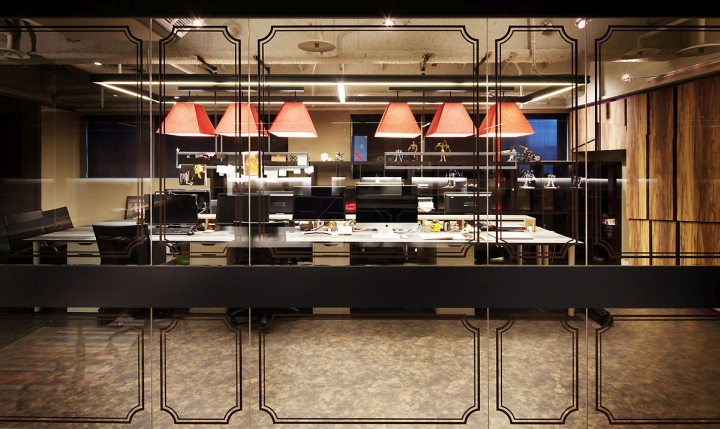
A three-meter wide corridor provides both display and storage functions, using the rhythm of the movement to express a harmonious space. The office area presents a classic tone through the strip line boards with the sticker adhesive method, which shows on the gray glass. Through the concepts of both imaginary and the reality, the transparent and extended visual sense is transferred to the visitor. Overall, by focusing on visual and tactile perceptions, compromised classic elements are used for the quality of the space.
Design: Ahead Concept / Jun-Song Yang, Ming-Hua Zhang
Photography: Zhen-Yu Lu








Add to collection
