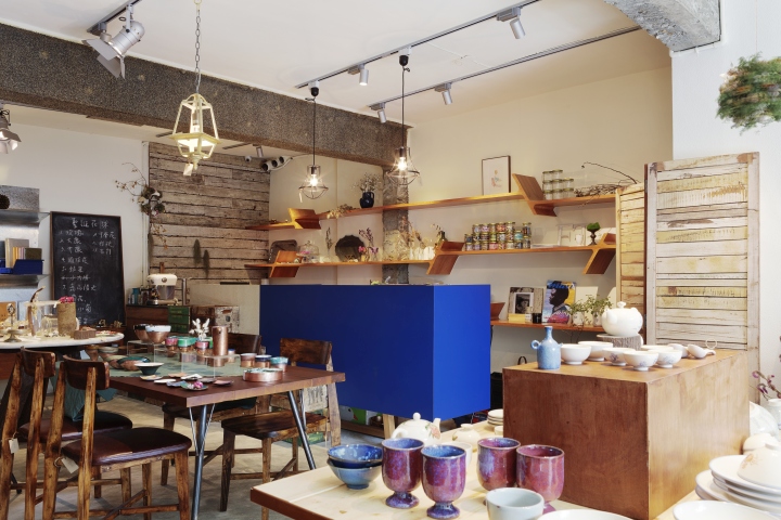

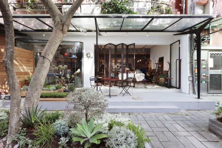
Fujing Street in Minsheng Community is one of the only streets in Taipei City that are embroidered with refreshing green plantations. Lushy tall trees are all along the street and in the parks; there are old-American-style building facades and stores owned by creative personals. All these allow people to be immersed in a pleasant and cozy atmosphere. For her love in nature and insistence on high quality of life, the owner of Fujin Tree 355 decided to locate her select shop here. She had designer Shih-Chieh Jeng, who is great at enhancing the original quality of the space, in charge of the interior design, with an aim to create a space that could achieve harmony amidst the green surroundings as well as community culture. He also involves the element of “home”, making the commercial space brimming with life.
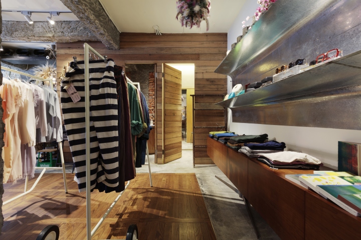
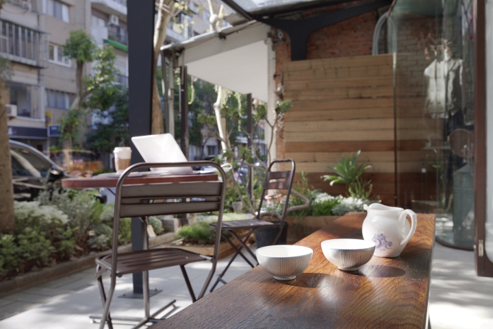
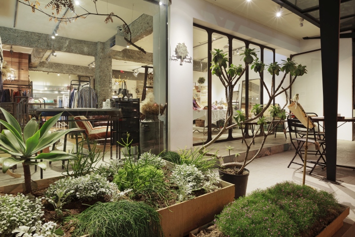
Nature forms the mainstay of Jeng’s design. Attempting to introduce natural elements on street to the shop interior, he sought to achieve the a state of purity by employing light colour tones, wooden texture and images of tree branches. Plants lining from the sidewalk through the front flowerbed to the indoor space along with metal and wooden decorative branches together contribute to the effect of spatial mimicry to the outdoor space. The decorative objects merge into the existing background, presenting the shop with vibrant visual tension of multiple levels. As sunshine filters through the interlaced structure of natural and artificial branches, a casting a shadow play in the space, enabling the expression of Fujing Tree 355 to vary from time to time.

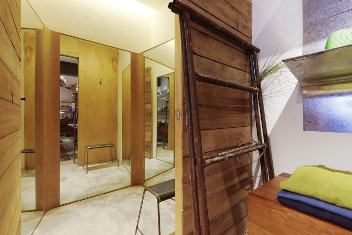
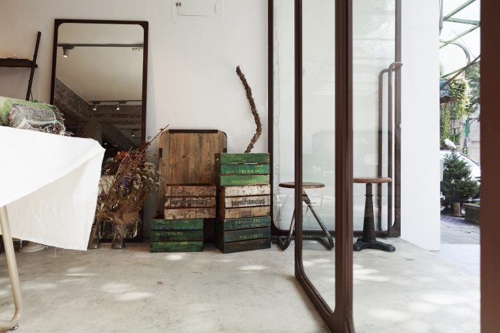
In addition, to create an industrial style for the space, Jeng included many metal components, such as black iron standing sign, shade roof, folding French door that could serve as decoration for different purposes, full-length dressing mirrors with metal frames and display shelves made with sheets of curved galvanized steel (SECC). Since Fujing Tree 355 is a commercial space targeting female customers, artful, elegant details could be found everywhere in the bold arrangement. To name some examples, the round corners of the French door and inner moldings of the dressing mirror, soften the clean, sturdy design. The feet of the roof gets thinner from top to bottom, painting a lovely picture of delicate lines and shadows with the legs of the iron table and the chairs. The combination of iron frame and circular curved glass in the display window also offer interesting contrast in space to visitors. Besides, by applying various metal pieces, Jeng endeavored to create a space featuring feminine aesthetics. Take the huge display shelves in the back for example; the galvanized steel sheets with rose patterns form flexible arcs, adding intricate, graceful feminine characteristics to the design.
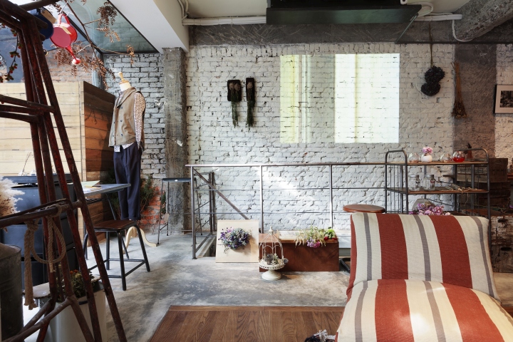
As for the design of interior space, Jeng removed all the walls from the previous kindergarten partition setting, opening up a vast LOFT space. Joining the concrete floor framed by stainless steel moldings, the other part of the floor is composed of wood planks installed to present the image of rail tracks, which highlights the theme of “home” and makes the space a constant reminder of family drawing room. To divide the whole space into sections serving different functions, colors and lighting are deployed. The lines and planes of the ceiling and wall structure are distinguished by colors. The old red brick wall, painted white, has an antique look that corresponds very well with the furniture and second-hand accessories from Journal Standard Furniture, while the azure counter, an artwork of color flash, could make people’s eyes widen at the sight. Photoflood lamps are responsible for the lighting of commodities, leaving a dramatic impression on customers. On the wall on the left hand side, casting continuous a projection that could not only improve brand image but attract passer-by’s attention and hence boosting the sales.
Dotted with stunning creativity in every corner, Fujin Tree 355 is just another example of Jeng’s experimental creations. Refusing to simply follow traditional spatial concepts, he always thinks out of the box. “I don’t like sticking to the same design pattern. Each client’s case stands on its own, and I must always come up with novel ideas so I could really bring out its unique charm,” said Jeng. Considering that many design ideas were his first attempt, he went to Fujin Tree 355 almost every day to supervise the work so he could make minor revisions promptly and make sure it would achieve his ideal of result. Jeng firmly believes that good works require thorough attention and control. Usually a commercial space takes only a month and half to accomplish; to ensure the design of the space could last as long as it could be, however, Jeng insisted on checking every detail himself. Thus, it took four months to finally complete the refurbishment.
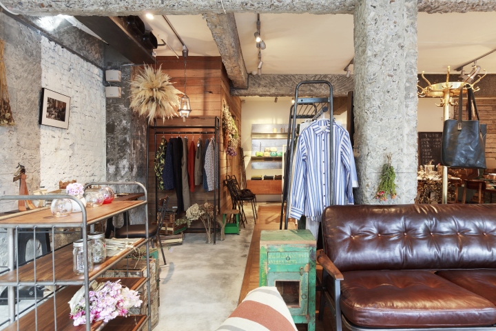
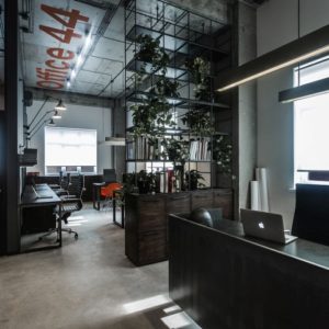
Seemingly unembellished, the exposed walls and pillars in Fujing Tree 355 are actually another original idea of Jeng’s. To give the space an industrial style and a tinge of history, he carefully instructed the craftsmen in carving at the early stage of removal. Additionally, the black iron railing of the staircase leading to the basement was intentionally rusted, and then to its surface a layer of protective coating was applied to create a vintage effect. As to the railing design, in most cases the railing is planted in the ground, Jeng chose to fix it to the ceiling, which absolutely subverts the visual conventions and conveys a sense of humor in space design. Moreover, with the 2.5-meter high ceiling, the restroom looks bigger than it really is,in which the floor space is only around 4.96 m2; also, bearing the idea of “space furniturization” in mind, he made the sink an independent article sitting on a melamine cylinder, which, together with the wood partition and an inlay mirror, achieving an unique aesthetic of interior design.
Design: JSC design studio
Photography: Ivan Chuang


Add to collection
