
Rehauling the overall organization and rationalizing the buildings called for a major renovation that simultaneously had to maintain the character of the buildings and preserve the listed components. The various components of the project were collated under the hashtag #cloud.paris, thus providing clarity and unity, from the organization of the complex as a whole to the interior ambiences, including the architectural expression.
Clarifying the building complex
In order to streamline and harmonize the whole of the building complex, forty-five percent of the total area was demolished. Facades were realigned, floor framings were reconnected, and a new building outline with an open floor plan was determined. The underground levels were the most affected by these heavy works and 11,000M² of basement were demolished, compared with 6,200 square meters of the superstructure.

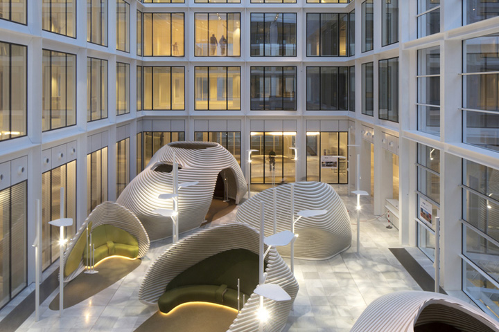
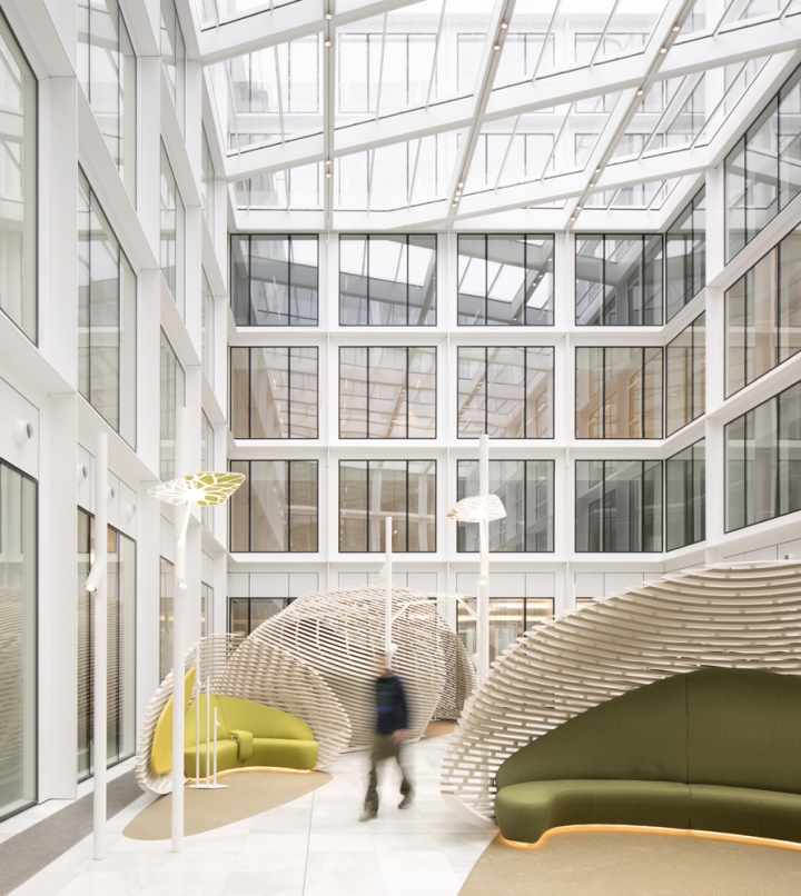
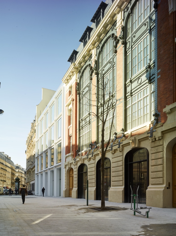
Reframing the courtyards and ensuring their continuity enabled the creation of a vast interior space around which the program is organized. The main entrance is located in the industrial hôtel of Rue Ménars, whose façade is historically listed. Together with the business center, the program has a combined active surface of 33,200m² for a capacity of 2,500 people.

Unity of the Façade and the Building Block
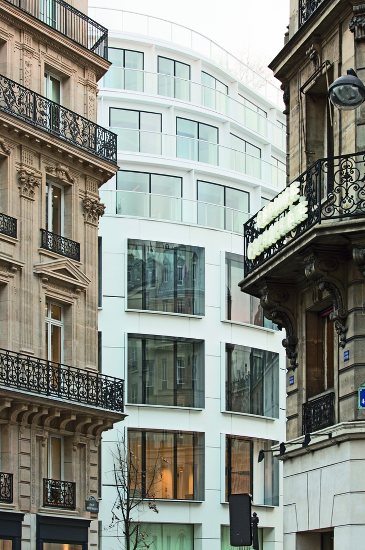
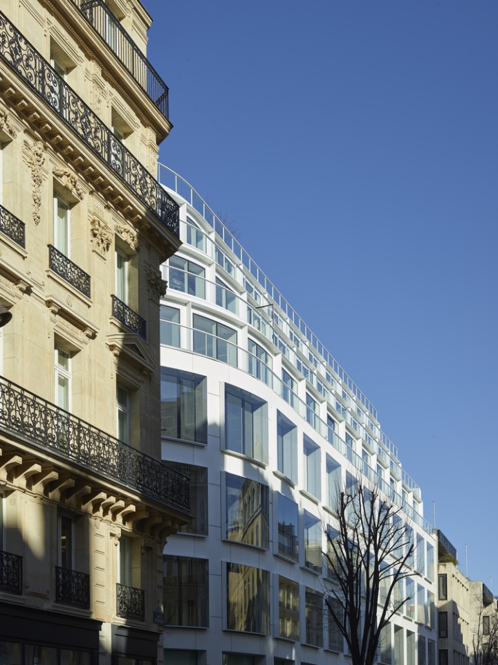
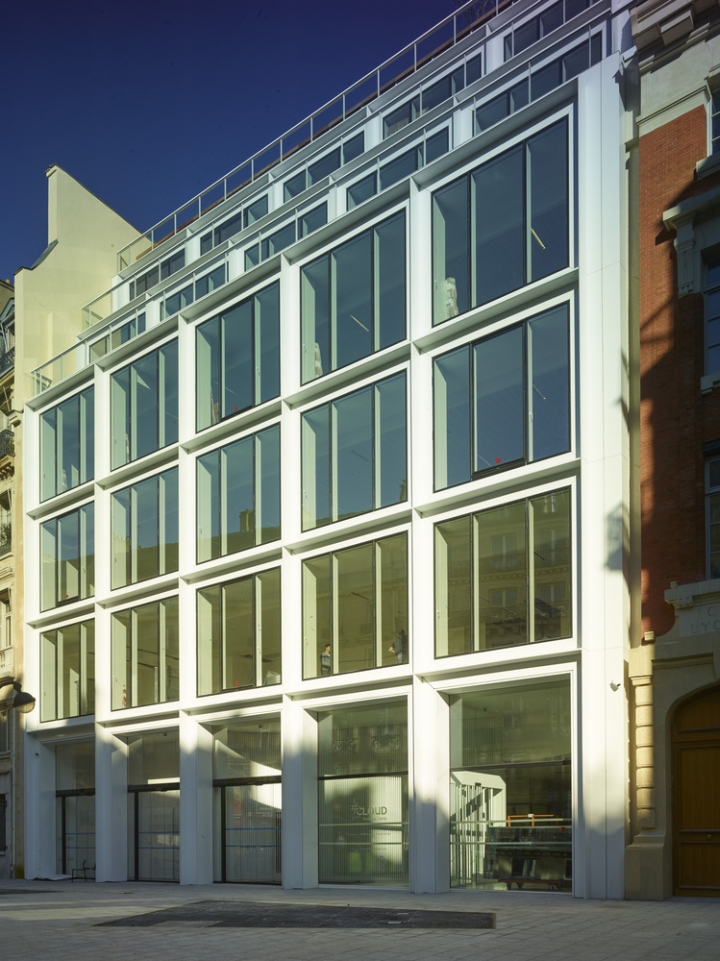
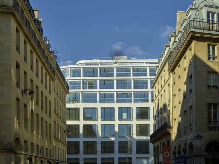
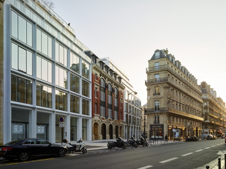
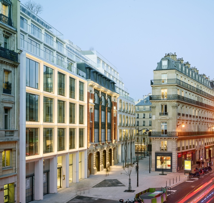
This significant restructuration is an example of contemporary architectural style that manages to safeguard listed heritage features within a unified whole. The façade of the former industrial hôtel Rue Ménars is caught between two evenly white matching façades with symmetrical square window grids.
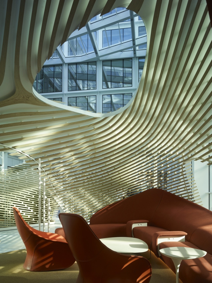
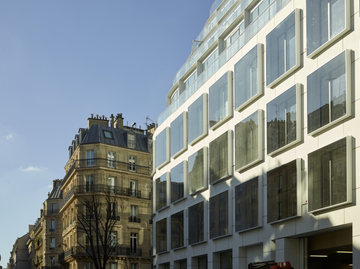
The impressive building with a rounded façade on the intersection between Rue de Richelieu and Rue Ménars has defined the new architectural style that applies to the whole building, up to its courtyard elevations. It retains its lines of strictly identical large square windows and the crowning of the building in successively receding stories. The outer skin is made from a clear material that brings both refinement and presence within the neighborhood.
Bringing it all to light
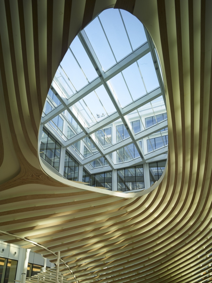
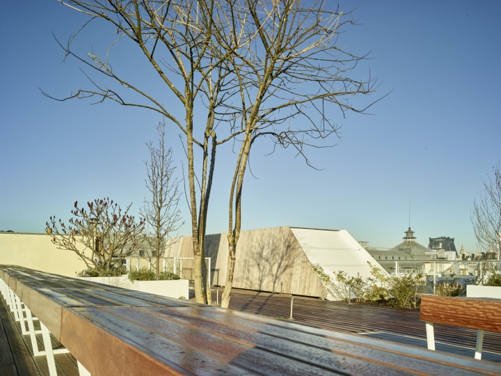
Historically, light is modernity, and here it is no exception: light is key to reclaiming interior spaces. The whole building is now basked in natural light that comes not only from its street-side façades but also from its courtyards—both inside and out. The reframing of the courtyards allows for an increased light exposure and comes with storied terraces that crown the building, all of them accessible and landscaped.

The propagation of light also rests on the uniform white façades with their generous array of windows on the courtyard side. The main courtyard is subdivided in three parts with different thermal characteristics: a covered atrium, an intermediate space, and an outside space.
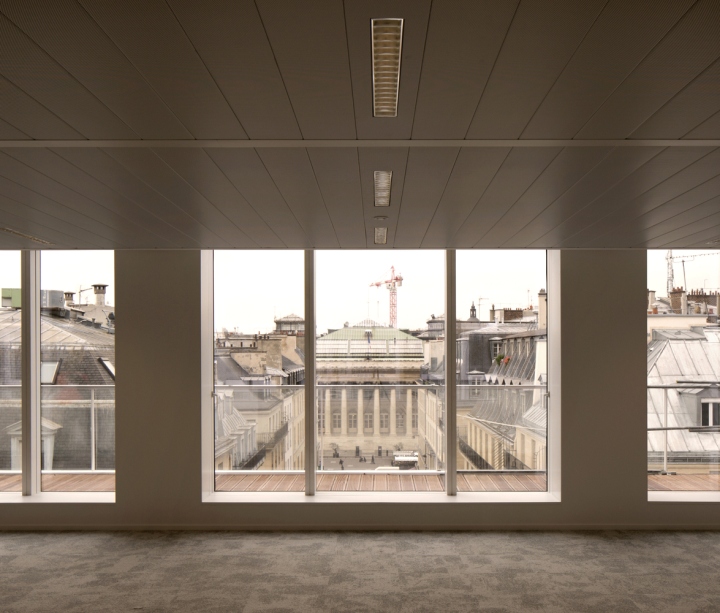
Ultimately, what appears from within the block is a new building. From this standpoint, the constraints and unexpected twists and turns of this thorough and extensive renovation have all but been forgotten. The redevelopment is highly visible when facing the main part of the building, at its rounded front at the corner of Rue de Richelieu and Rue de Ménars. There, the historical transformations required of contemporary Paris are revealed in an epiphany.
Architects: Philippe Chiambaretta Architecte
Design Team: Émilie Chambre, Arthur Couprie, Julie Deglesne, Didier Gratio, Emmanuelle Henin, Cuong Nguyen, Sabine Sachter, Grégoire Seriyes
Photographs: Jean Philippe Mesguen, Clement Guillaume






http://www.archdaily.com/783971/number-clouaris-philippe-chiambaretta-architecte


Add to collection
