
The main idea of this project was to create an interior and image Redesign graphics, a restaurant with more than 30 of experience in the field of gastronomy, collect his identity restaurant confidence always with a new gastronomic approach and concept of interior.

We start from a place very versatile because of its multiple uses and schedules, and a logo that refers to the ancient castle of the city, which already identifies the local and will serve us a starting point. Why we have reinterpreted the traditional children’s game of wooden building blocks to generate raster graphics and texture that apply to different parts of space and graphic identity end.

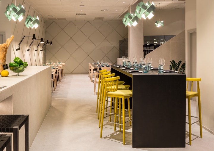
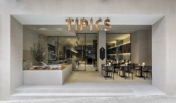
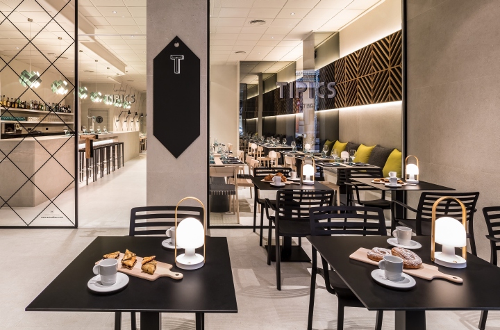
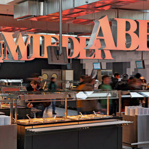
The restaurant is presented as a large space of 300m2 divided into three different areas: the cover-sweet terrace corner, bar-fresh lounge, dining area and restaurant space privé.
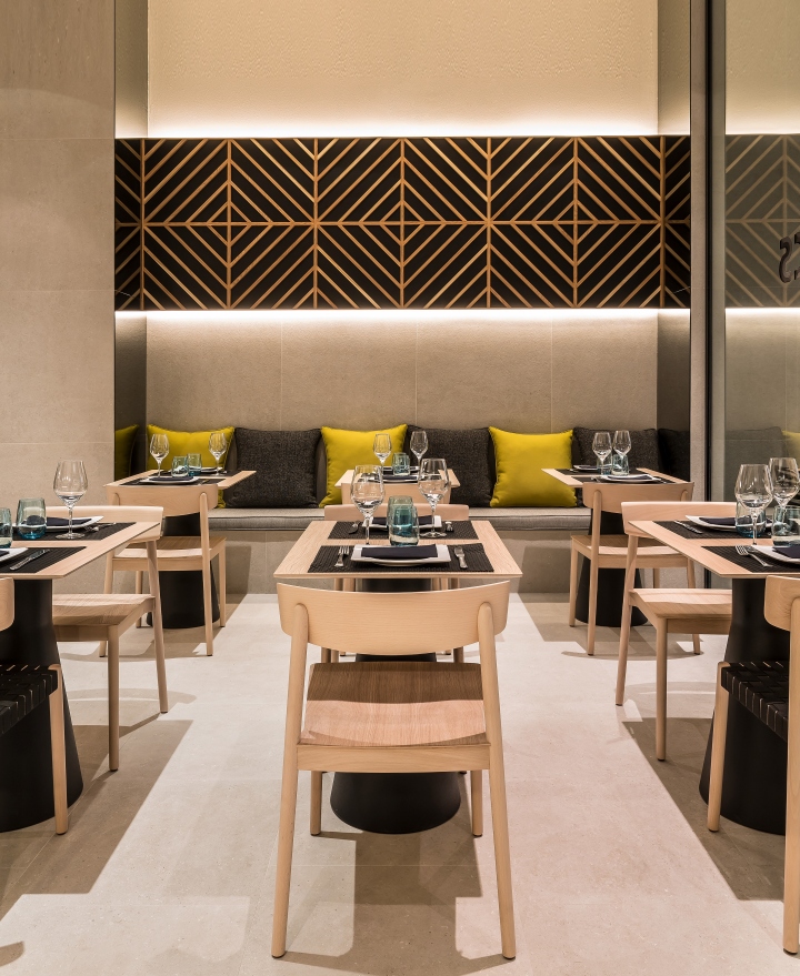
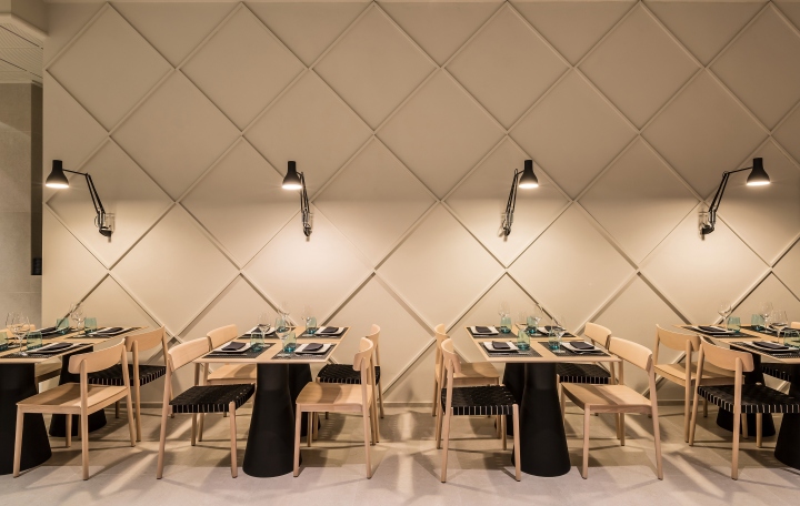
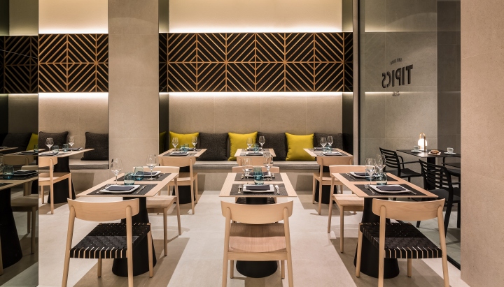
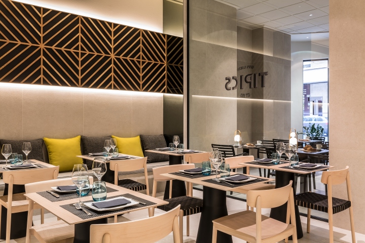
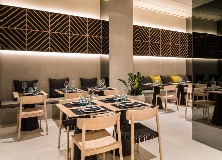
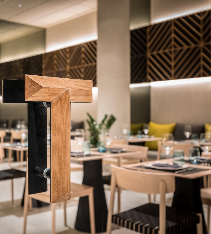
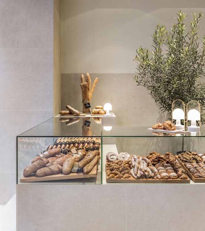
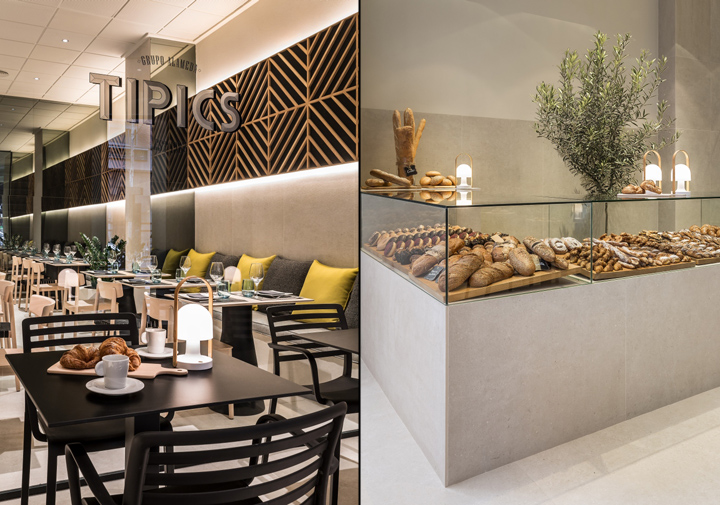
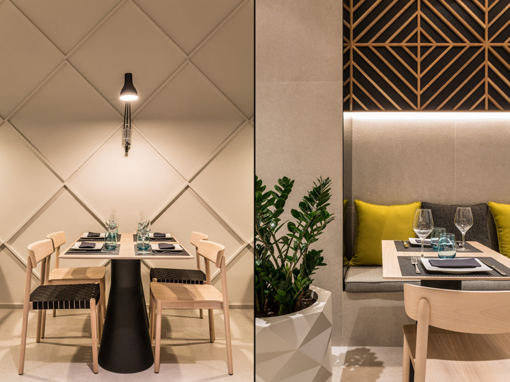
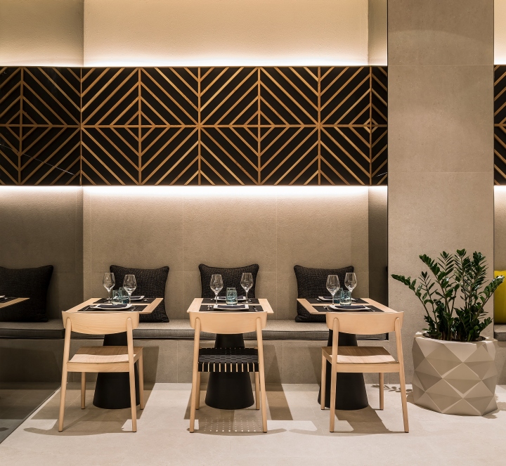
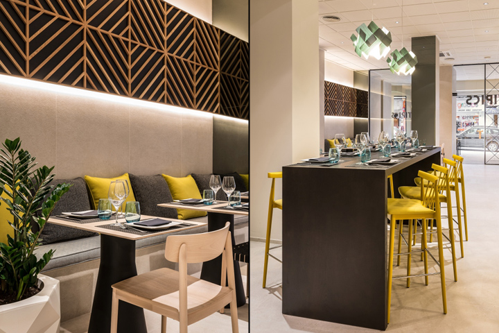
The cover-sweet corner terrace is characterized by a large bar glass and stone that serves as exposure of the large selection of fresh pastries, combined space tables to enjoy the outdoor environment. A large glass closure and labeling graphic divides this space entry area main-fresh lounge bar where you can have breakfast or an informal meeting with friends or clients work. The dining restaurant and privé area is part of a space with a subtle decoration woodwork and painting on the walls, combined with the special selection of furniture that blend natural wood oak tables and chairs with black color in different parts of other décor.

A special selection of furniture Andreu World, which combines Smart chairs in natural oak finishes, with braided in black or with a special combination of black lacquer and textiles Kvadrat with rotundas and compact Reverse tables in oak and black base. They wanted to emphasize the location of this restaurant and its food culture through the strength of stone and for this, the general container for all spaces combines the limestone of Portuguese origin and Catalan ceramic Living Ceramics with the freshness of a painting textured in the same tones of natural stone to give more space.
Designed by estudi{H}ac
Photography by German Cabo
