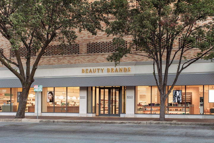

Kiku Obata & Company’s transformation of Beauty Brands, a major beauty retailer based in Kansas City, MO has launched. The former CEO of Ulta Beauty, Lyn Kirby, took the helm of Beauty Brands in 2014 and appointed Kiku Obata & Company to lead a major rebranding. Kiku Obata & Company designed the brand’s new identity and retail prototype with the intent of elevating the value-based chain into an upscale, yet accessible beauty destination – focusing on expertise and a sophisticated, modern American beauty sensibility.

A retail and salon concept founded in the mid 1990’s, Beauty Brands has been reinvented as a contemporary shop-salon-spa concept focused on bringing together a curated edit of the best independent labels and established brands, as well as offering high-quality beauty treatments across its 60+ stores.

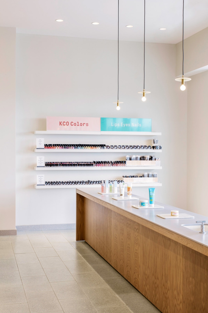
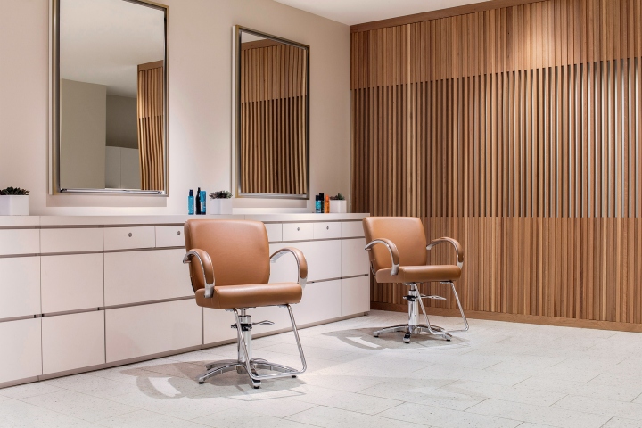
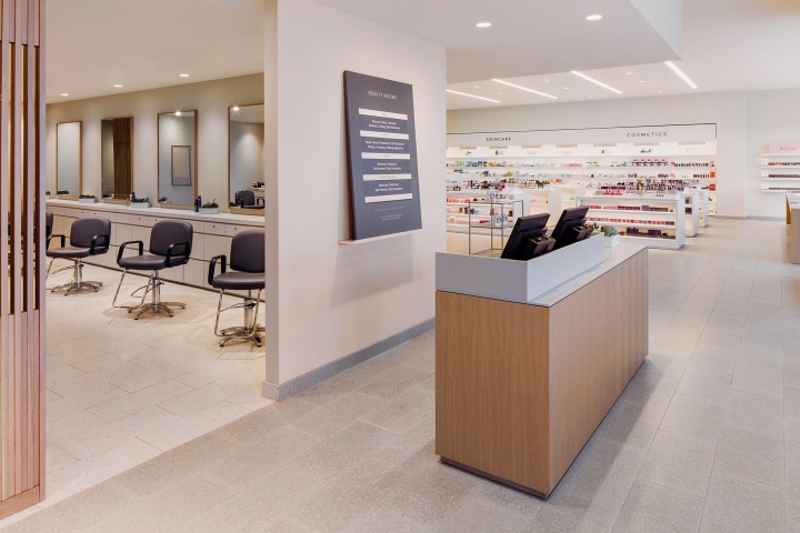
Kiku Obata & Company’s transformation required major alterations to existing locations and the complete design of new stores. The new prototypical design moves the salon-spa to the front of the space alongside the shop (before it was hidden in the back) to showcase its focus on expert treatments on one side of the store, and retail products and experiential feature areas on the other side. New elements introduced into the retail space include the Beauty Bench, a long bar for tutorials and events at the front of the store; a Beauty Concierge for booking treatments; and a series of Beauty Bars for complexion, brows, hair and fragrance – making the retail space an interactive gathering space where visitors can learn, socialize and experiment.

Clear visibility through the space and maximizing daylight were prioritized, helping customers immediately understand the full environment and to breakdown the large retail space so it feels calm and ordered. The challenge was to create an index of different brands that sat next to one another within a wider environment. We looked at great library precedents, galleries and museums of objects to help us define a balanced, almost curatorial display of multiple brands. It’s from this sense of order which then allows Beauty Brands to exhibit its own identity – and that in turn brings benefit to the visitor allowing products to be easily found and referenced alongside other products.

The main route through the store passes through a series of different areas, either devoted to different product offerings or spaces for tutorials and consultations. The concept can be shopped entirely on one’s own with no need for assistance, but includes many spaces for expert guidance and advice when needed – allowing visitors to tailor the experience to suit their needs.

Natural materials and a warm, light palette reflect the retailer’s sensibility. Contrasting terrazzo floors were used in the shop and salon-spa to differentiate these two areas. A hand-plastered wall in the brand’s signature soft peach color extends the length of the main route and white oak fixtures and screens are used in feature spaces. The natural and light interior invites customers of all ages and presents an understated, yet sophisticated take on modern beauty.

In addition to the retail space, Kiku Obata & Company designed the brand’s identity, packaging, advertising and select communications for launch. From print collateral and campaigns to the physical environment, all touch points share the same sophisticated, modern and natural sensibility that will come to define the retailer within the beauty category.
Photography by Ross Mantle
