
Brief
A flexible, “black box” approach to store design that will appeal to a youthful, energetic target market, where fast fashion fixes are the priority!
Concept, Key Elements, Materials, Inspiration
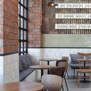
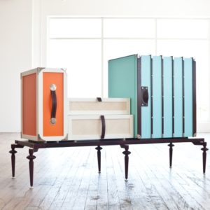
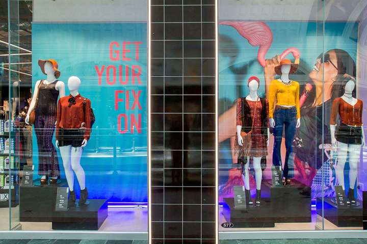
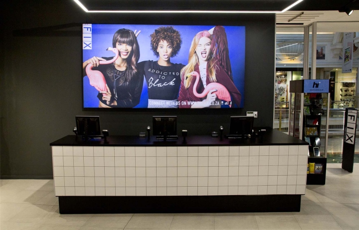
We’ve created a neutral background with “pops” of colour and design elements to compliment the vibrant personality of our key customer.

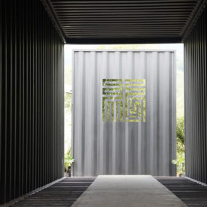
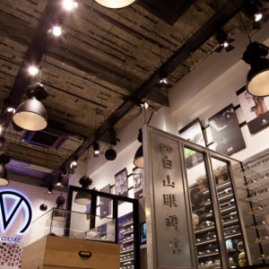
Part of the key design elements were to include the grid effect – seen throughout in details, lighting and key fixtures, and the play of black and white to better showcase bold prints and colour that are inherent in the product type. Materials like steel and tiles contribute to this fast paced environment, maintaining the contemporary and flexibility of the space. We took our inspiration from the grid approach used in their corporate logo, as well as the fashion forward youth of South Africa.
Target Market
Lower LSM, ladies in their 20’s – 30’s that are fashion focused and looking for great fashion fixes, fast! Bold, confident and expressive.
Designed by Claudia Kiessling & Melanie Motherwell / TDC&Co
Photography by Kim Grant




Add to collection
