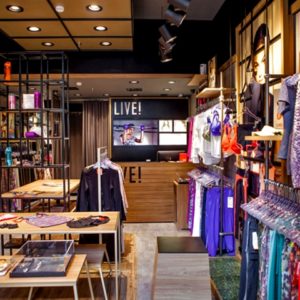


The entire concept revolves around engagement of customers with a sports feel. The design language chosen was motion/action. Sports is all about action, so the focal point of the salon is the styling mirror stations. To bring in the motion, a curvilinear forms the backdrop of styling stations. The quite interesting part is a graphical form of Federer on motion was added to the curvilinear partition. Rectangular pipes were chosen to add more drama to the motion concept.

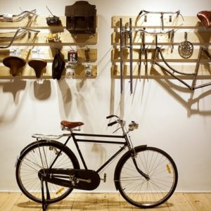
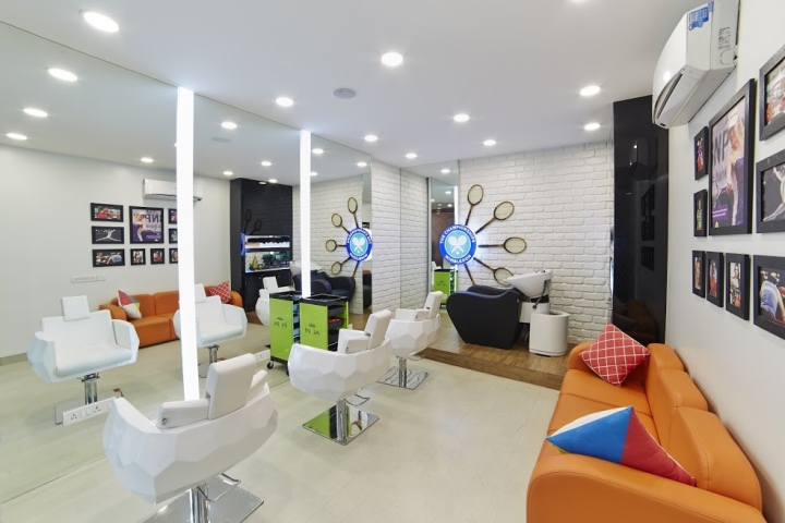
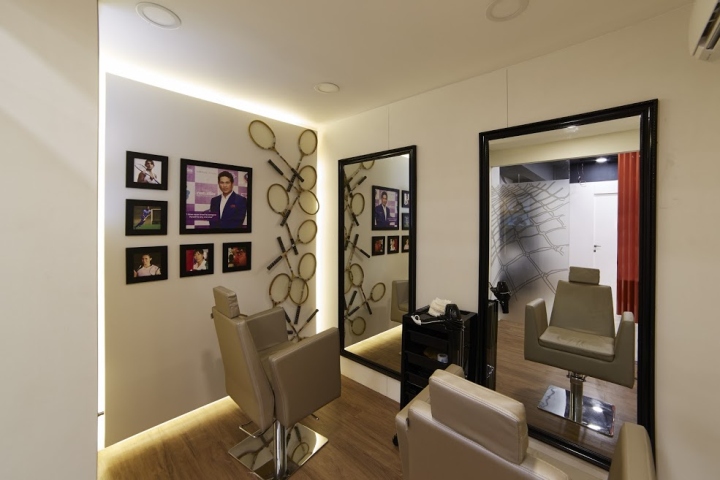
The ceiling has a convex football framework(stitchwork concept) which is hanging in the ceiling to add football in air/motion concept. The hung football has a backlit concept to add more character to the concept. The colour language is bold colours, the brownish orange on styling partition represents french open as well as athletic track. The Aqua Blue is used in gaming zone representing water sports. The makeup room is touched with Wimbledon theme using vintage wooden racquets similar to Wimbledon museum.
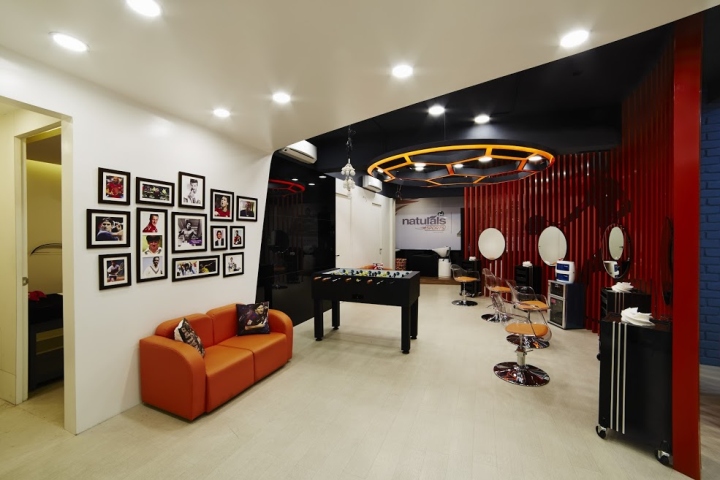
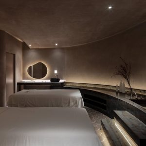
The look and feel of Salon is done with various forms of sports representing each room with one. The layout was designed to ensure flow of services creating openness of Styling area. The lighting for styling area or the facial room is designed accordingly based on higher lux or the mood lighting depending on kind of services required for the particular area. The design for this Salon is all about sports experience in every part.

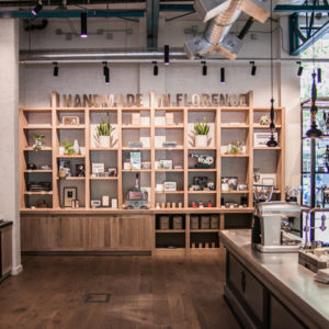
Each space has been chosen with unique sports theme by bringing motion to all the static elements. The glass partition has been done with Frosting Design i.e It gives impressions of tennis ball caught in nets. The cash counter follows the same design language of motion with shape and fluidity depicting the Sports theme. Thus the space was designed by creating the balance in all types of sports and incorporating it in the Design.
Designed by Saran Associates
Photography by Panneer Selvam



Add to collection
