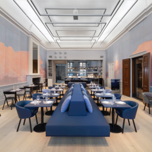
XODÓ contemporary warehouse by Packaging Brands, Petrópolis – Brasil
posted by retail design blog on 2016-10-11
Add to collection


XODÓ CONTEMPORARY WAREHOUSE – Branding, Architecture and Identity. “A contemporary warehouse designed to be a gastronomic reference in a city famous by the charm of the buildings of the imperial era. The new store “Xodó” in Petropolis, mountainous region of Rio de Janeiro, is all this!

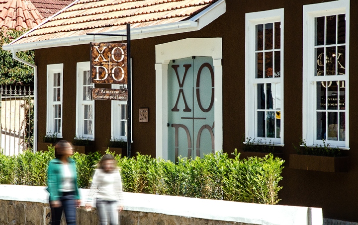
After the implementation of the project designed by Packaging Brands, the former “pink house” has gained a renewed identity and it is a meeting point for tourists and locals.

Part of the group “Xodó de Minas”, known for the quality and tradition for over ten years, the new store goes beyond offering a unique shopping experience and consumption in the city. The space is the result of a rereading that keeps alive the baroque period features, strengthening the emotional relationship with customers.

The project – which included the entire brand identity and complete store design – was created from a concept that sought points of contact between Petrópolis, Minas Gerais (origin of the brand) and Portugal (origin of the family of partners). The embellishment of facades and ornamental detail interior, expressing the emotions of life and the human being, they referred to the Baroque, unique period of architecture, music and literature.

But how to make a contemporary reading of Baroque elements to build a new experience for Xodó brand? In order to bring a custom language that was able to touch the customers, the communication follows a poetic line and speaks directly and informally. The evolution of patterns based on traditional Portuguese tiles led to several possible applications respecting the origin of the brand, without being tied to a place, time or style.

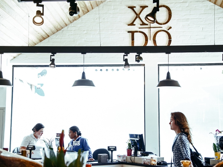
Coatings and choice of color palette (primarily brown and blue) aimed to balance this contemporary baroque tone in decorative tiles. The white on the bricks was used to enhance the natural light and increase the feeling of space. For the facade we choose the main color palette, brown, with the aim of showing the transformation of the space that was once pink, generating impact for customers.

In addition to the store, it was built a factory with its own bakery products, which won leading role in this project, showing the stages of production. As a suggestion, we brought the possibility to use the rooftop as a complementary open space or area for events, from festivals of cheese, wine or partnerships with other brands.

The solution generated a modular visual communication, with pieces that have emerged from the patterns break, resulting in a contemporary setting, full of attitude and unique style.”
Design: Packaging Brands
Photography: Jonas Pinheiro


Add to collection