
Add to collection

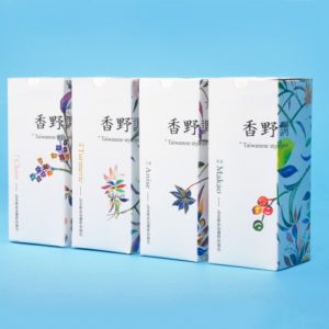
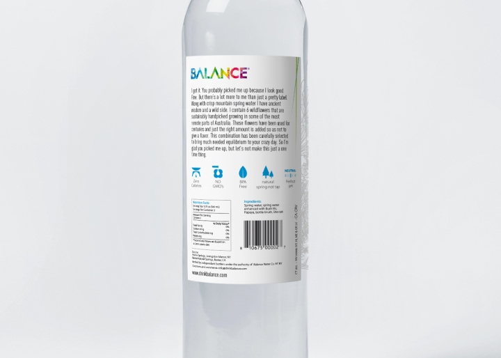
Balance started with very humble origins in Sydney and is now sold in Australia, Asia, America and Europe and operates offices in New York, Sydney and Cologne. Since Balance is deeply committed to the environment, natural products and improving peoples well being, the design process had to be a combination of all this things.
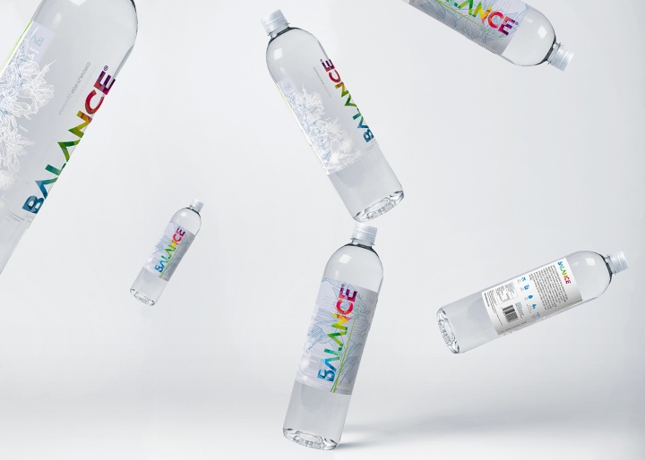
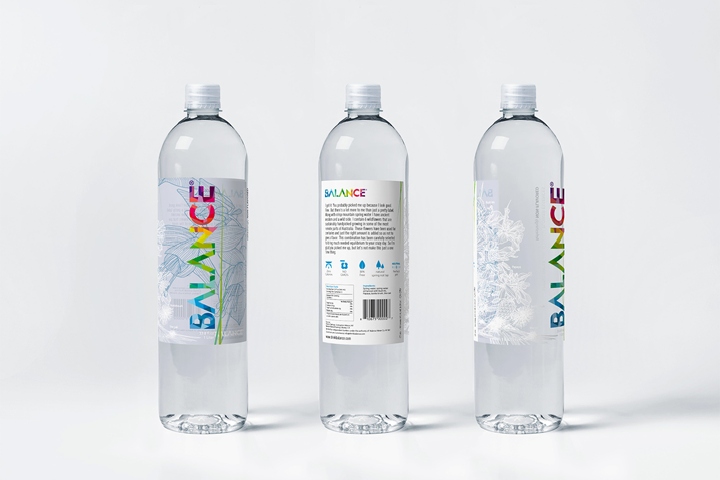
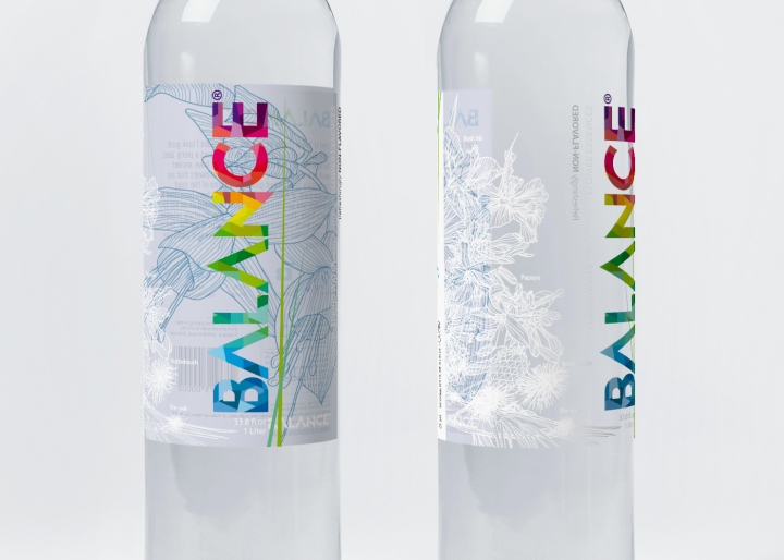
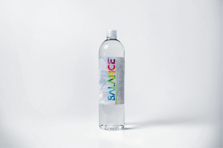
The client asked us to create a colorful brand, we decided against our philosophy to use 21 colors. It was a conscious choice and a challenge. The brand identity is based on a geometrical grid and a modular system, such combination together with the rhythmic movement of the color elements works for the brand recognizability.
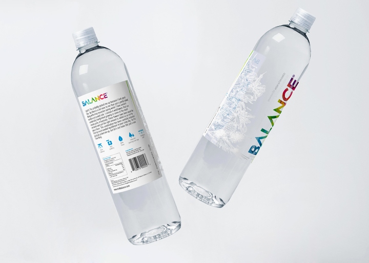
The brand name is divided into separated elements proportioned between them and each color in the project is connected to the colors of the beautiful flowers infused in the water. We have hand drawn the flowers on the side and in the inside back panel which we wanted to look like an embroidery.
Design: Graphic Opera
http://www.packagingoftheworld.com/2016/11/balance-water.html


Add to collection