

Alto da Invernadinha wine packaging by Priscyla Falkenburger
posted by retail design blog on 2016-12-07
Add to collection
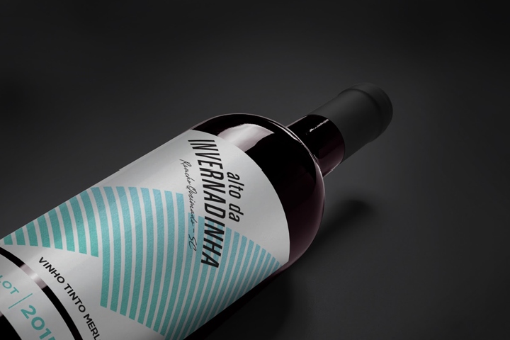

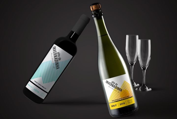
Alto da Invernadinha is a small winery in south Brazil. They have a small production of wines and sparkling wine and early this year they have decided to enter the national Brazilian market. The idea was to stand out with a larger label for the wine and a smaller one with the wine details (such as year of production, type of grape and alcoholic percentage).
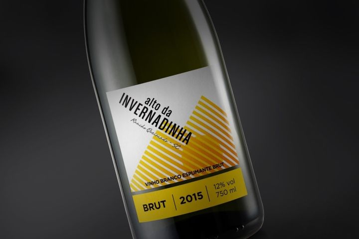
This way when the production changes it is easier to print only the smaller sticker instead of both of them. The winery lies in a high altitude witch makes the production and it’s quality very special. The concept was to show the two mountains of the winery, to represent this particular region in the south of Brazil.
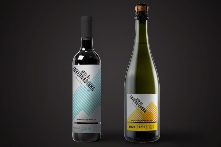
In the wine label we see the mountains in the counter-shape and in the champagne we see them being formed by the yellow and orange lines. We also see a sun coming up through the hills. A small winery trying a very modern label to launch it’s products for the first time.
Design: Priscyla Falkenburger
http://www.packagingoftheworld.com/2016/12/alto-da-invernadinha.html


Add to collection