Add to collection

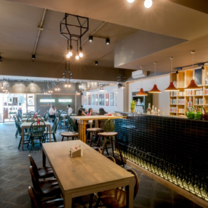
Let’s face it, at fairs you work, you do business, sales and contacts, but you also do your fair share of drinking. And while Madrid´s edition of Cprint! could hardly be targeted as the abstemious exception to that rule, if, on top of that, what you intend to “sell” is precisely the suitability of the media manufactured by Endutex for the interior decoration of dining facilities and retail spaces, would it not be just right to recycle the typical stand, generally an open and strictly corporate showroom, into a traditional but sophisticated Irish Pub acclimatized to the local warmth and colour, while season it all up with the look & feel of the materials, patterns and trends of the greatest actuality when it comes to interior design?

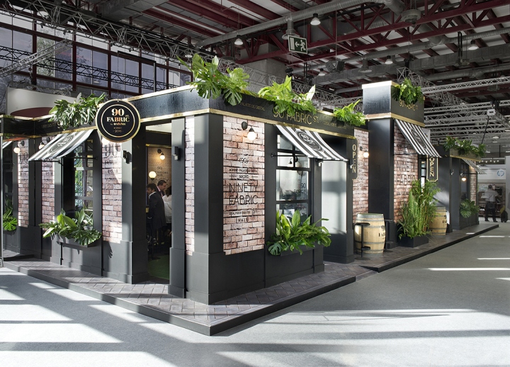
In Egue and Seta, we thought it was well worth a shot, and once done, we toasted! If you want to “taste” the result, come in, raise your glass and say Cheers! The challenge this time was double (and “on the rocks”) in many ways. On the one hand, Endutex´s media needed to be shown “in raw” (not printed), while they should also be displayed in their applied version, literally splashing with ink both interior and exterior of this bar. On the other hand, different segregated areas should be created for the display and operation of large format printing machines, and others dedicated to the careful and personalized attention of the public.

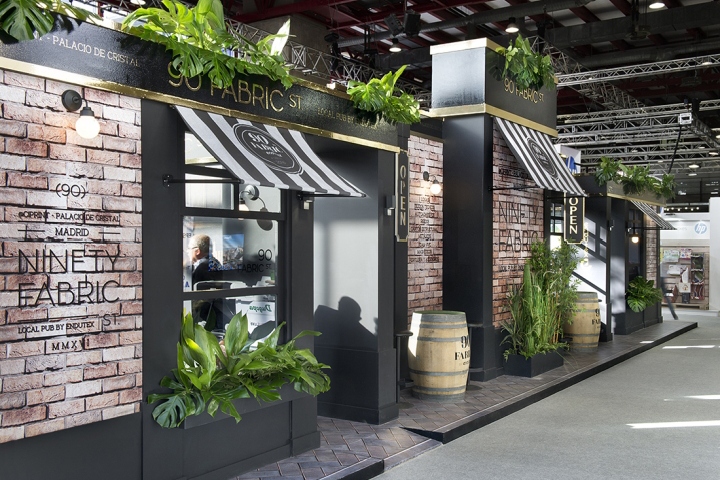
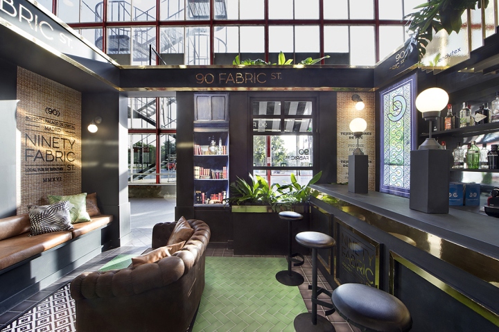
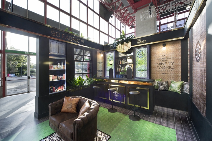
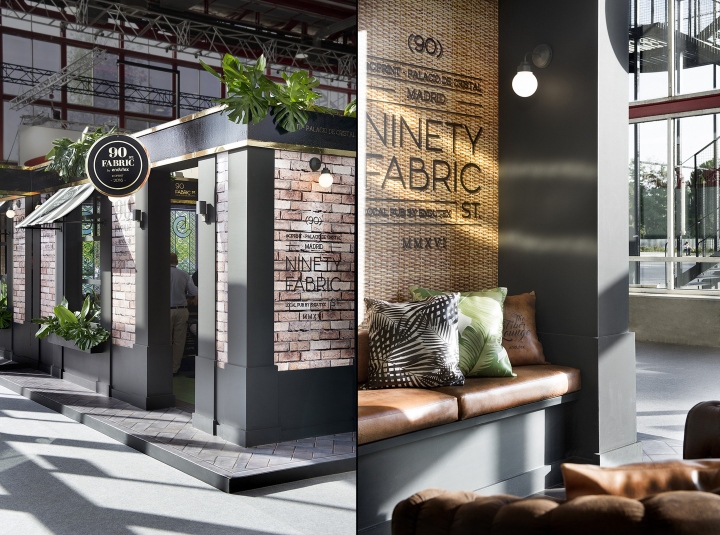
Finally, the interior of a contemporary restoration space should be closely recreated, while the exterior should be treated as one of an urban nature: mimicking low-profile façades, with their openings, architectural and vegetable coronations; and their adjacent public spaces in the shape of sidewalks and outdoor terraces. All of the above under the “aesthetic umbrella” of an aged steampunk Art Deco or a high-ranked Gatsby Industrial style, in which “everything that shines” is never gold but golden ink, and the predominant raw material is a very long fermentation pixel. Getting drunk (on images in this case) was never so innocuous or the hangover so mild.
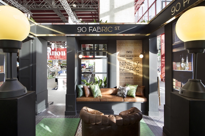
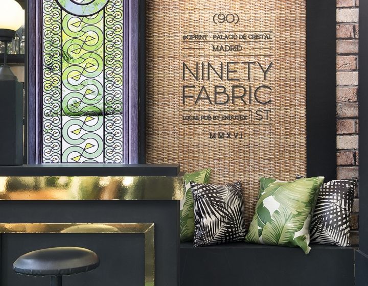
However, in order to avoid any possible visual poisoning, it was decided to flee from the indiscriminate mixing of patterns and textures, preferring to “pair” floral prints with natural fibbers, leather, tiles, paving stone and bricks whose natural colour would outstand over an interior architecture composed of joinery, mouldings, cornices, baseboards and pilasters coated in a deep black shade alternating with golden glitter. On the other hand, the “naming” of the space, which appealing both to the textile nature of the product and to the number of the Stand ended up sounding like “90 Fabric Street”, established a clear set of branding guidelines for the corporate image system especially designed for the fictional brand.

Such branding signs, consisting solely on an elegant typographic dialogue between serif and sans serif fonts in matte black or metallic gold called the attention of visitors from over the windows, the façade marquees, the banderols or from the solid oak barrels that on the outside terraces served as small cocktail tables useful in this case for quite informal but productive meetings. Fancy another round? Us too, but it’s rather late. So let´s say will be there waiting for you at Madrid Cprint!´s next edition to prove that while drinking does not solve your problems, work can sometimes be enjoyed as much as pint or two with the pals!
Design: Egue y Seta
Photography: VICUGO FOTO


Add to collection