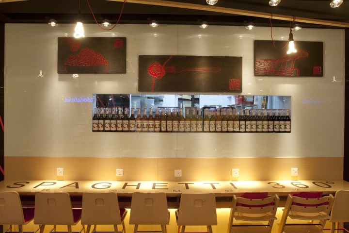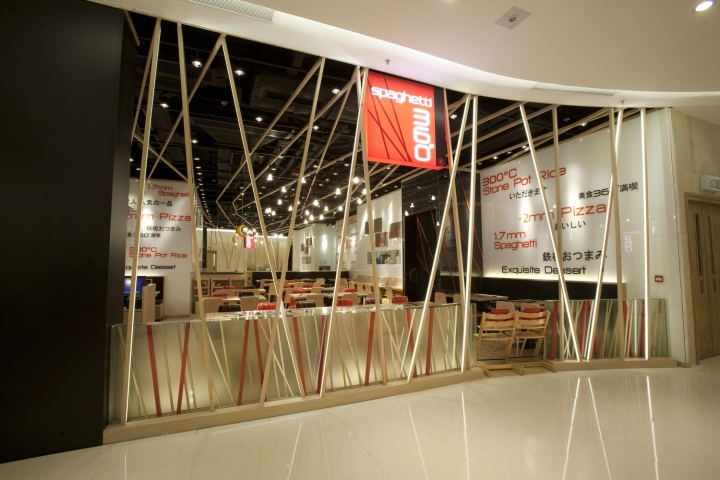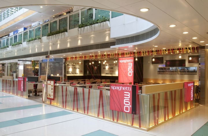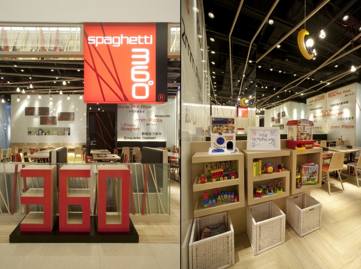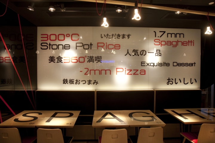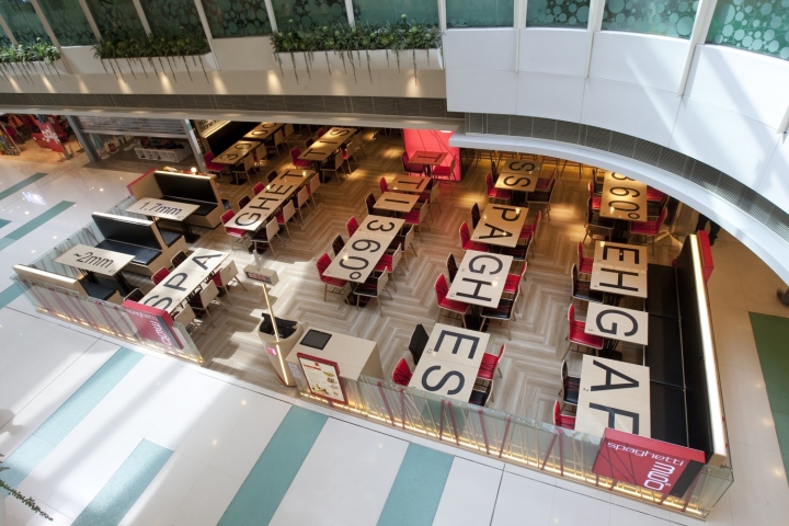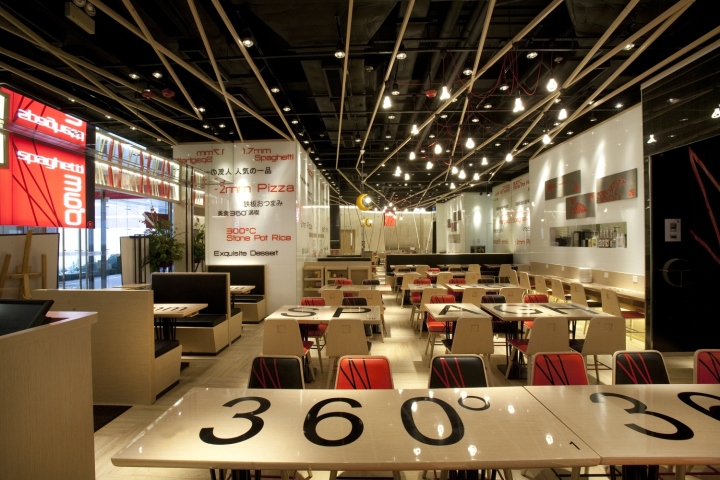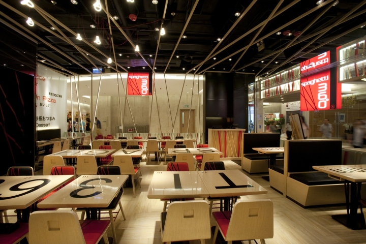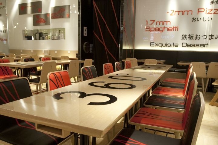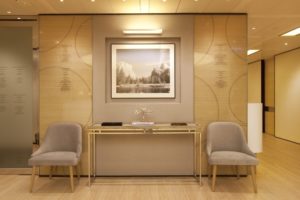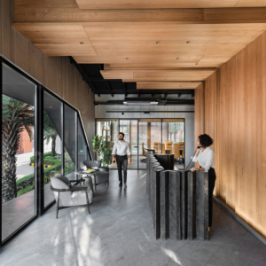
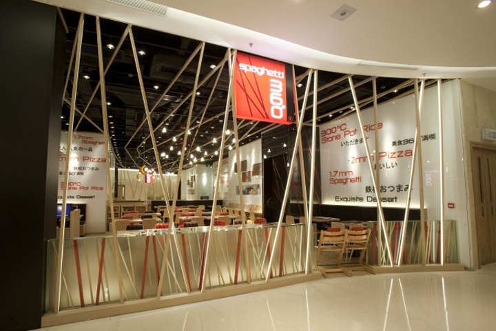

Based on the Japanese-western dining concept, spaghetti 360° is dedicated to providing customers a 360° total dining experience with high quality food, impeccable service and comfortable environment. Being a big fan of cooking and eating, Clifton has devoted his culinary passion when designing the space. With the design brief to develop a brand new trend in food & beverage industry and inspired by the linear pattern of the spaghetti 360° logo, the brand new restaurant image capitalizes on the iconic linear pattern, to create a visually astounding façade and interior. The striking color palette in red, black, white and brown creates a strong and recognizable brand presence and an astounding visual contrast. The design symbolizes a perfect fusion of the western and Japanese design elements.

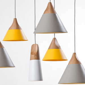
An architectural ceiling feature was created with linear wooden stripes and “Spaghetti Lighting Feature” of the Plumen pendant lights to create an iconic ceiling design. The connection of linear pattern of the ceiling and the side lit wooden linear stripes extended from the floor to ceiling creates a visually stunning effect which attracts passage flow from entrance to adjacent mall, while mirror reflection of linear pattern at side façade creates a subtle feature wall. Stone, a traditional material in Japan, is applied on the focal feature wall, where symbolic and modern graphic of spaghetti 360°’s signature dishes including 1.7mm spaghetti, stone pot rice and ~2mm pizza are engraved onto the stone panels.

Inspirational feature wall message of signature dish in Japanese and English gives a lively Japanese touch to the overall space. Beam lighting design further strengthens the Japanese look. The choice of light wood color, white glass wall and beam lighting, offers a soothing dining ambience for its customers. While the chic chair design in black and red, the light wood color tables with creative and fun scrabble graphics, the captivating linear pattern, all adds a modern touch to the overall design. For the aspect of environmentally friendly considerations, we must understand the greatest materials and energy that a restaurant will be consuming.

Clifton Leung Design Workshop has chosen FSC wood, which is environmentally appropriate, socially beneficial and economically viable, for the fabrication of furniture for the restaurant. Simultaneously, the wood of the back and the seat of the chairs are in one piece, thus minimizing the use and wastage of the wood during the fabrication. In consideration of the user friendliness of the customers and waiters, we have added recessed handles at the chair back for their ease of moving chairs. Moreover, LED lighting was used in the entire shop, such as the Plumen pendant lamps and Philips kids lamp, achieving energy saving standards. It is a world of Linear Connection that creates the perfect social platform for a sensational and chic dining experience.
Design: Clifton Leung Design Workshop
Photography: Shia Sai Pui
