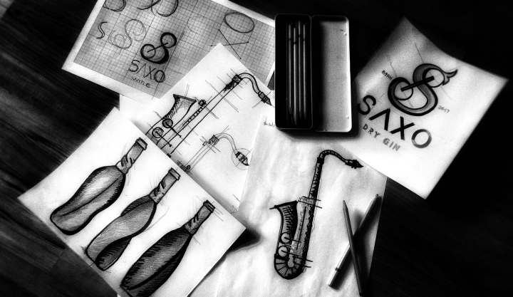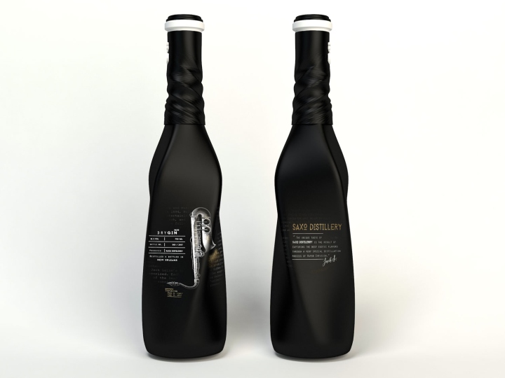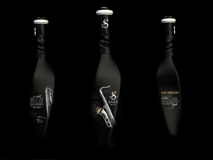


The inspiration for this concept was the sound of jazz music, its history and birth place – the city of New Orleans. The packaging design represents an immersion in this particular style of music, simply translating sounds into images, shapes & contrasts.

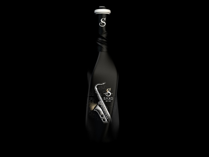
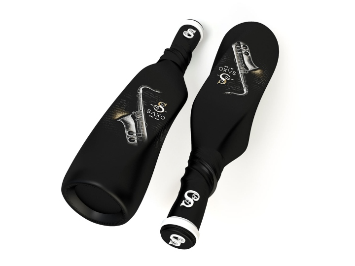
A mix of dark contrasts, curve lines and fade in images are creating this packaging design and the jazz atmosphere. It seems like the sound of the saxophone music wants to get inside the glass bottle and curve it like it was a sculptor. The central ax of the product is changing its direction and uses like a base foundation both a circle and a rectangle in order to describe this curve contour of the bottle.

The history of jazz began in the late 19th century; the place of its birth – the city New Orleans; artists like Nick LaRocca, Papa Jack Laine’s band & many others represented the core of this type of music and movement. All these – history, city, musicians – lay the foundation of the research for this project.

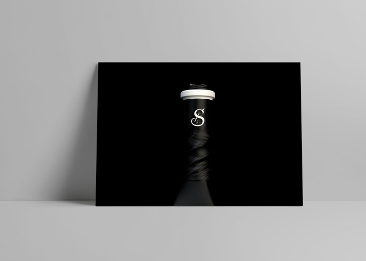
Listening to this artists, understanding the mood they create, helped in developing the complete perspective and also all the small details of this concept. The classical illustration of the saxophone, the newspaper style text that is fading into the dark background, the construction of the logo, all the elements are letting music be they’re guide.
Design and photography: creativeBYdefinition


