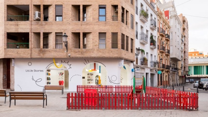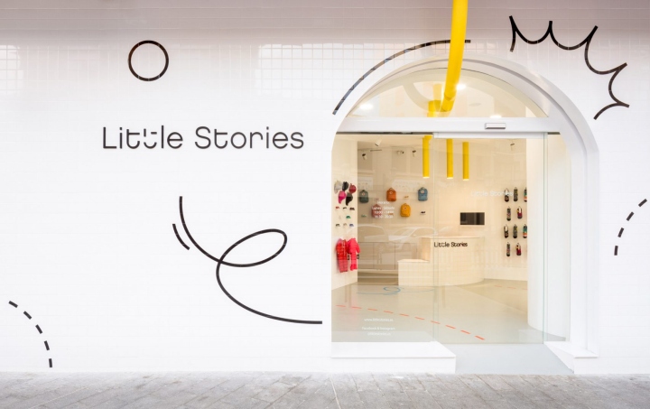

Spanish studio Clap has used arch-shaped cutouts and primary colours to create a playful children’s shoe shop on a street corner in Valencia. The local design studio was approached by the owners of children’s footwear company Little Stories to help develop its brand identity. “After several workshops with the client, we came up with three key points that reflected the essence of Little Stories: games, simplicity, and adaptability,” said Clap.

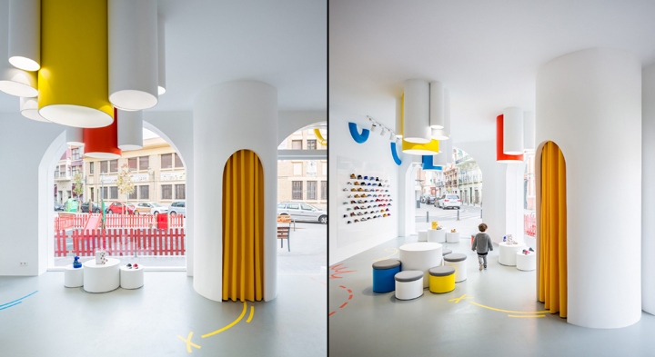
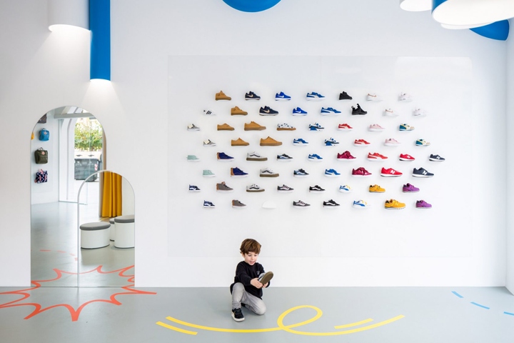
With this in mind, the studio then set about creating a physical retail space. The 70-square-metre store has a tiled facade punctuated by three oversized arched windows. Inside, whitewashed walls and pale grey flooring act as a neutral backdrop for pops of colour provided by the shop’s fixtures. Lights encased in chunky blue, yellow and red tubes distend from the ceiling, illuminating cylindrical display stands underneath. These primary shades have also been used to paint cartoonish line drawings on the floor, intended to form small paths for children to follow through the store.

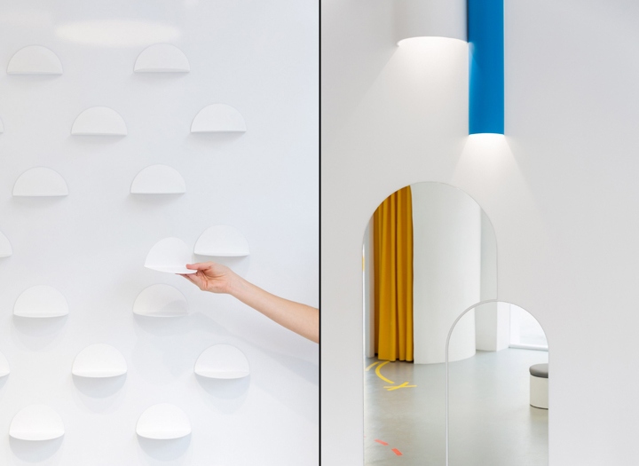
“The inspiration for these lines was the idea of freedom, fun and versatility – some characteristics we think the mind of a kid have” Angela Montagud, a designer at the studio, told Dezeen. “Every detail is designed to encourage imagination and play, but at the same time highlight the products on display.” The shape of the windows is echoed by the arched doorways of the store’s dressing rooms, the domed mirrors placed against the peripheral walls, and the curved form of the cash register.

Shoes are also displayed on metal semi-circle-shaped shelves, which can be detached and moved around due to a magnetic plate fitted to the wall. While Clap applied bold tones throughout its interior scheme, fellow Spanish studio Nábito opted for pale interiors when designing a children’s shoe shop in Barcelona – covering the entire store in white, grid-like ceramic tiles to reference the ordered lines of school notebooks.
Design: Clap
Photography: Daniel Rueda
