
Add to collection


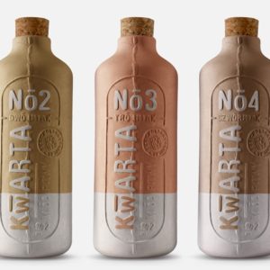
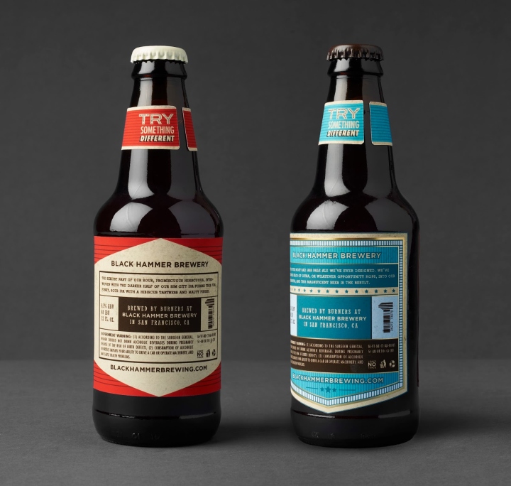
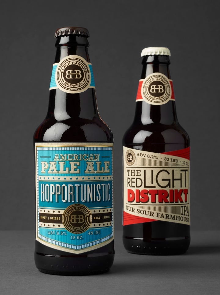
Tasked with the challenge of creating a packaging identity for a local brewery in just one month, I set out to find the most interesting and delicious beer in San Francisco. I found a little place in the SoMA District called Black Hammer Brewery. Everything from the uniquely named brews to the dog-friendly, steam punk, yet modern atmosphere made it one special place. I couldn’t put my finger on it, so I contacted the brewery via email to find out it’s story. A person identified only as “Love Wolf” answered me to explain.
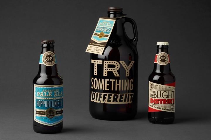
Black Hammer Brewery opened their doors in August of 2015 by Jim Furman. They are owned and operated by “Burners”, or those who go to Burning Man, an event, a community, a global cultural movement based on 10 principles: Radical Inclusion, Gifting, Decommodification, Radical Self-Reliance, Radical Self-Expression, Communal Effort, Civic Responsibility, Leaving No Trace, Participation, and Immediacy. The “Black” in their name comes from “Black Rock City”, which is the name of the temporal city that is built in the Black Rock Desert during the event.
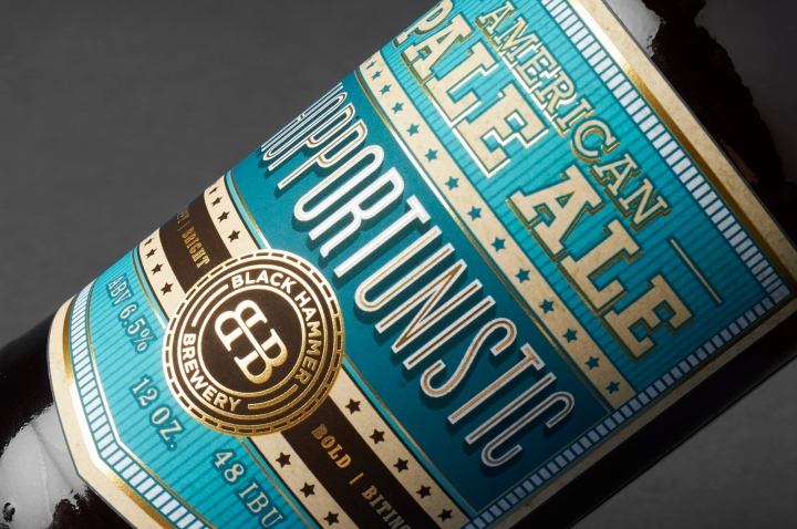
Jim Furman’s Burning Man nickname is “Hammer”, as he is always building at the event. Innovative, Eclectic, Expressive are just a few words to explain Black Hammer Brewery. The packaging designs went through many stages and iterations in order to capture the essence of Burning Man. This sense of eclecticism, creative expression and camaraderie is what inspired the design of the beer labels as every brew is uniquely named and has a story behind it.
Designed by Celina Oh
https://www.packagingoftheworld.com/2018/04/black-hammer-brewery.html


Add to collection