Rugged branding by Katie Mayze
posted by retail design blog on 2018-05-08
Add to collection
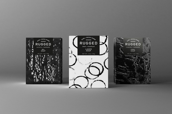
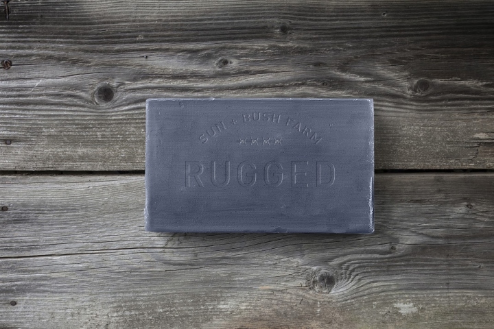
Our brief was to create a niche product to be sold in boutique stores. I was given the product ‘soap’ and the customer chosen was ‘farmers’. After researching this demographic, I narrowed the customer base to focus on young male, Australian farmers. This is a difficult demographic, so I decided to win them over by creating a modern, relatable and masculine brand, which needed to be reflected in the packaging and brand name. The soap brand uses natural ingredients to address the issues of dry and damaged skin caused by the harsh Australian landscape.
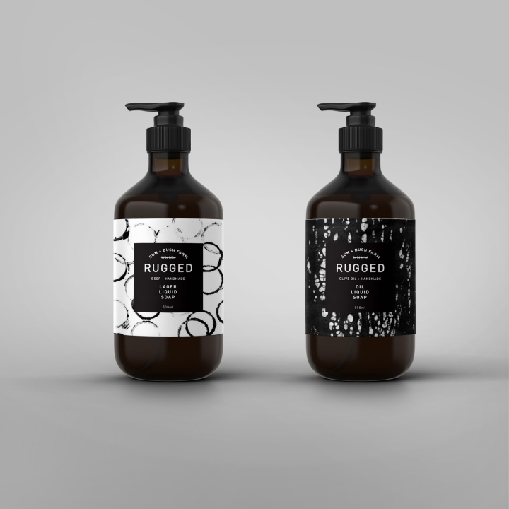
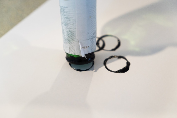
The keywords I worked to were ‘dry, pattern and nature’. The modern, masculine feel was achieved through the monochromatic colour palette, the brand name ‘RUGGED’ and the barbed wire logo. Graphic, organic patterns were used, to focus on items men would see in their everyday working life such as oil, cracked earth and beer. All of the patterns were handmade to give the product a unique, organic feel.
Designed by Katie Mayze
(Student Project)
https://www.packagingoftheworld.com/2018/05/rugged.html


Add to collection