
Introduction
The Salsa Shop concept is all about freshly made, quick Mexican meals with the tastiest and most natural ingredients, served in an open and friendly environment. Salsa Shop also stands for a new standard for fast food under the motto ‘Good food, fast’. After opening the first five branches in Amsterdam and Utrecht, Salsa Shop asked Studio Ninetynine to create the design for the second-generation restaurants and make the interior of the restaurant concept roll-out proof.
Design concept
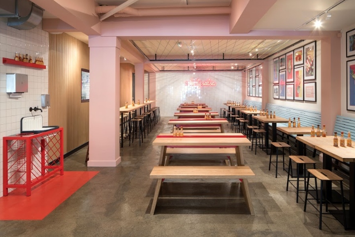
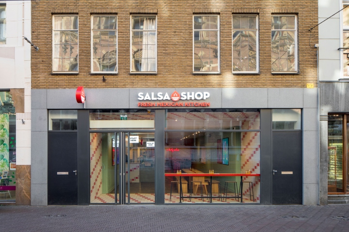
Since the Salsa Shop restaurant concept should be experienced as an easy recognisable fast food concept with a comfortable seating area, Studio Ninetynine developed an interior design that enhances the somewhat contrary personalities of the restaurant. With the food truck analogy in mind, every Salsa Shop should consist out of three areas: The Canopy (entrance area) functions as a recognisable beacon which stimulates associations with the words ‘fast food’ and ‘Mexican food’. The Truck (counter with grill behind it) represents the smooth operating fast food outlet, and the Terrace (the seating area) is inviting, informal but not too comfortable with a canteen atmosphere.

The Canopy:
A very recognisable tile pattern of white, pale pink and red tiles of various sizes covers walls, ceiling and floor of the first three metres of the restaurant. A counter table along the facade allows people to look outside while enjoying their food. A communal table for ten completes this area.
The Truck:
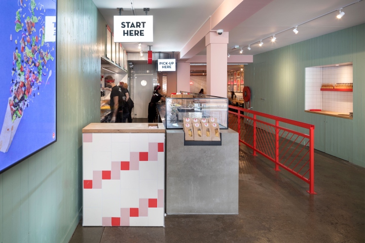
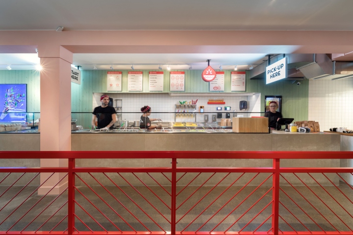
The walls in this area are cladded with wooden slats painted in pale green. On the left side, the long counter leads the customers deeper into the restaurant. To highlight the order counter, this block is cladded with the same tile pattern as the canopy area. In addition, an ‘order here’ light box gives direction to the customers. The main counter is made out grey Viroc and is designed as a solid block representing the core function of the Salsa Shop. To guide the customers further, two additional light boxes mark the position where the Salsa will be added to your food as well as the pick-up area. A powder coated red flow divider separates the waiting line and the people leaving the restaurant.
The Terrace:
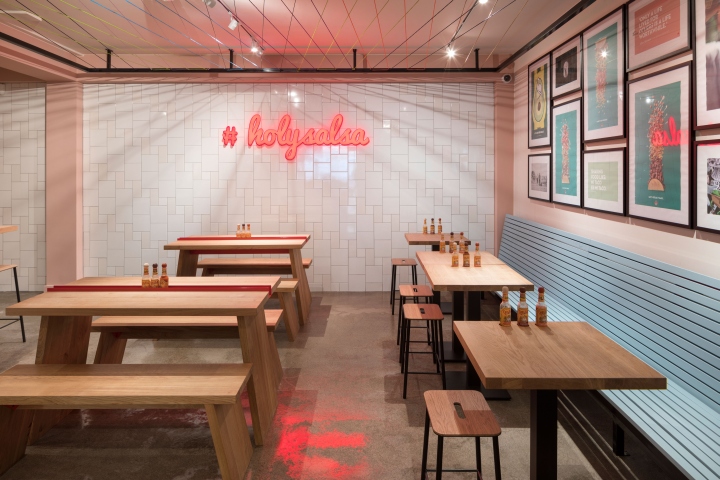
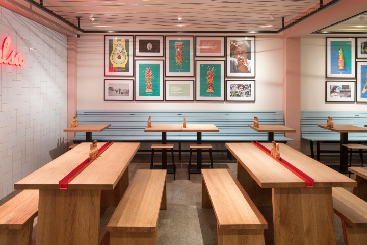
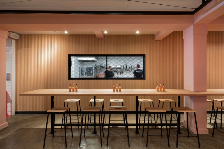
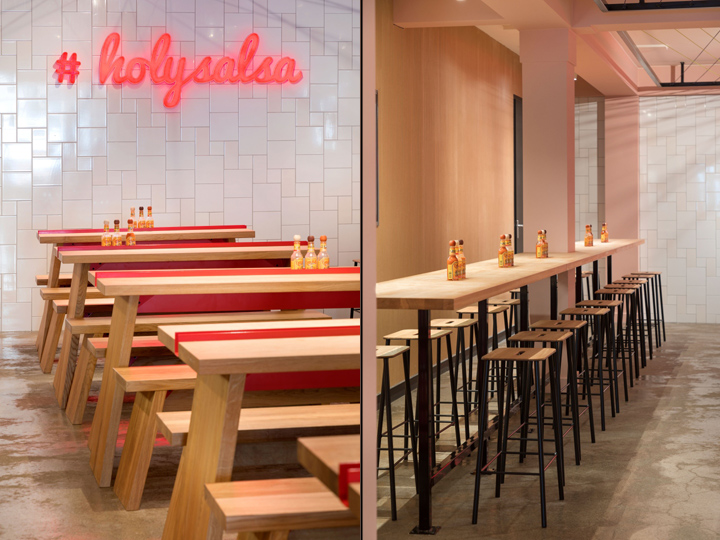
Inspired by Mexican art, architecture and street life, this area is colourful and full of different textures. The kitchen, also located in the area, has a wall finished with well board, a material reminiscent of corrugated metal but made from wood fibres. Along the opposite wall a long wooden bench, painted in bright blue is placed in front of white walls with an image gallery. Columns and beams in this area are painted light pink. A row of bespoke tables, which refer to classic picnic tables, is placed in the centre of the space. The very recognisable red u-shape profile in the middle of the table holds salsa bottles for the customers. Frames with troche wires in different colours create a second ceiling layer and are an abstract interpretation of typical Mexican garlands.
Designed by Ninetynine
Photography by Ewout Huibers





Add to collection
