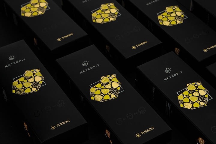

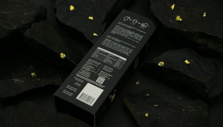
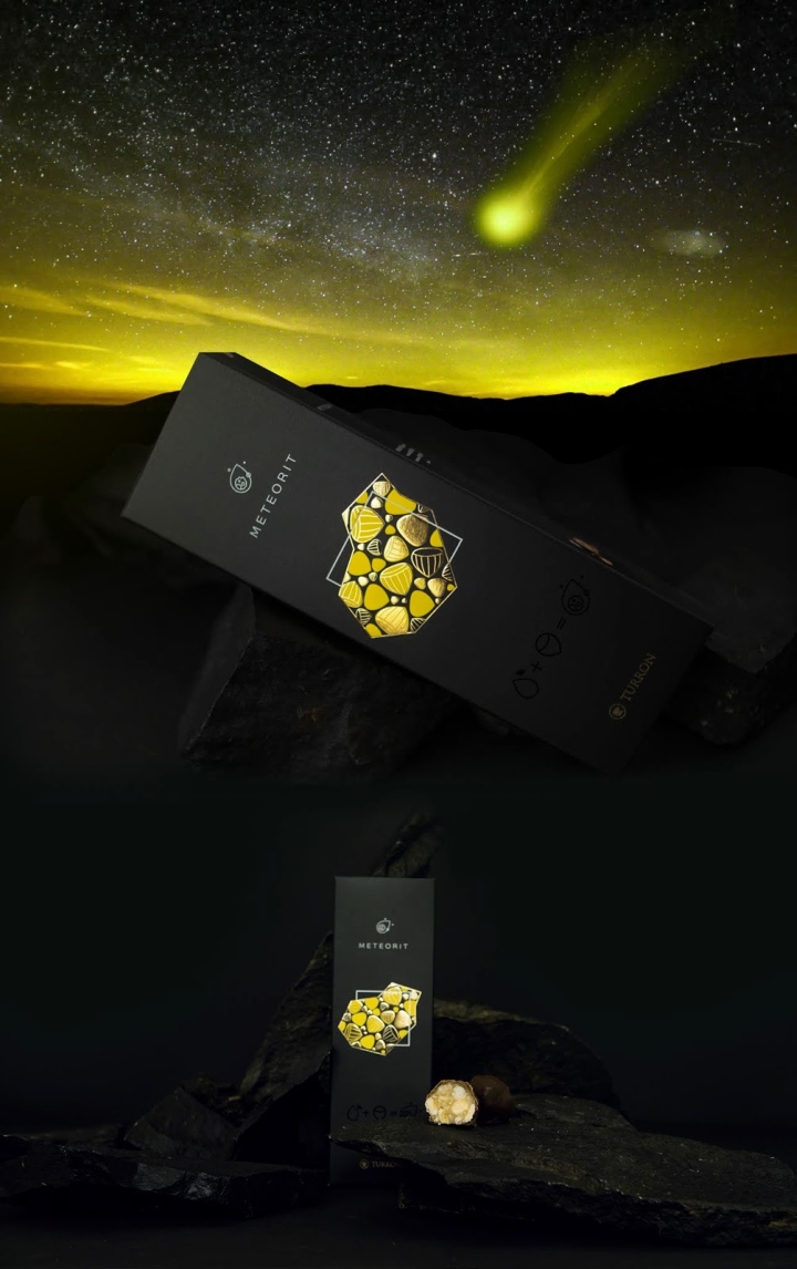
The TURRON launches an updated line of chocolates – Meteorit on the market. Our task is to show the audience a new product while keeping the recognition of the well-known, previously developed, elegant brand style. The main visual support points are the abstract graphics, the division of the silhouette block of the meteorite image into several levels, with the use of non-standard tactile effects, performed by high-quality printing methods. Tasteful meteorite consists of nuts, honey, and abstract graphics – this way we built a new image, based on the premium severity of Turron. The laconic nature of the design is also supported by printing tools: a special lacquer coating highlights candies on a velvety matte background, brightening up the new product to consumers.

What’s Unique?
The main task of the project was to create an associative graphic image of the candy without pointing it out. Using a graphic approach and different printing methods we accomplished the task and created new rebranded packing.
Designed by PROFI Creative Group




https://www.packagingoftheworld.com/2018/07/turron-meteorit.html


Add to collection

