Add to collection
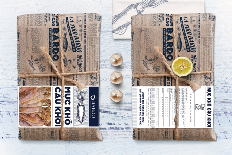
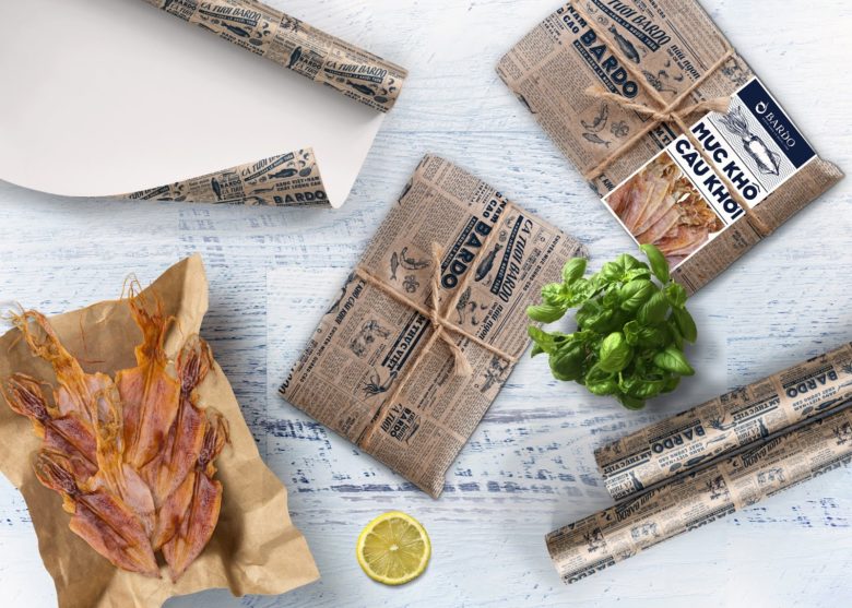
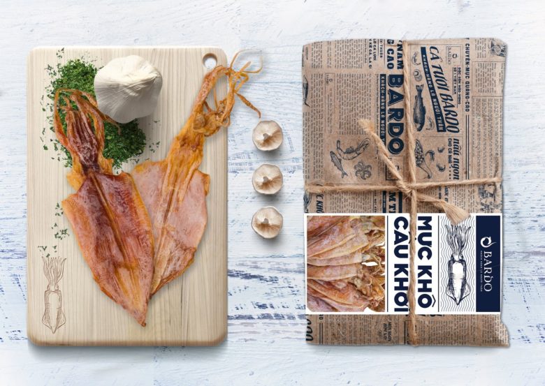
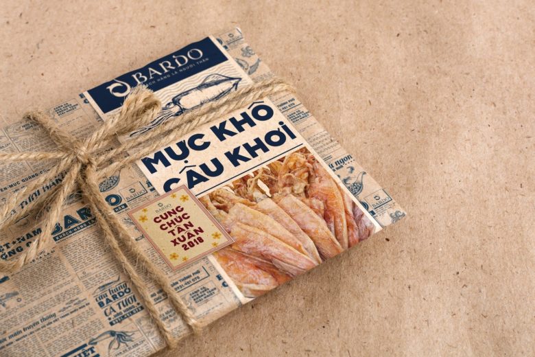
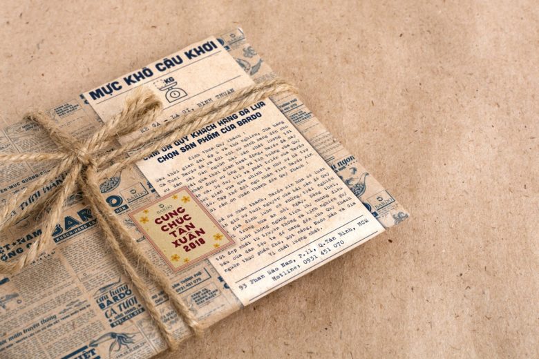
Bardo is a fresh seafood shop based in Ho Chi Minh City, Viet Nam. Bardo wants to have a new premium look on their packaging in upcoming Tet holiday for their special dishes: dried squid products. Bardo wants its products to have a Vietnamese traditional look and show respect and value of Vietnamese fishermen.
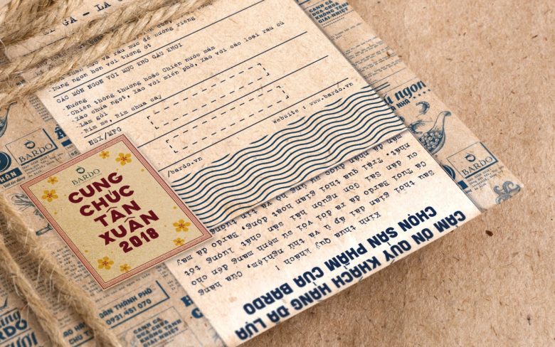
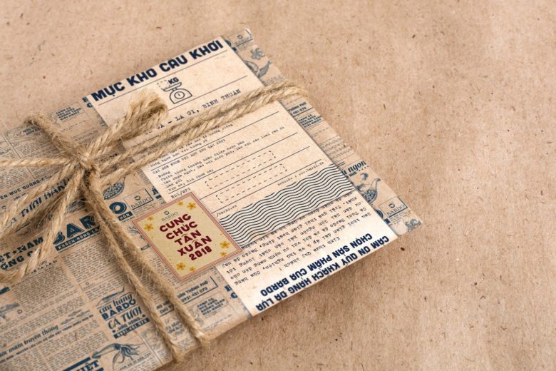
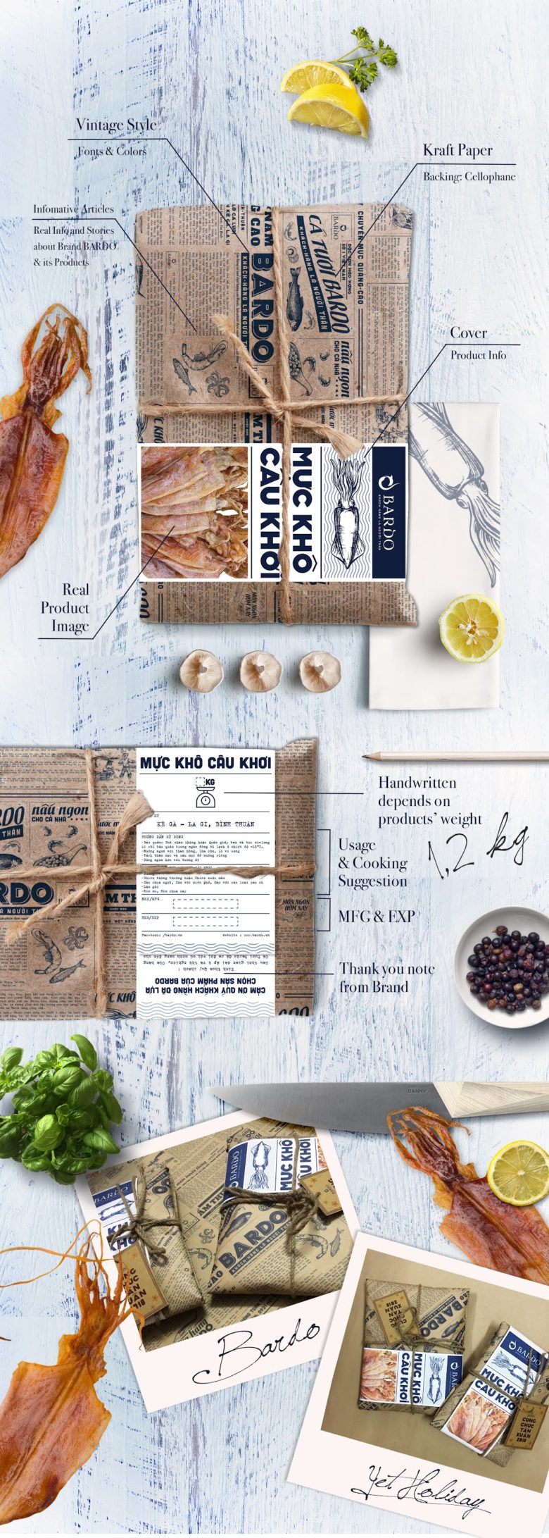
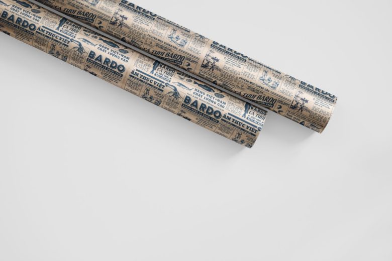
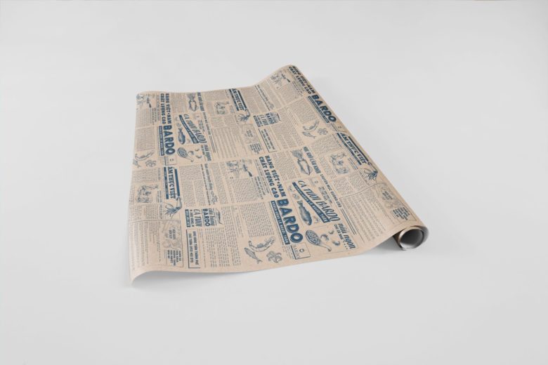
I came up with creating “Old Viet Nam” look and feel (Việt Nam Xưa), using the old, vintage fonts and colors. In Vietnam old time, moms got used to using slim mornings newspapers to wrap fresh food and things which help protect them. Thus, my idea is to use this feature to create this packaging using kraft papers with “newspaper alike” design.
“The newspaper papers” is covered with the informative articles about Bardo brand and product itself, such as: What Bardo values, the story of Vietnamese fishermen, what Bardo sells, where the products come from, how to well cook the dried squids, tips and tricks in cooking Bardo ‘s specialities. These info helps branding for Bardo and products themselves.
Designed by CTNguyenNguyen_Jo Lavie
Add to collection