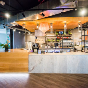
Henri Cleinge architecte has adapted a historic building to house the new offices for tech start-up Crew Collective, located in Montréal, Canada. Located in the old Royal Bank space on St-Jacques street in Old Montreal, the Crew offices is a project defined by a 12,000 office area for a tech start-up which would also include a café for freelance workers as well as for the public. The project presented two distinct design challenges: The first design challenge originated from the client’s requirements- how to elaborate an architectural relationship and construct boundaries between the various program functions. The second challenge became a deeper questioning on how to approach design in the context of a heritage building.
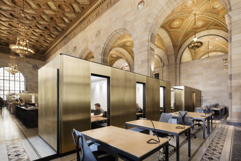
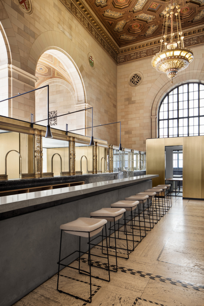
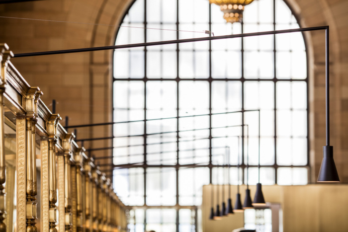
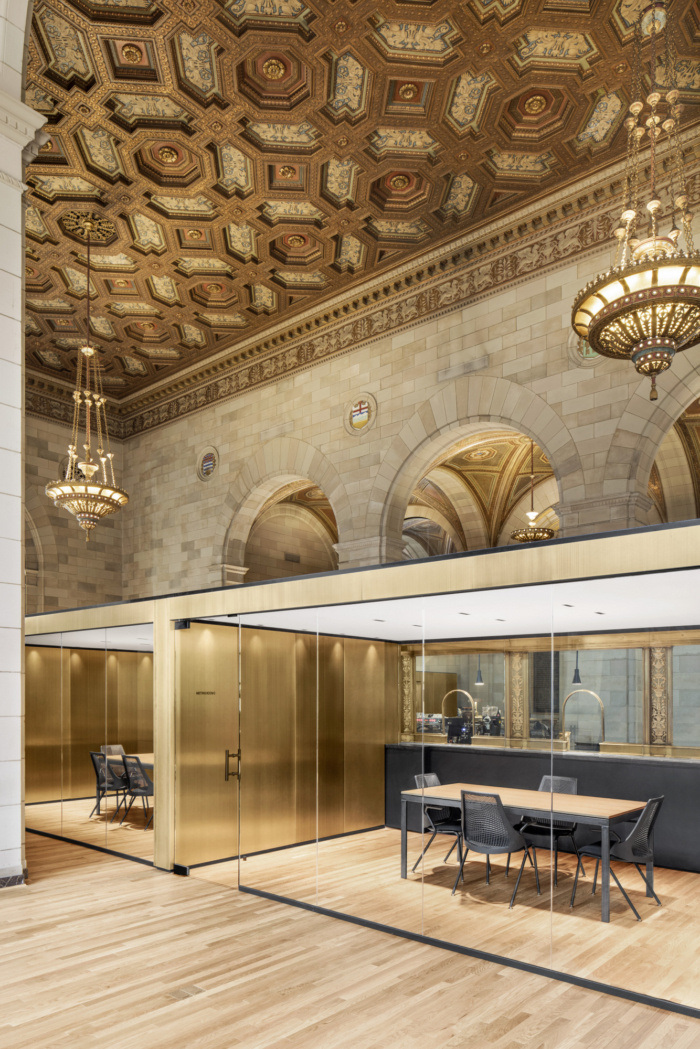
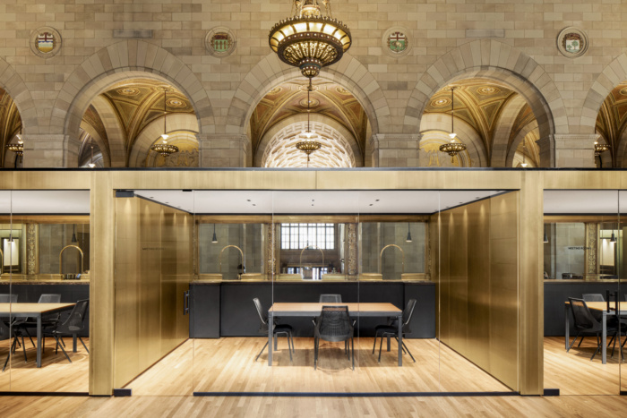
The complexity of the program required fluidity between the various work spaces. Part of the floor area was to be designated for permanent Crew employees, and was to contain conferences rooms as well as other office standards. Other areas were to be rented to freelance workers either by the month or by the week. These workers were to have access to conference rooms as well. Lastly, temporary workers or the public could also use the café and the desks for a few hours, having Wi-Fi access, and lockers for their computers as required. This environment was meant to create a flow and possible interactions between permanent and temporary workers, nurturing co-working in the tech community. The design was meant to facilitate this flow by creating transparent and translucent borders between the various office spaces. A complex series of glass walls were erected between the various areas, with a defined access to reflect the degree of permanency for each worker group. The existing bank teller stands dating back from the old Royal Bank were not to be removed. As a consequence, they were used as a natural border between the café space and the conference rooms, which in turn created a separation between the more public spaces and the permanent workers.
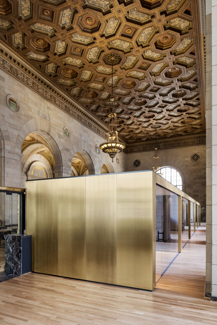
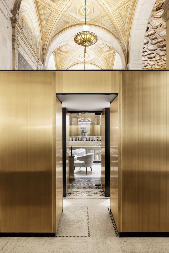
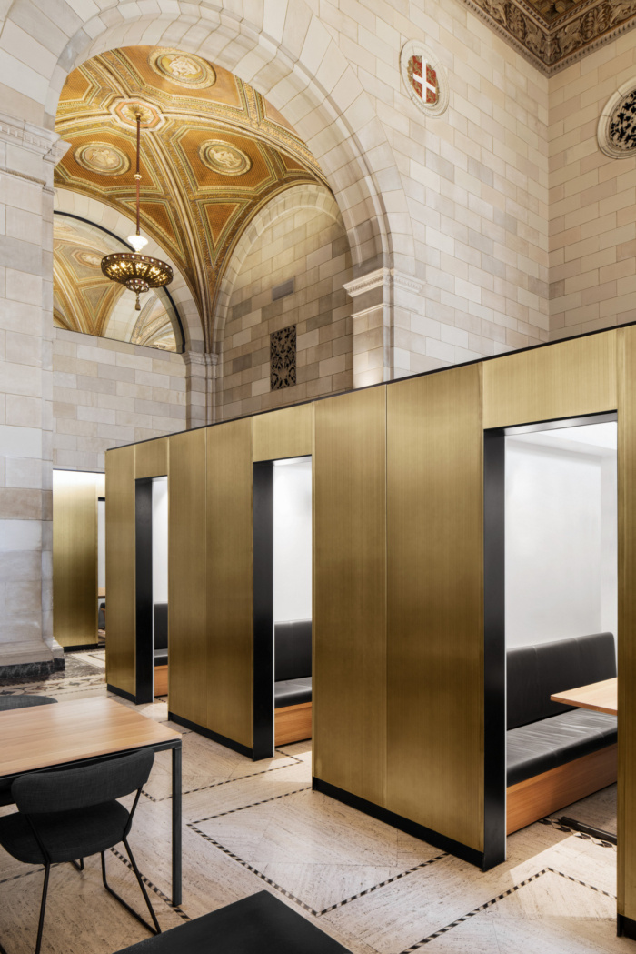
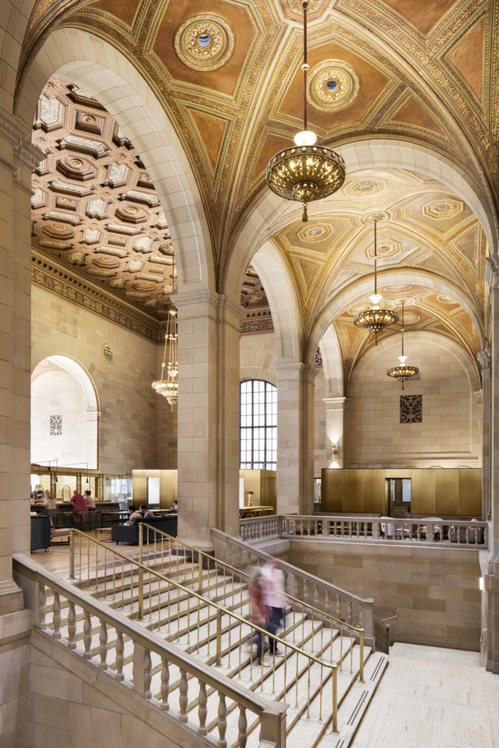
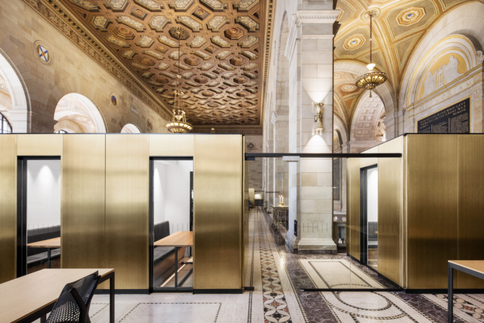
The teller stands as well as the existing building shell offered a great design opportunity, as a rich and textured background; a testimony to another era, which could thrive with a new function redefining its purpose. The 1926 building contained remarkably crafted elements: An inlay marble floor, an ornate painted plaster ceiling along with custom suspended brass light fixtures, as well as other brass elements including the teller stands. Confronted with this heritage ambiance, the design had to be carefully balanced to express, recycle, and respect the existing, as well as simultaneously allowing a contemporary discreet intervention reflecting the contemporary identity of the firm to exist. The new design integrated brass plated steel throughout, fixed to boxy minimal enclosures, in order to dialogue and contrast to the existing ornate brass elements. The conference rooms which were divided and compartmentalized with linear walls, covered with brass plated steel, and enclosed with glass partitions and a horizontal plane of a ceiling, by coincidence, ended up relating to the paper compartments within the existing free standing stands dating back to the paper days, when deposits were inscribed with pen onto paper.
The new design remains a kind of secondary feature, allowing the original building to be the primary feature. It is only by being in the space for a certain amount of time that one can appreciate the new intervention.
Design: Henri Cleinge architecte
Photography: Adrien Williams



Add to collection
