
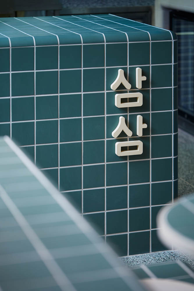
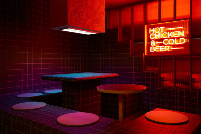
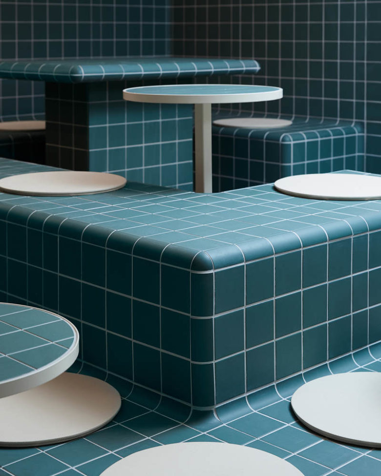
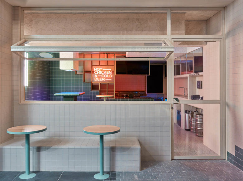
Sam Sam’s interior explores a sense of elegance and modesty with its clean, perpendicular and tiled design that flows continuously around the walls, floors and furniture, forming soft curved surfaces along the corners of the space. Similar to Sam Sam’s menu, its overall scheme, lighting features, and seating layout also gives a contemporary approach to the retro style of the 60s and the architecture of traditional Korean public baths.
The aim of this project is to create a new twist on a classic design. Bound into a truly innovative world of contemporary fashion, this concept depicts the blurred boundaries between modern Korean interior style and western architecture language. While driven by the recent trend in Korean architecture of “Modern Minimal Interior Design”, the continuous lines and three-dimensional geometry becomes the main language of the interior space.
Significantly, the spatial concept also needed to be incorporated with Sam Sam’s branding concept of ‘casual and fun Korean dining’. In doing so, the overall scheme of the project gives a sense of a public bath architecture that is still part of Korean culture today. This then explores the possibility of adapting cultural and traditional architecture into a more contemporary setting.
This small-scale restaurant (17m2 of dining area) is constituted to have more than 12 seats including self-ordering kiosks, a counter and bar area. With this programme, our team played with different types of compositions, configurations and layouts such as elevating the main seating area to create dimensions in a compact space. My team also added a sense of sophistication and uniqueness in the project by embracing the seating style of public baths while curving their edges to emphasize continuity and minimalism.
This idea became one of the challenges the team had to resolve since the tiles used were not made for an unconventional scale and design. The team had to calculate and run through all the tile work in 3d to make all the lines and elements continuous no matter how many corners and level changes there were.
Architects: Arkim
Photographs: Nguyen Dang



Add to collection
