Add to collection
Space is a showroom including several furniture brands like HermanMiller and Ligne Roset. It is a spiritual architectural community that showcases the characteristics of brands and designs. Design thinking focuses on two main aspects: 1. How to find the best way to showcase the different characteristics of brands and furniture types in a single showroom. 2. Not only displaying products but also providing a continuous space experience and artistic atmosphere.
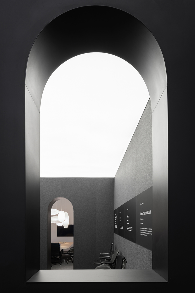
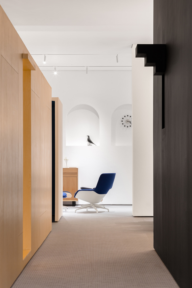
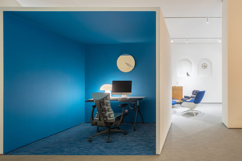
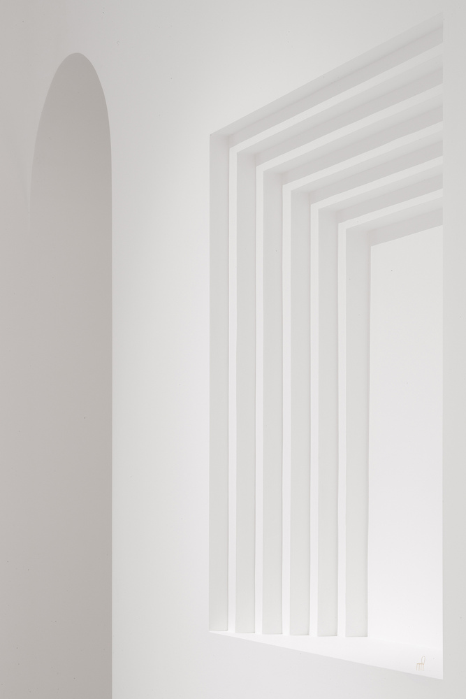
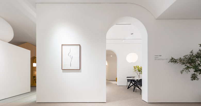
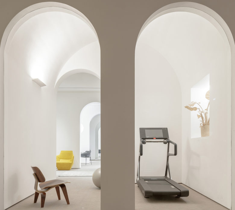
First of all, space is treated like a theme park divided into four areas by various combinations of furniture, representing classic design (wooden house), technology (ergonomic chair zone), health (home office), and art (living gallery). The spatial scale, shape, and color of each space are different, which form a different atmosphere and stimulates the pleasure of exploration and discovery. Secondly, the use and organization of basic geometries run through the entire design process, such as the array of continuous arches in the living gallery area, the geometric sculpture on the column in the wooden house and the caves on the walls. These forms interact to serve symbolic, metaphorical function, which inspires people to think about the meaning of the space. These components are like hidden clues that connect the four areas together and thus provide a continuous space experience.
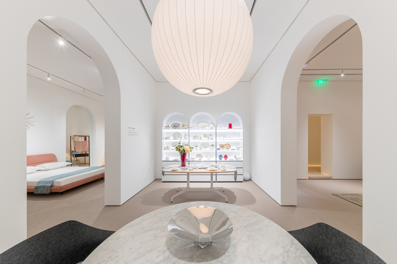
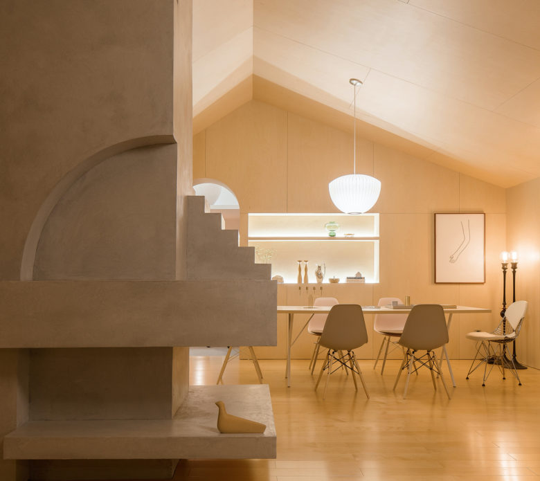
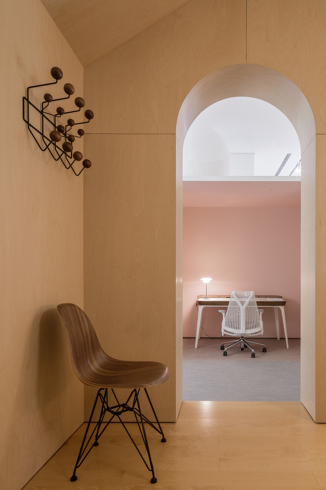
The showroom is divided into 4 areas. “House of Classic Design”, “Ergonomic Chair Zone” and “Home Office” constitute Herman Miller’s showroom in Guangzhou, while “Living Gallery” presents a collection of products from other brands which Yi’s International has signed an agency agreement with.
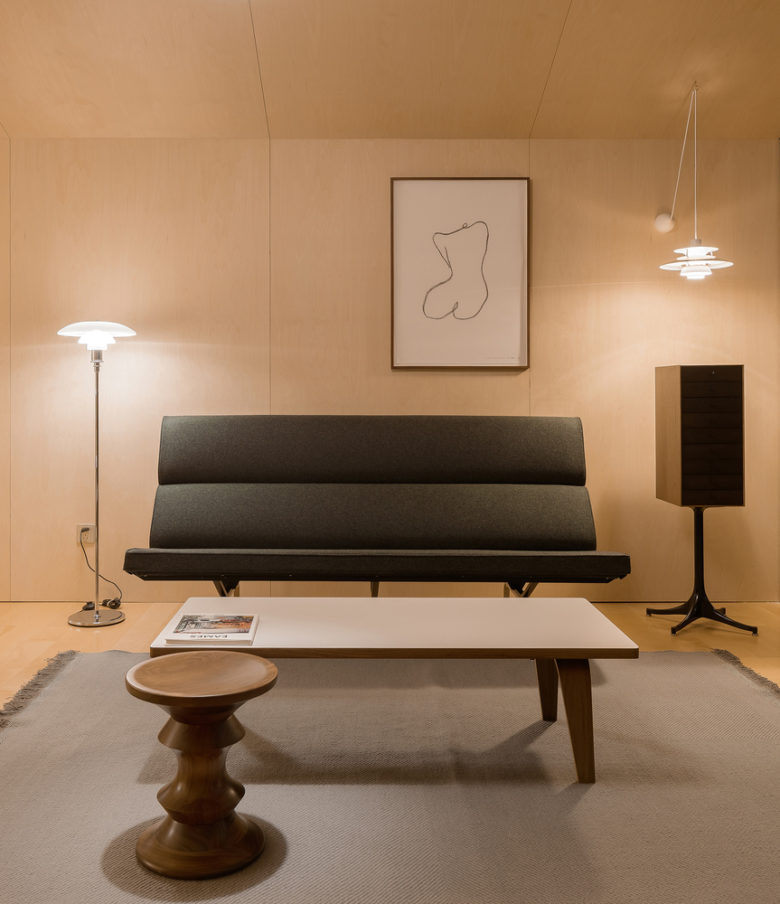
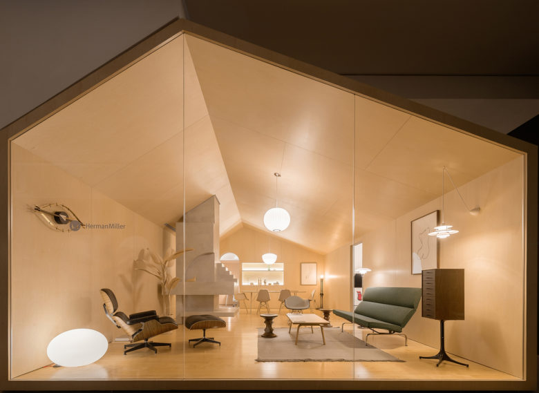
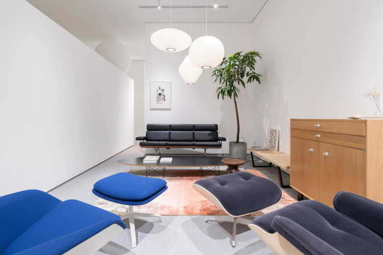
House of Classic Design. The small timber cabin in the middle area is meant to accommodate the most representative works of the designer couple, and pay a tribute to classic designs that have been lasting for more than 6 decades to create a spiritual space. The sole of the space lies in the cement sculpture, which was originally a meaningless column. Through adopting Carol Scarpa’s core “Cutting” concept, the designers turned the column into a sculpture that combines functions and symbolic meaning and a spiritual center in the space. “Cutting” doesn’t mean “cutting off completely”, but creating something out of nothing, and cutting out the “the disadvantageous” whilst transforming it into “the favorable”. The design team chose to utilize soft light sources rather than spotlights in the cabin, with a view to producing an oil-painting-like tone and delivering a sense of age.
Set in the wooden hut, the sculpture is a miniature architecture. Is it minimal in scale? When looking more deeply and feeling its details, we can discover a world of another dimension. Just like the spatial design process, it needs to go very deep to reproduce and convey the spirit of space. The painting sketching a female body can form some connection with the sight line directly, making the space more humanistic.
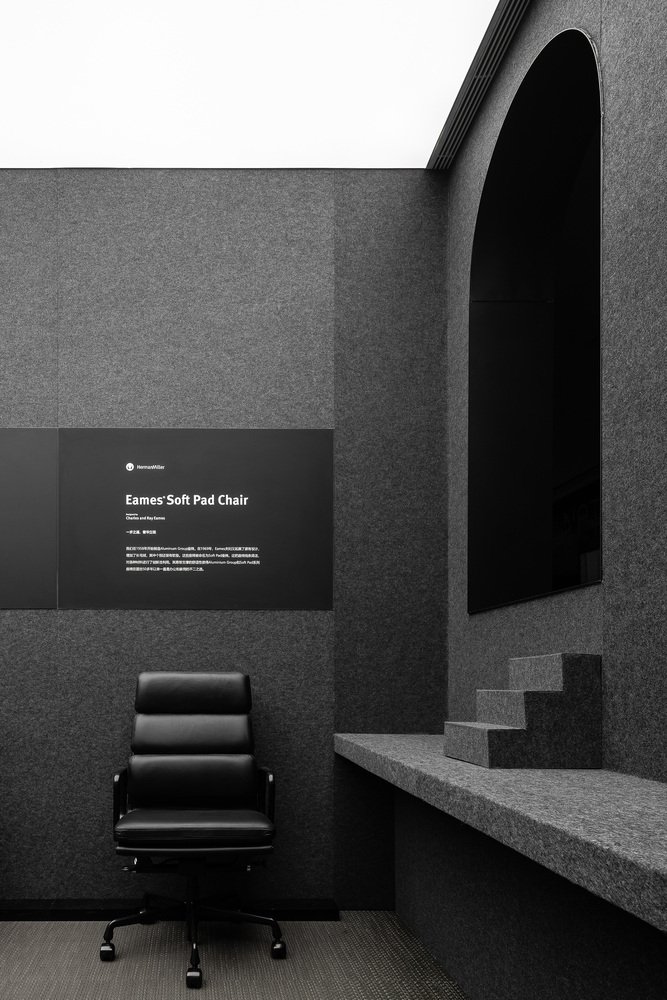
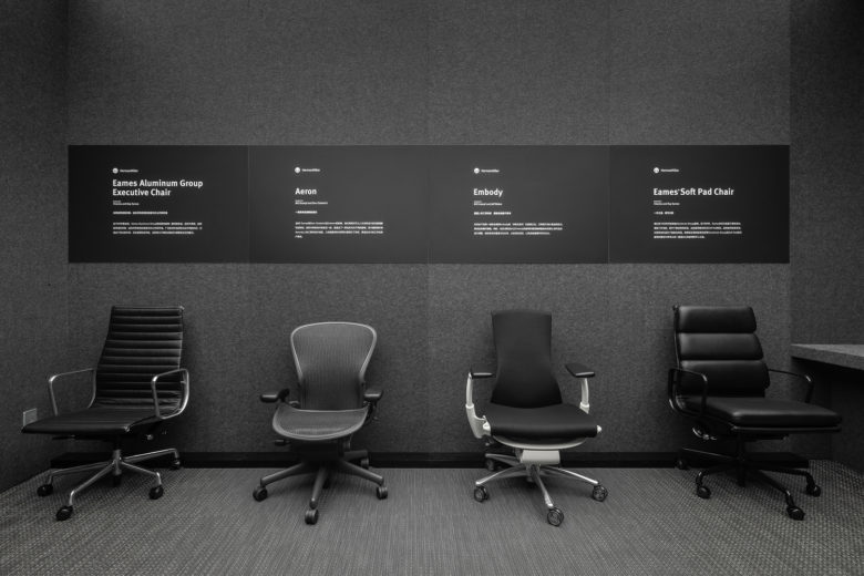
Ergonomic Chair Zone. Only in such a pure space, people are able to concentrate on experiencing the scientific and technological sense of the products, undisturbed by others. Considering that many people come and go in the showroom, the designers utilized sound-absorbing felt like a wall covering, so as to provide the visitors with a more tranquil environment.
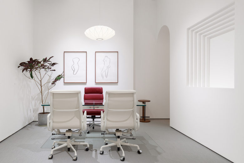
Home Office. Within the architectural community, this area transcends physical forms. In essence, different architectural forms are harmonious in a wider space, because artworks are embodiments of human nature (As we believe, in all fields related to humanity or human activities, there must be something in common between the East and West, the past and present). What gets closest to furniture is the human body. The paintings of human bodies sketched with simple lines have a natural affinity with the furniture, which can better integrate the visitors’ experience into space.
At the junction area of the three spaces, two geometric forms, a cube, and a sphere compose a sculpture with a large volume. It echoes the space and injects a flexible atmosphere into it. The sphere, the imaginary of the sun, is placed on a corner of the cube so that the moving people can feel its distinctive “forms” and “strength” at different positions, either large or small, full or incomplete. When people sit down to watch it, it appears naturally at the top, but while they move, it will disappear, just like our experience of the sun.
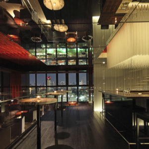
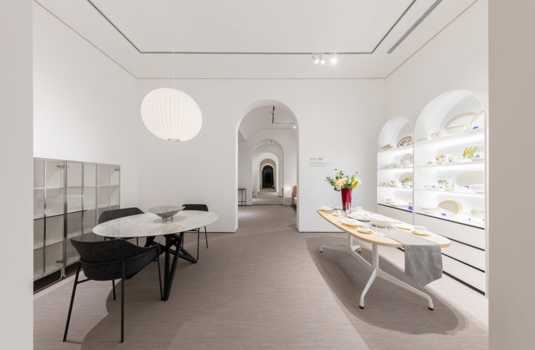
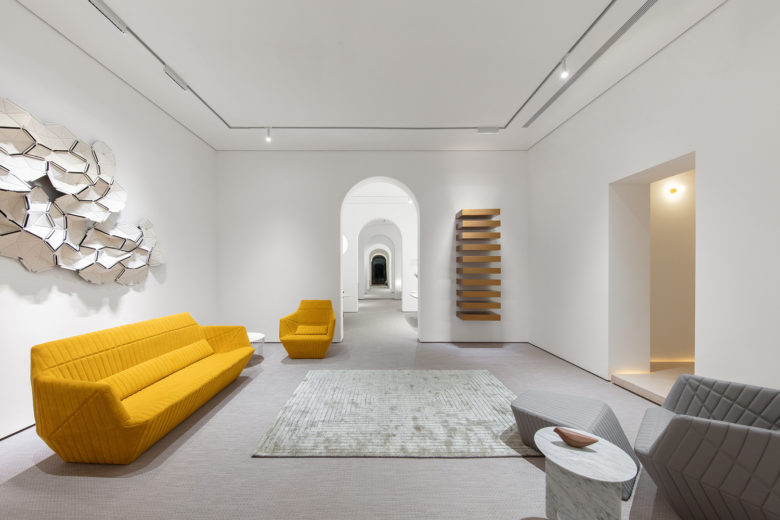
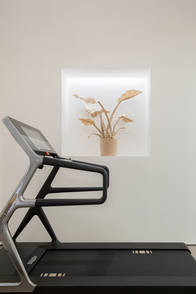
Living Gallery. The white entity is a continuous living space. From inside out, there is the bedroom, dining room, living room, and gym, all of which are partitioned by thick walls, delivering a strong sense of formality. That’s exactly how life is supposed to be — taking everything seriously. Repeatability in mathematics can create a sense of rhythm, which leads people to infinity.
Architects: Peng & Partners
Lead Architects: Peng Wang
Design Team: Haopeng Gu, Cheng Li
Photographs: Feng Shao


Add to collection