
Add to collection
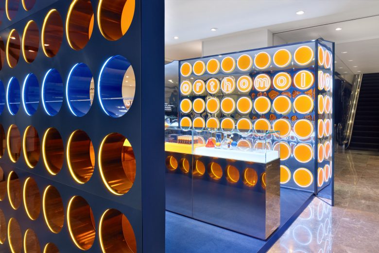
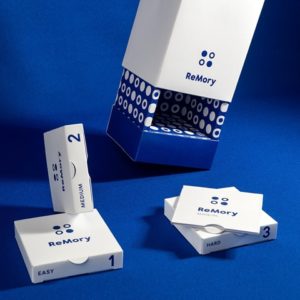
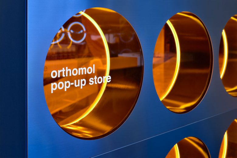
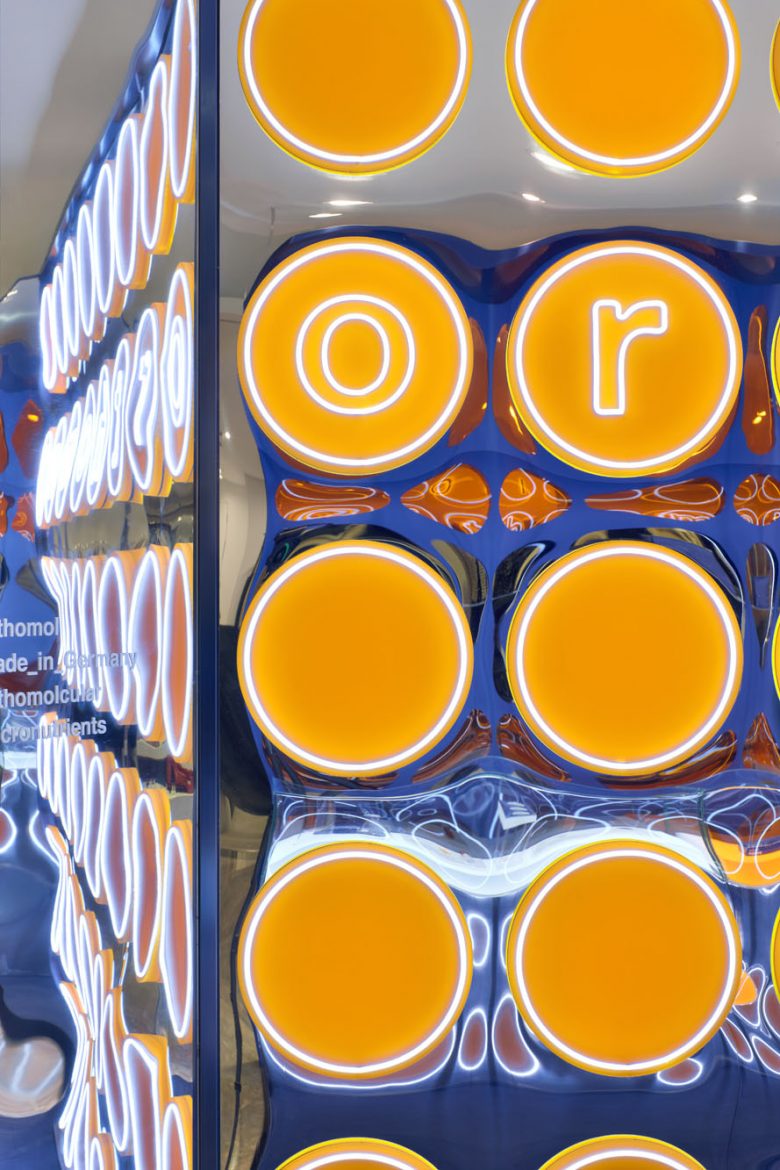
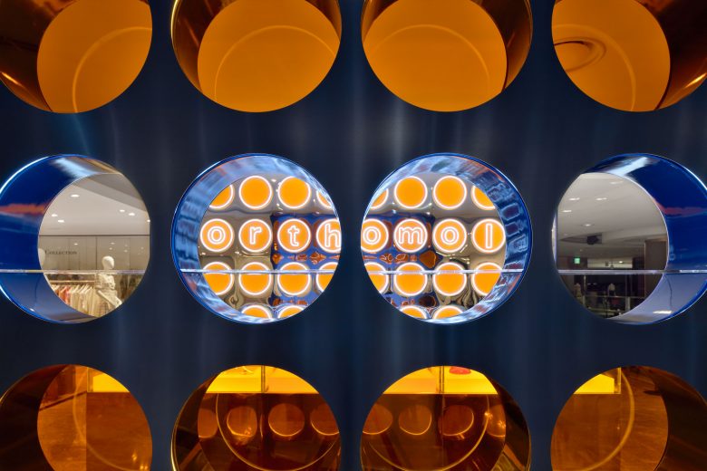
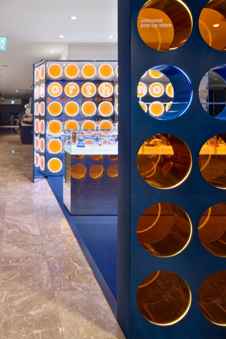
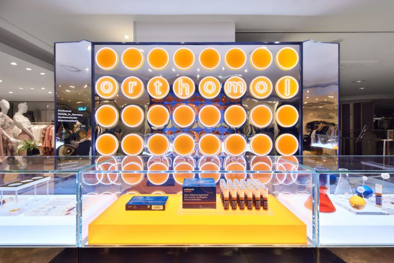
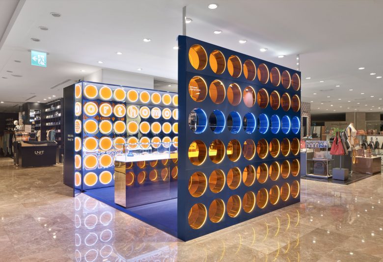
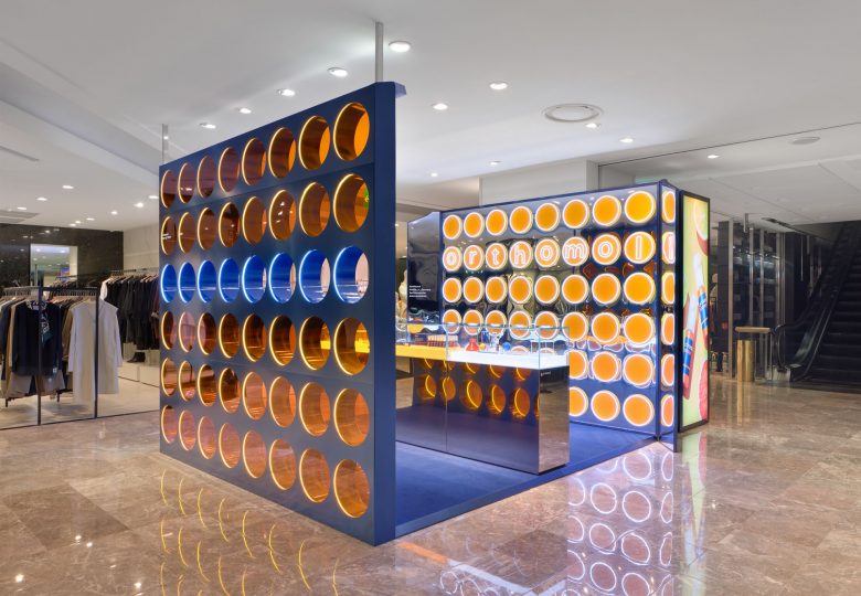
Under the design concept of ‘unboxing’, main strategy is to deliver the brand’s image in a simple but intuitive way in the space that oversized the product by borrowing the features of Orthomol’s blue box and bright orange package. In order to convey the image of premium vitamins Orthomol pursues, blue SUS and orange acrylic were used as the main finish material and, the back wall and front of the pop up store is designed to be symbolizing top view of the opened product package. Overall, the design was praised by critics that it delivered the premium image of Orthomol well with an impactful design that attracts consumers’ attention even in the department store where there are many brands.
Designed by Collective B
Creative Director: Younjin Jeong
Design Team : Hyoungseok Lee, Aram Jeong
Photo by Studi5var


Add to collection