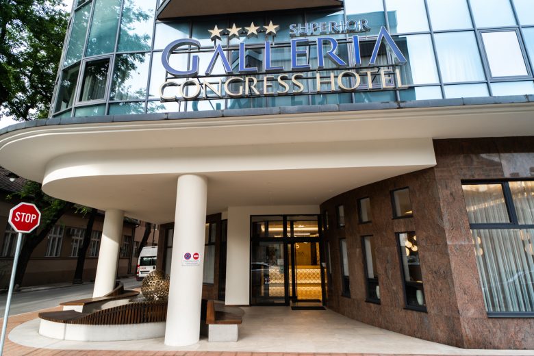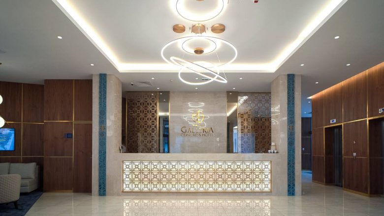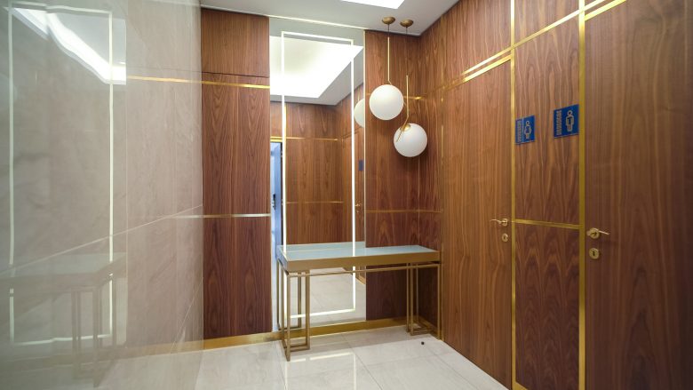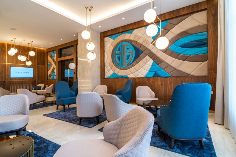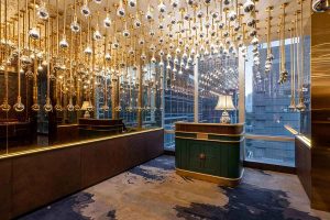
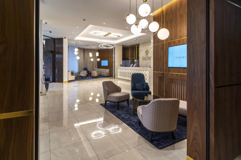
We were supposed to redesign the entrance hall and the lobby with the reception for the Subotica’s hotel Galleria. What they wanted was a more attractive and exclusive look. We decided to try to do something more, so its spirit can match the location. That is why we did our best to interpret art nouveau in a modern way. By the way, art nouveau is something Subotica is well-known all over Europe.
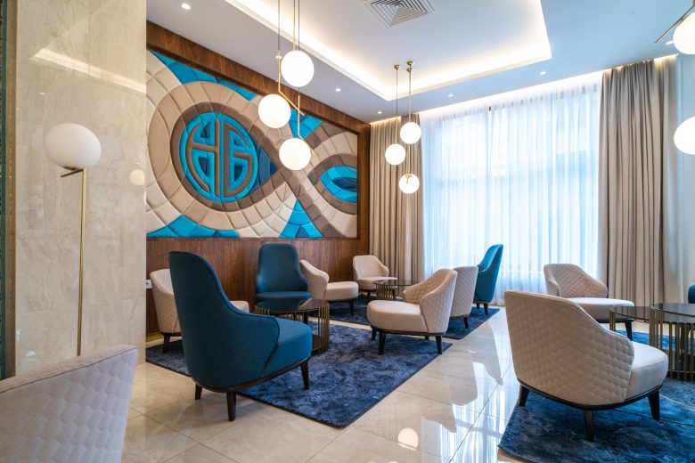
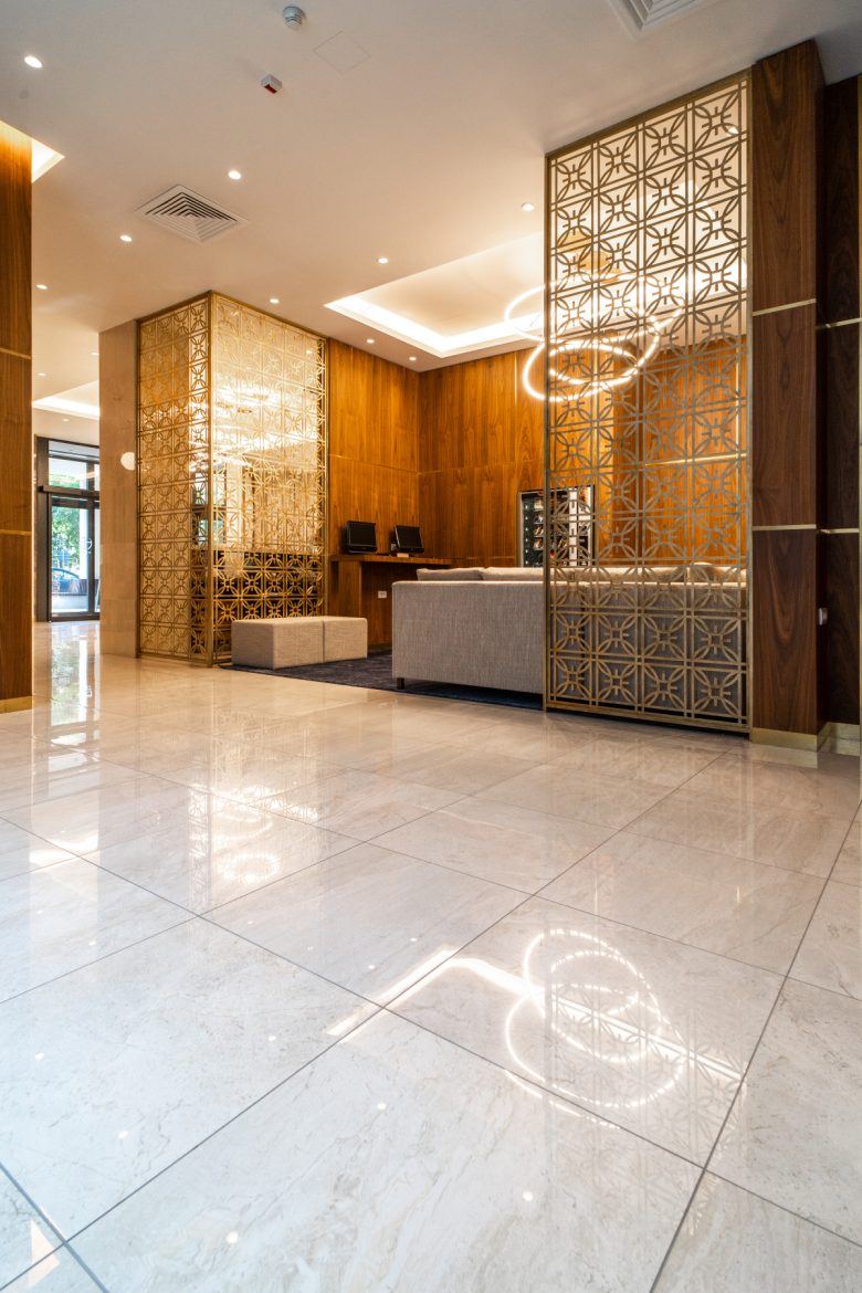
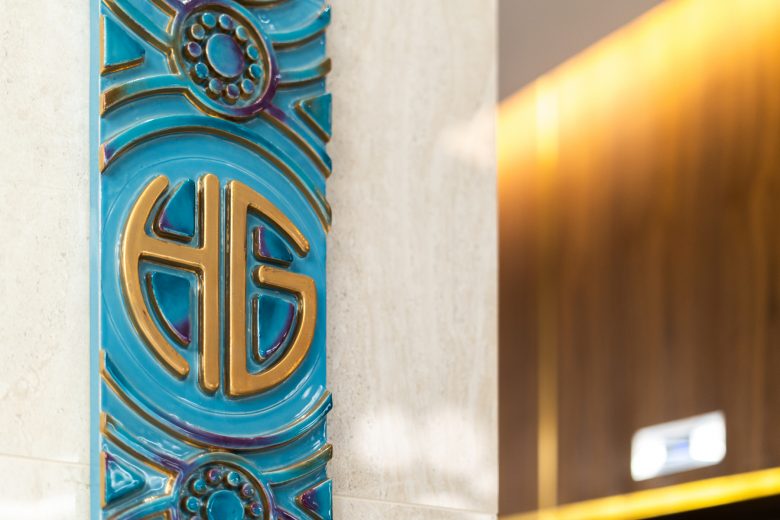
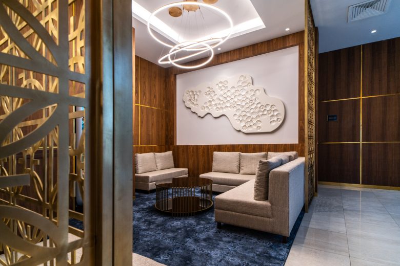
The logo of the hotel Galleria was leading us. The remarkable perforated metal surfaces in the hall were designed to remind of it. We stayed loyal to the standard colors of the hotel, although they were combined in a bit unusual way. It went smoothly. Just like the way few bright colors on a big decorative wall surrounded and highlighted the logo.

