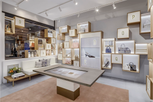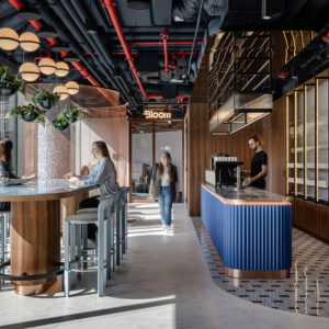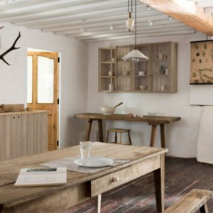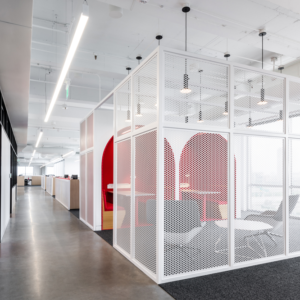
Sneaker District has all the cred with devoted fans and a booming online presence, but the physical store was stuck in the past: outdated, cluttered, and built with unsustainable materials and practices. In the sneaker world, how you look is everything. Unlike many other retailers, sneaker brands decide which stores can stock their product, not the other way around, so the physical experience is crucial to an effective business. The result is a complete overhaul of the retail space with a focus on powerful branding, a smooth and interactive consumer experience, and a design that’s as future-proof as it can be.
Innovation. Finding your next pair of sneakers can be laborious: you need ladders and extra hands to access the pair you want. Although this split-level space is graced with high ceilings for beautiful and extensive product displays, it also makes it almost impossible for sneakerheads to browse easily.
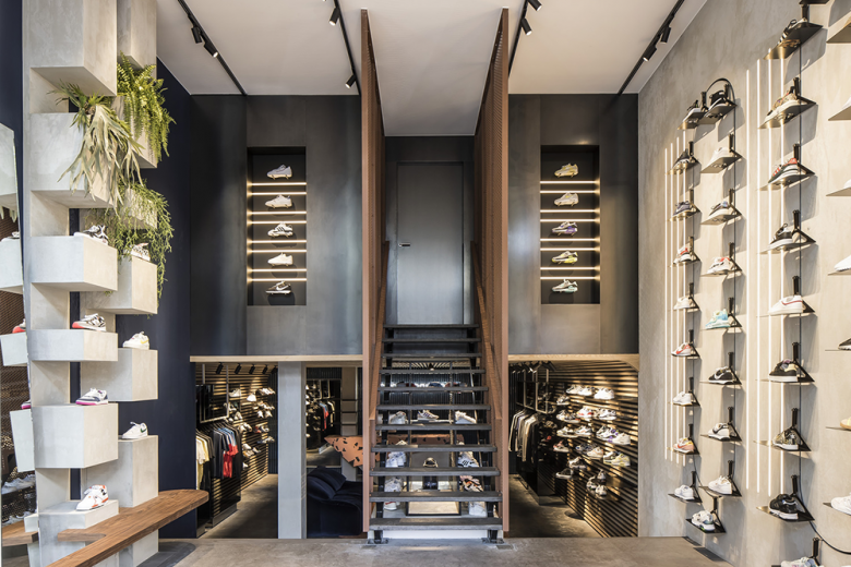
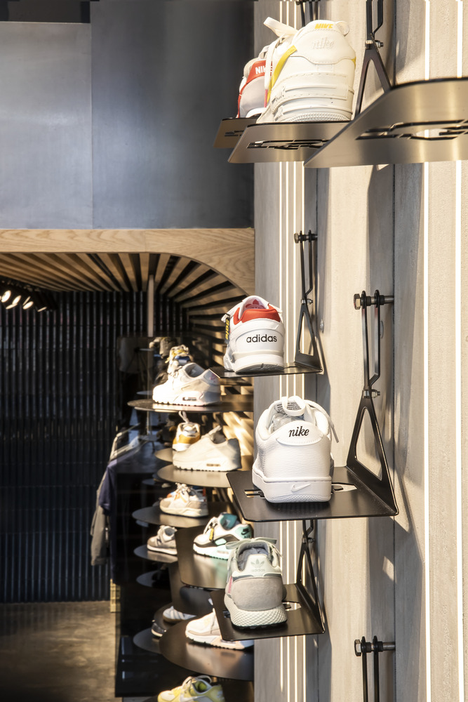
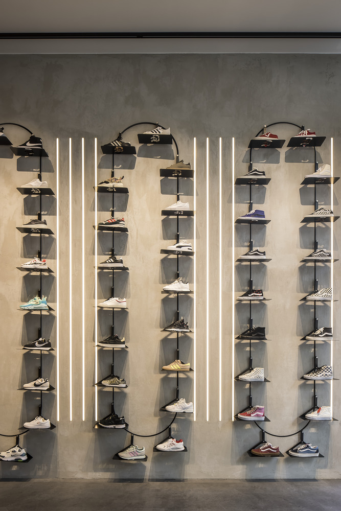
We partnered with the Technical University of Delft to find a way. The solution was an interactive sneaker carousel. Built on slim tracks in a stylish ellipse shape, the sneakers automatically rotate around, allowing the consumer to select as many as they like without any drama. The display also acts as a way to catch attention from the street. It’s set against a textured concrete wall and illuminated with adjustable LED lighting supported with smaller LED strips at the back.
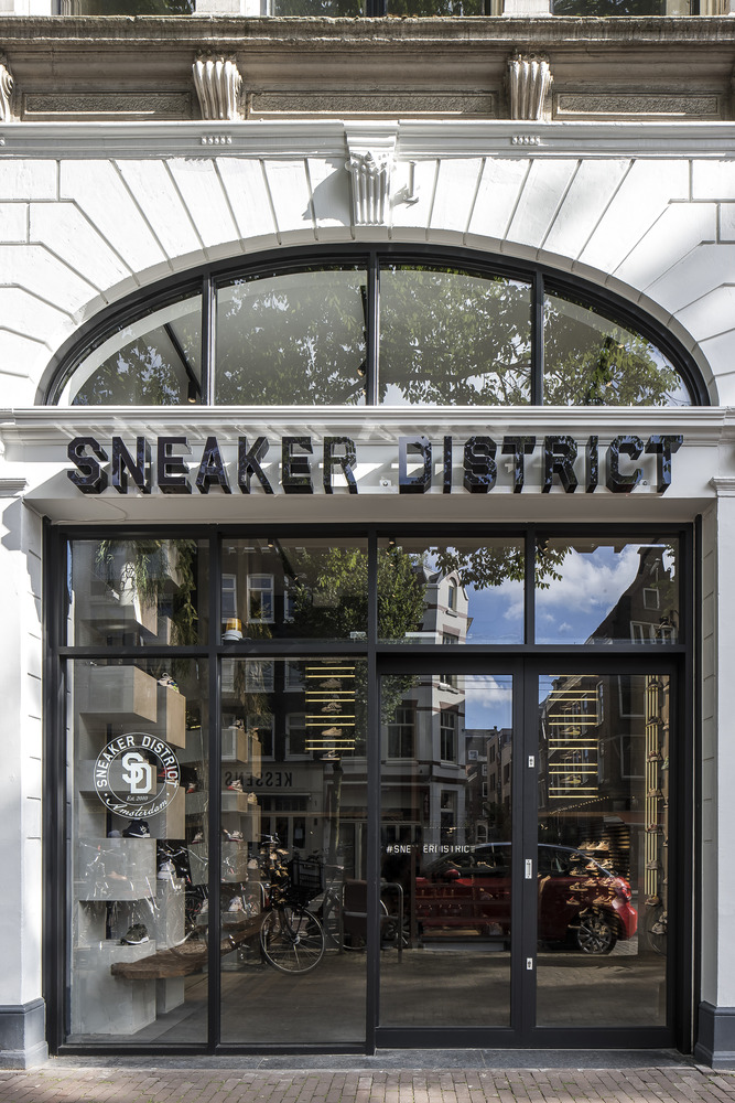
Creativity. Sneaker culture and craftsmanship were the inspiration for this project, and are represented through signature statements and raw sustainable materials. This attitude starts at the front door. The facade was restored and the faded sun canopy was replaced with a brand moment: sans serif Sneaker District lettering as bold as the brands they sell punctuated with gloss black window frames.
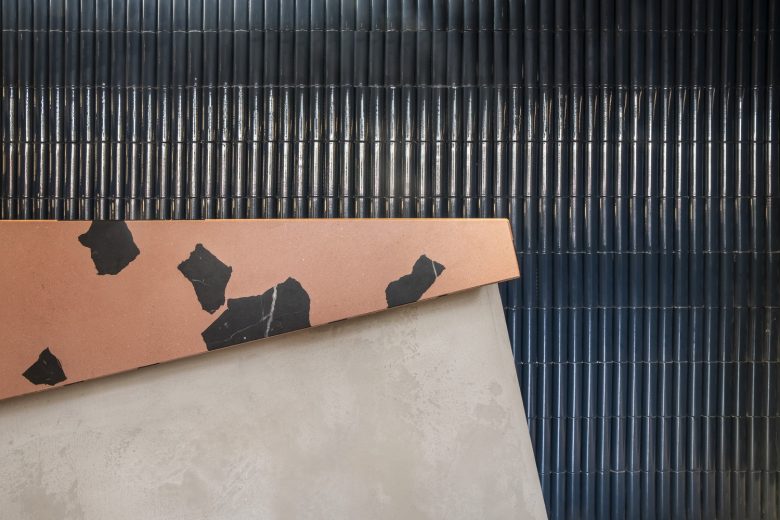
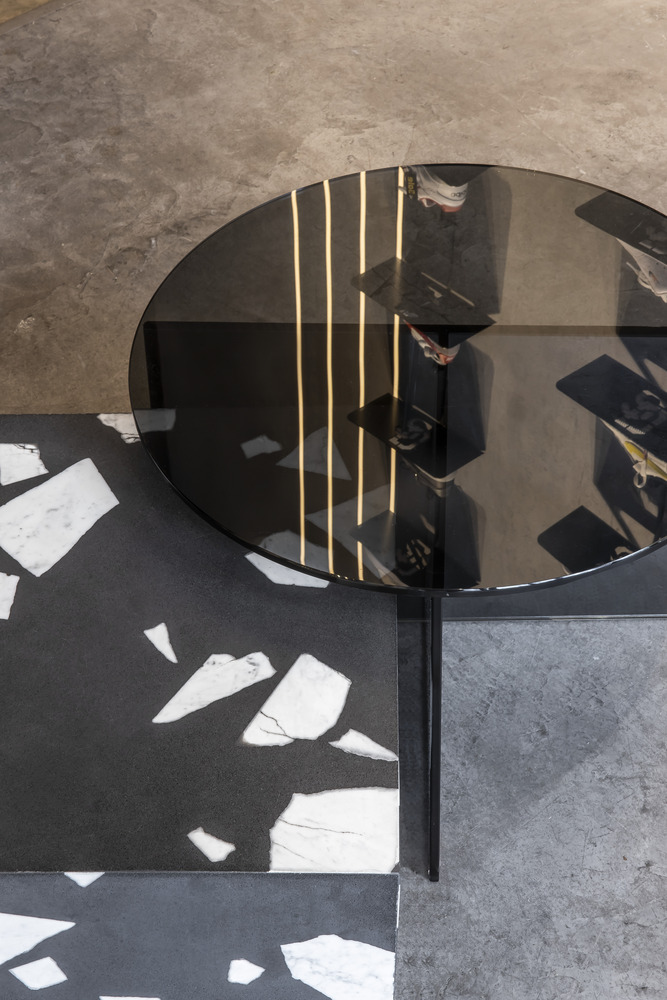
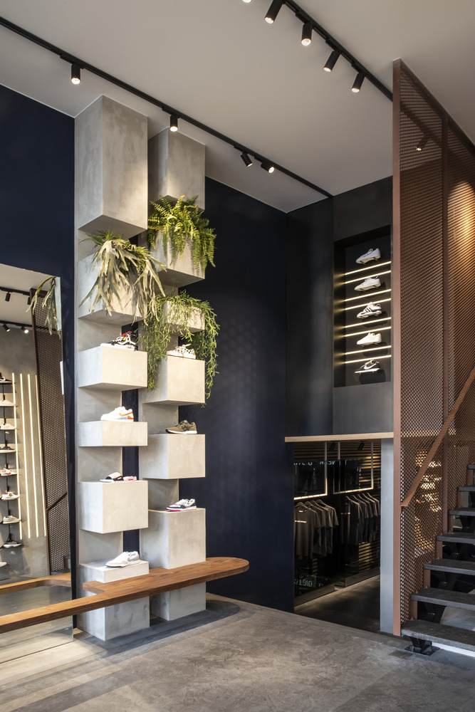
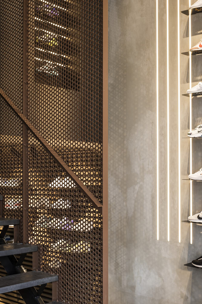
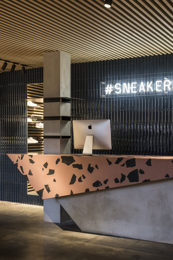
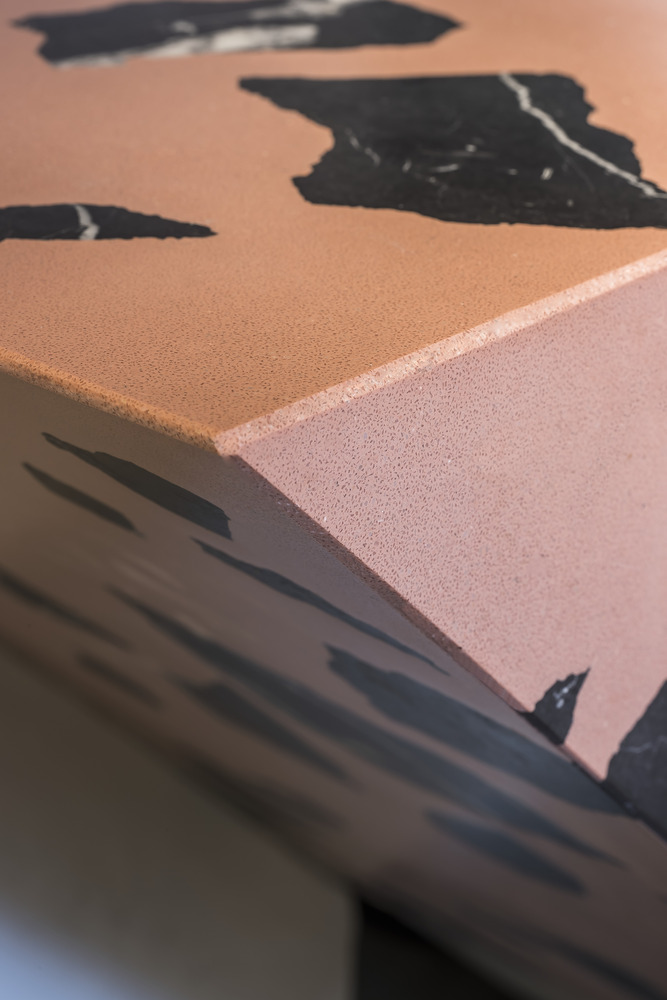
Inside you’re greeted with a warm industrial design. Front-and-center is the vault door to the storage room made from hot-rolled steel and flanked by perforated steel banisters in reference to the delicate mesh used over the toe of a shoe. The steel is powder-coated in a rusty red—a tribute to your favorite kicks getting some wear and tear. The counter/bar, made from recycled marble and inspired by Nike’s famous elephant print, is shaped like an abstract sneaker shooting out from the floor. It’s all every sneaker fan could want.
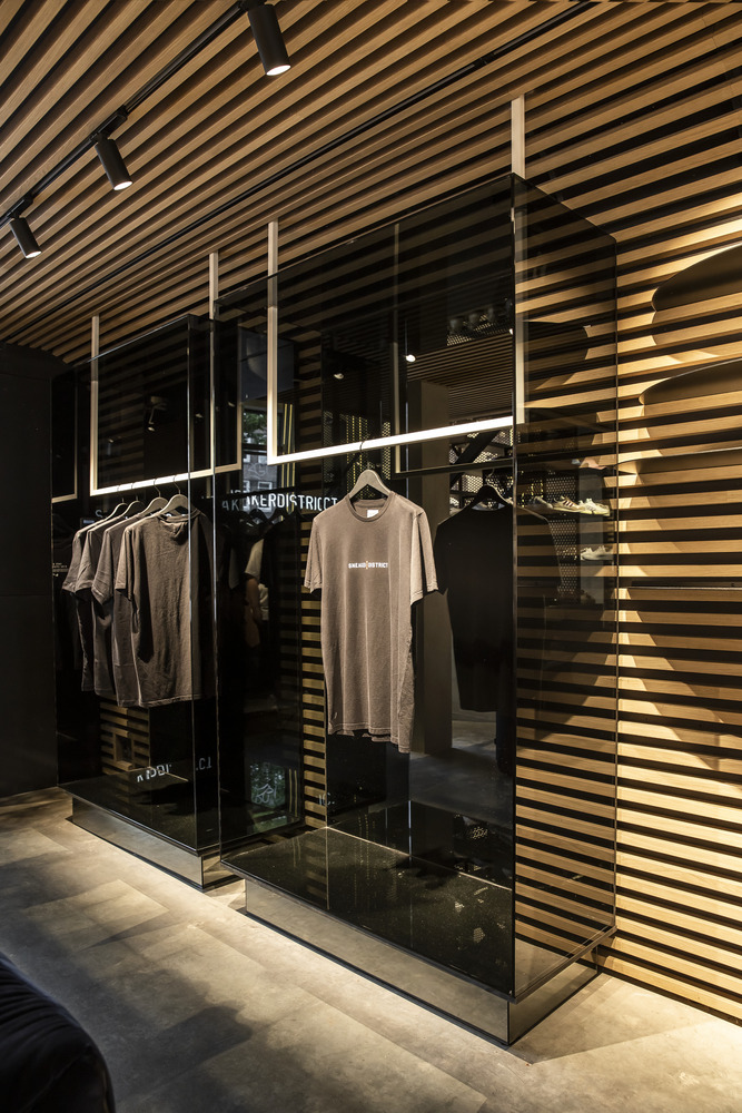
Outside of sneaker inspiration, we accentuated the store’s natural shape with wooden scantlings and Kaufmann Keramik tiles finished with the #sneakerdistrict neon. With only limited apparel, we turned the clothing displays into mini-galleries. Super slim shelving with smoked glass cabinets and mirrored plinths play with your eyes to give you the impression that the clothes are floating.
Functionality. This retail space isn’t so focused on selling sneakers. Sneaker District already has a strong online presence to do this. Instead, this space is more of a “hang-out” where the sneaker community can come in, connect with other sneakerheads, and celebrate the culture around it.
Alongside the rotating sneaker displays, we focused on tightening the gap between seeing a shoe in-store and making it yours at home. In-store online ordering means you can touch the shoe and have it delivered to your door in just a few hours; no need to carry them around town. With COVID, space has become a backdrop for video shopping sessions where staff can give consumers a virtual tour around the collection before ordering.
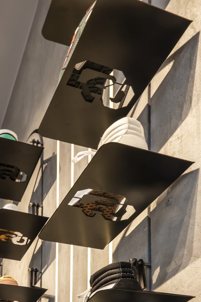
Sustainability. Social, economic, and environmental wellbeing has all been considered in this project. Socially, it’s a space where anyone can stop by to learn about the sneaker world and connect with others. Economically, we partnered with local building companies, universities, suppliers, and the Sneaker District community to benefit all who came across this project. And finally, for the environment, we focused on a flexible store design that’s adaptable for different occasions and uses sustainable materials. The point-of-sale counter can be transformed into a bar, while the LED lighting and shelving can be adjusted or moved depending on what’s needed. The concrete floor was kept and restored along with the original facade. We also selected recycled marble, eco-friendly paint, and natural clay wall finish to bring this store to life.
Image is everything in the sneaker world, and now Sneaker District looks just as impressive as its reputation. The new store in Amsterdam gives the community a slick retail space to connect and collect. It ties together everything they love about the culture in a more efficient and environmentally-friendly way, while also putting the Sneaker District brand on the map.
Architects: Barde + vanVoltt
Lead Architect: Bart van Seggelen
Interior Designer: Valérie Boerma
Interior Architect: Ivo KLaver
Photographs: Nikki van Toorn
Add to collection
