
WoofWoof coffee by Wishnia
posted by retail design blog on 2021-07-27
Add to collection

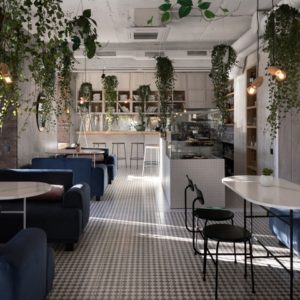
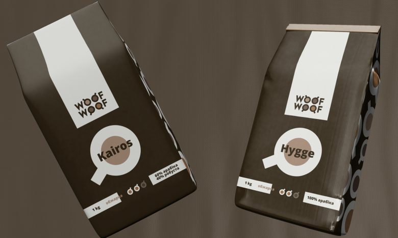
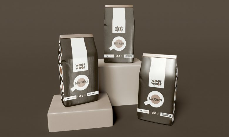
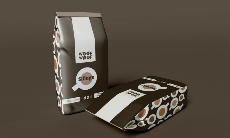
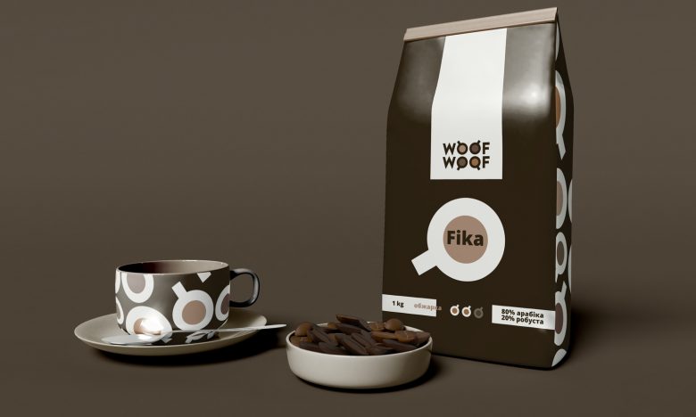
The WoofWoof company sells coffee beans.
It was important in the packaging to reflect the variety of varieties offered and the reliability of the company as a supplier. The visual stylization of the O letters coped with this. The balance between simplicity and meaning was maintained graphically.
Colors are selected that convey the desired atmosphere and showcase the company’s products. The logo itself is a unique typeface with the letters O, stylized as cups. The interior of each O is filled with a different color, which symbolizes the variety of coffee served.
The result is a simple yet dynamic identity and noticeable packaging.
Add to collection