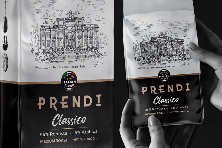
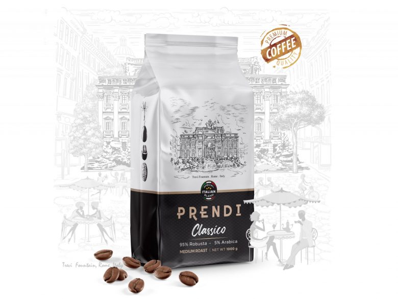
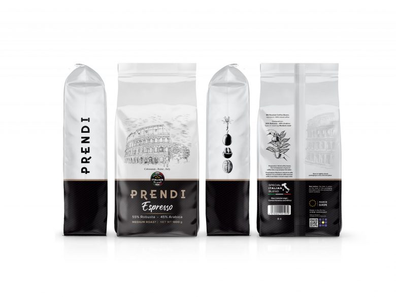
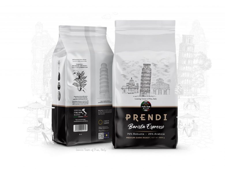
Prendi coffee brand has added new products to its product portfolio. The design and implementation of these packages was the responsibility of the Metis design team, which worked with the Prendi brand in all stages from idea generation to printing.
We strongly believe that good coffee is important, so we focus on three simple things: quality, taste, and uniqueness, along with good packaging, are the evolution of this process. We produce our coffee in Italy, the country of good coffee, in the center of our modern and innovative production. In the production of coffee beans, we make sure that every stage of production is done well, because every stage is very special, from carefully roasted coffee beans to delivery in high-quality packaging.
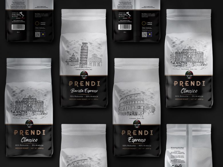
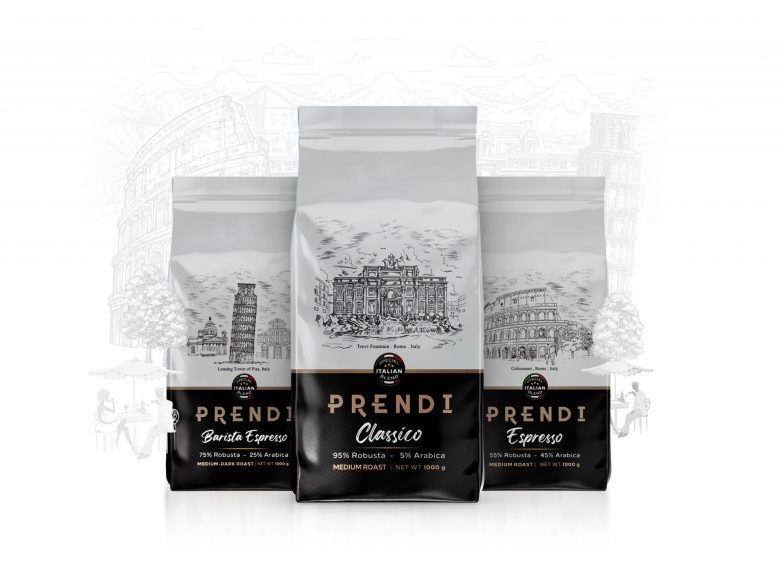
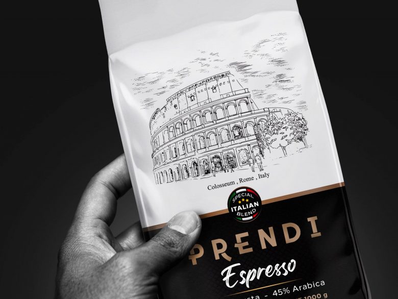
There are many important steps in creating a great cup of coffee – from a farmer taking care of freshly grown coffee beans, to a roaster getting the best results from individual coffee beans to a carefully prepared barista. Serves coffee with love. We strive to achieve the highest standards of quality and taste to provide you with the best coffee experience, we are always striving to maintain the traditions of delicious coffee and at the same time bring innovation and new wind to our coffee. But in the end, you see the packaging in the showcase, so all these processes are completed with good quality packaging. Metis’s commitment in this regard was very heavy. Also, our initial idea generation started from Italian historical monuments in order to show Italian coffee to our audience at first sight, while at least packing. The manual design was done with a pencil and then Rapid to be digitalized in the final stages with changes and to make the packaging simple, stylish and eye-catching by combining simple pagination and using special fonts.
The use of black and white coloring was the employer’s desire, in which illustration was more prominent and a challenge for studio designers, as he scrutinized the radius of creativity.
Designed by Studio Metis
Add to collection
