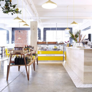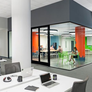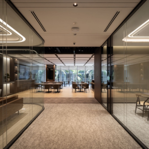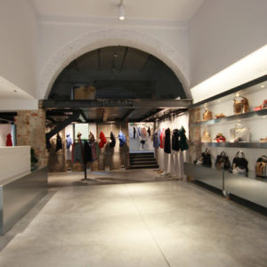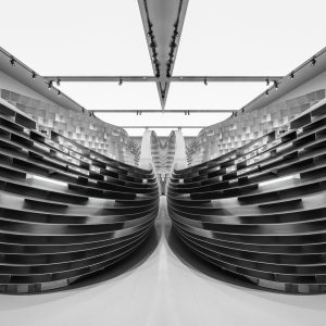
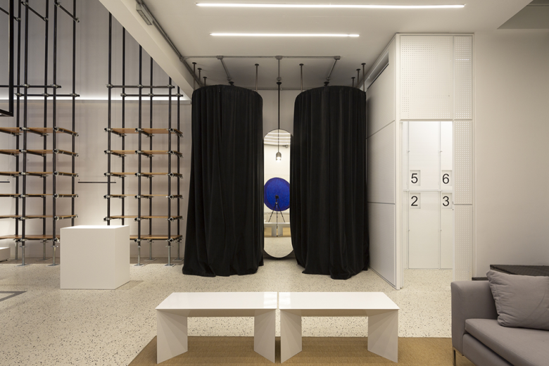
Not having a defined program our main challenge was to design a space that was able to accommodate different types of programs and that could easily adapt to each one of them. We were interested in the analogy with an art gallery, in which exhibitions are in constant change and transformation.
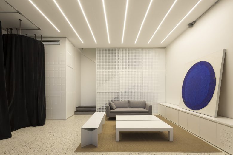
From its beginnings, Room was thought with just one main premise: flexibility. Each and every one of its elements (furniture, lighting, and services) should seek to enhance and exploit this quality.
The project is located in the Palermo Hollywood neighborhood in Buenos Aires. A neighborhood with a young audience where gastronomic and retail shops prevail. Due to its strategic location within the city, it has recently become a main tourist attraction with intense activity throughout the day. It’s a place where independent designers are settling in order to become relevant in the market.
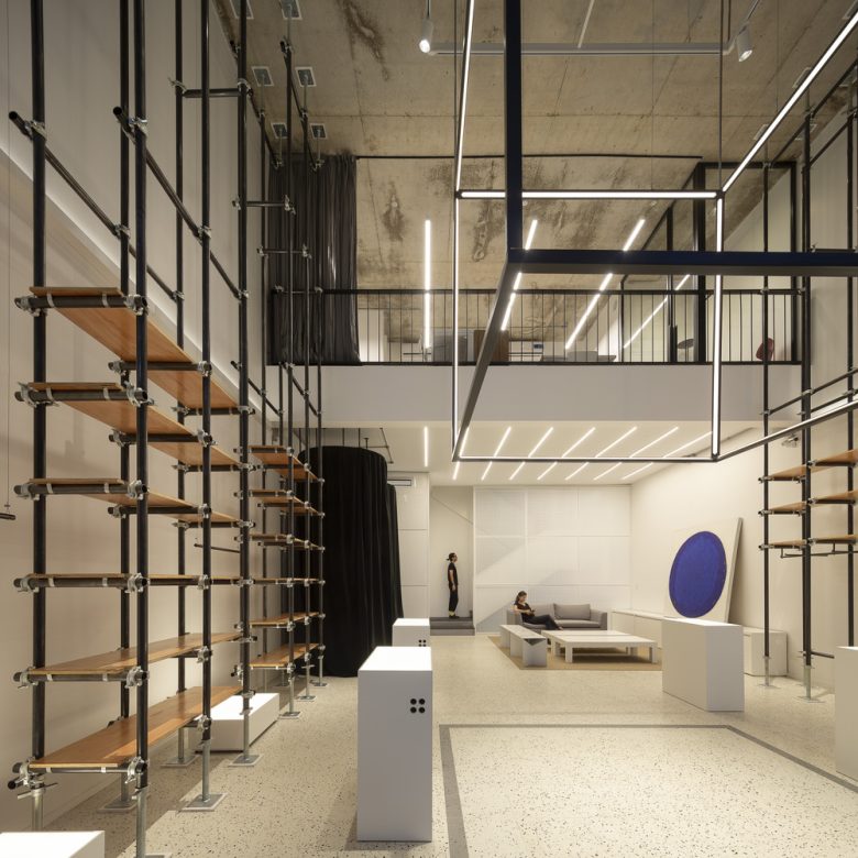
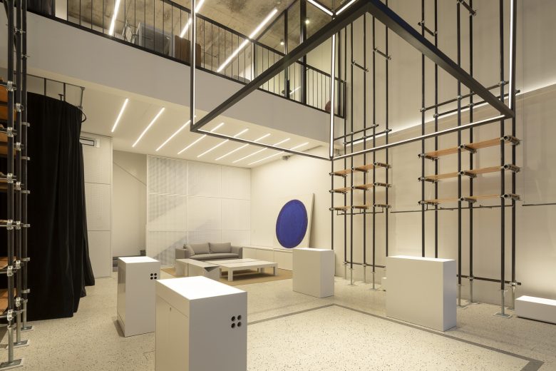
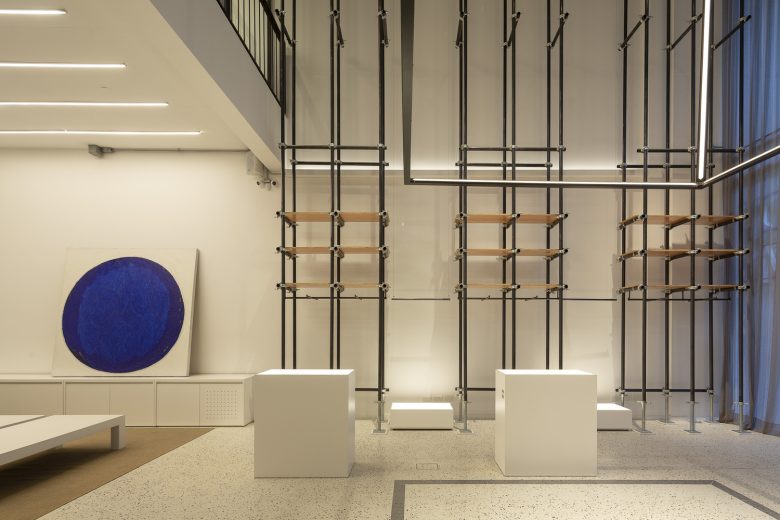
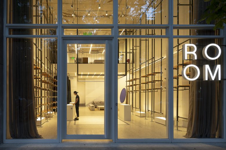
The main space features a double height that aims to serve as a container for a wide variety of activities and exhibitions. When this space is empty its ornamental elements are highlighted, but while it’s in use what grabs the main focus are the displayed elements.
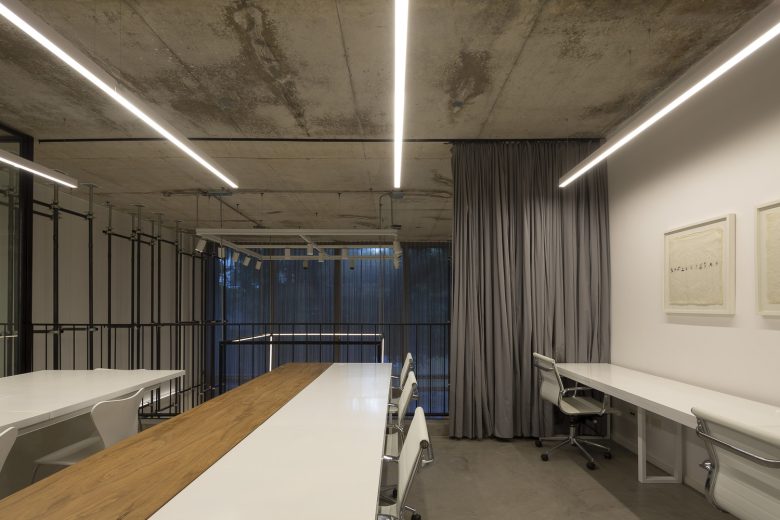
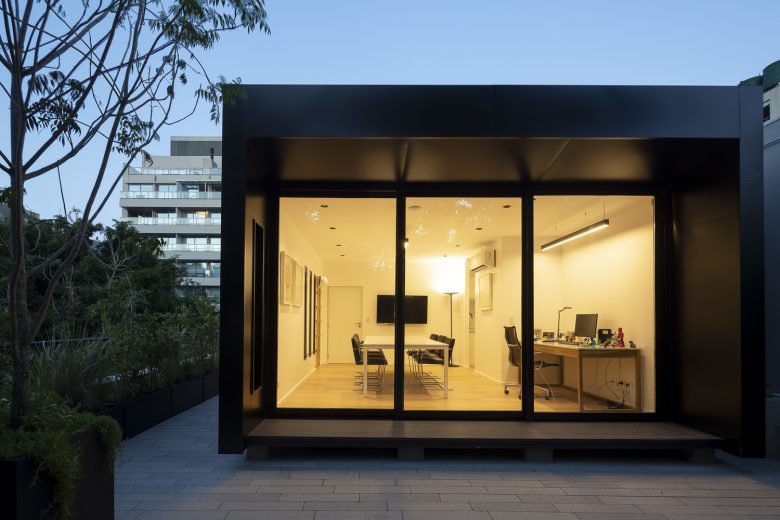
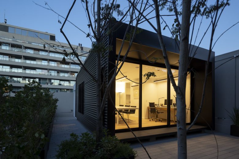
On the upper floor, there is a complementary office space that can work autonomously from the rest of the building. The main office is placed on the terrace to gain privacy. Together with a green outdoor space they create a meeting and leisure space that ends up complementing the whole building scheme.
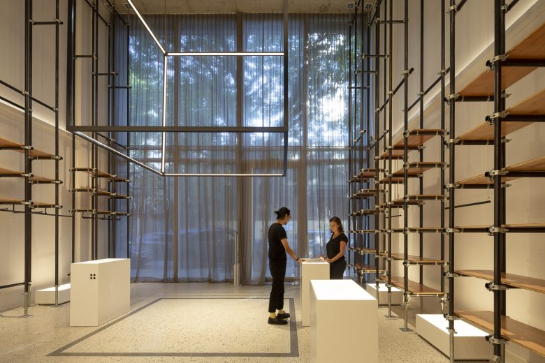
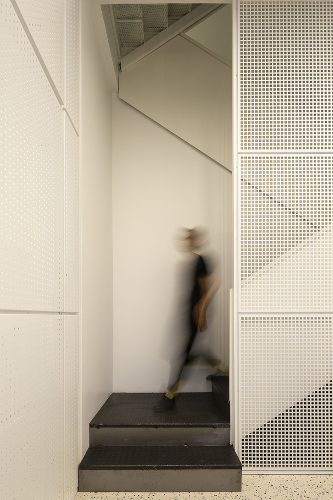
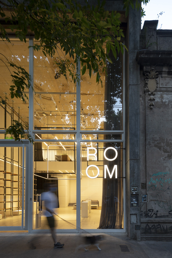
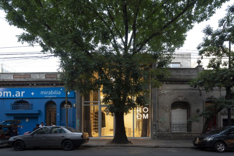
The aesthetic of industrial and raw materials was chosen to merge with the homogeneity and purity of white. Iron, aluminum, and timber are in plain sight producing a contrast with the whiteness of the floor and walls. From the outside, the glass-covered façade features this quality inviting anyone who passes by to stop and contemplate it.
The lighting design was considered to be a crucial point for the project. Not only for its functional aspect but also as an ornamental and highlighting element. In this way, we can differentiate between elements with a scenographic porpoise such as the big cube hanging from double height. Those with a general lighting function, such as the linear lights, and those with a highlighting role, such as the central ring and the integrated light on the furniture.
In order to accomplish the flexible and contemporary space pursued furniture design was also vital. The equipment should serve as exhibition elements, enhanced by the integrated lights, as well as storage devices. As a result, scaffold-like structures were assembled to provide the possibility to adopt different configurations (exhibition, storage, workstation) depending on the user’s necessity and the different programs that the space can accommodate.
Architects: Pirca Arquitectura
Architects in charge: Antonio Florio, Luciano Basso, Gonzalo Charón
Photographs: Javier Agustín Rojas



Add to collection
