Add to collection
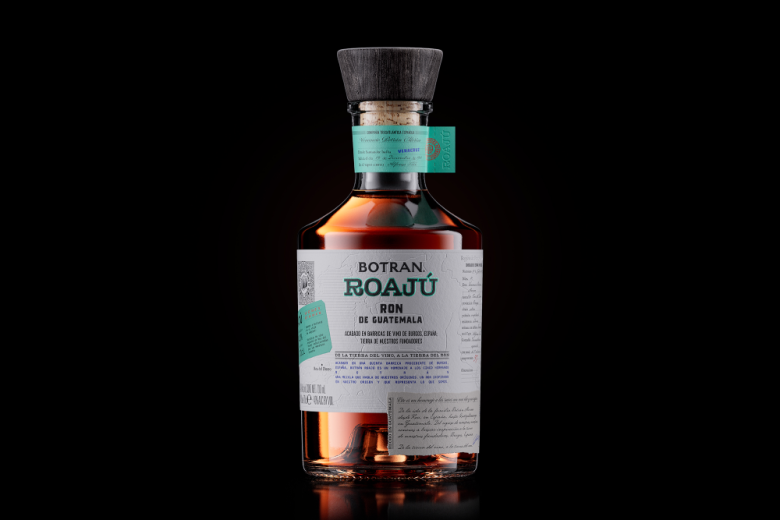
Founded in 1940 in Guatemala, a brand acclaimed for its portfolio surprises us with a new edition: Botran Roajú. A blend that honours the roots of the family, through its narrative, concept, and finishing.
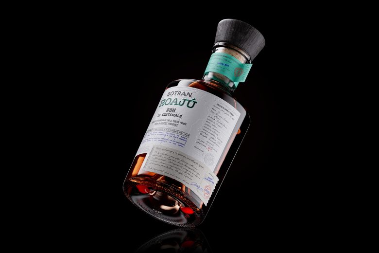
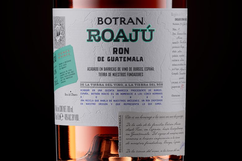
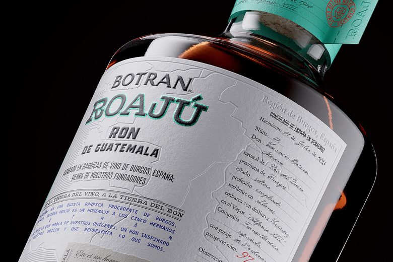
Our discovery that the Botrán brothers were born in Roa de Duero (Burgos) and that the finishing of the rum came from barrels of their homeland, presented the opportunity to make a full circle, going back to the home to which the brothers never returned.
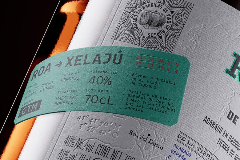
To encapsulate this historical coincidence, we created Botran Roajú, a name that combines origin (Roa del Duero, Spain) and destination (Xelahú, Guatemala), establishing a connection between the land of wine and the land of rum.
We defined the brand’s visual packaging and identity by drawing an analogy between the two historical moments, and striking a balance between classical and contemporary elements past and present, Spain and Guatemala, wine and rum.
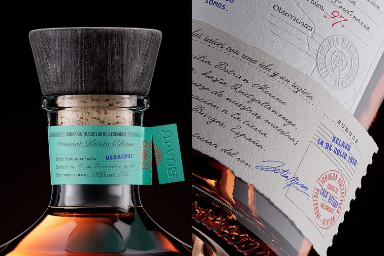
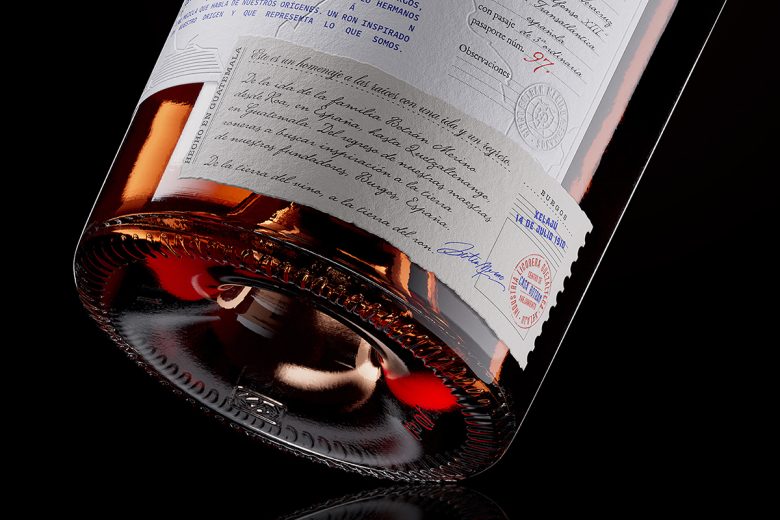
We convey the transatlantic voyage through the bottle’s design. The map of Burgos reveals the origin; the passport encapsulates the journey by Venancio (the eldest Botran brother and the first to arrive in Guatemala); a note that stands as testimony to Venancio’s arrival in Guatemala and his memories; and a modern banknote as a tribute to the Master Rum-Makers’ return to their birthplace.
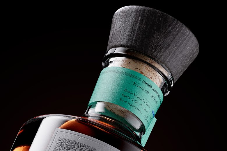
By layering labels and employing wooden and contemporary typographies, we unveiled distinct pivotal moments. To round off, we revived the origin by including a bottleneck using Venancio Botran’s departure ticket with the Spanish Transatlantic Company.
Botran Roajú: from the land of wine to the land of rum (and back).
Designed by Morillas Branding
Add to collection