As interior designers, we often create spaces that are complete and self-contained. But this time we have taken a different approach. Our latest design is not just a space, but a canvas for human interaction. Designed by van Baal interior design and Tomasz Budnicki and located on the modernist Siemensdam campus, the Hans und Werner Kantine bridges the gap between the architectural heritage and the contemporary pulse of Berlin’s new office district. The groundfloor of an old factory building has been transformed into a lively restaurant.
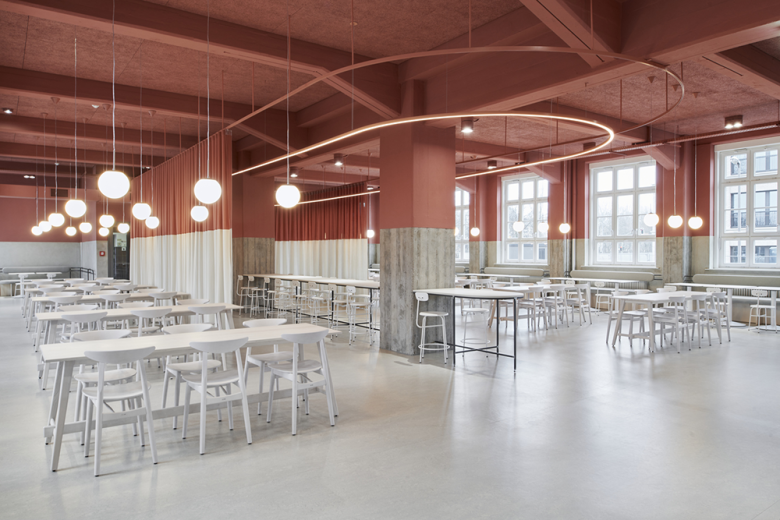
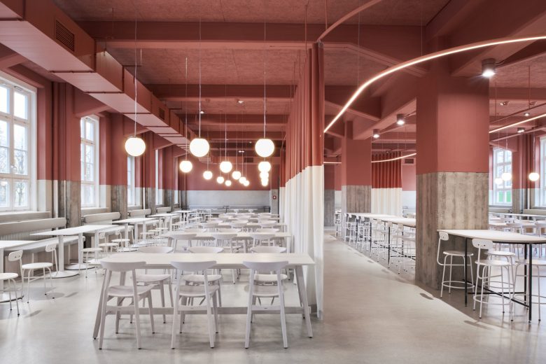
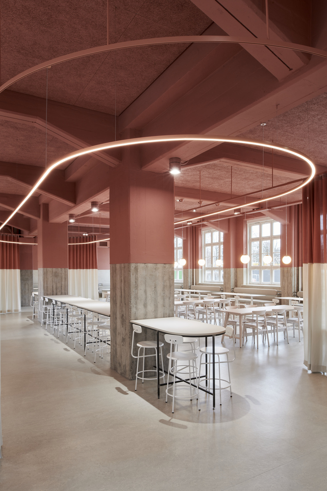
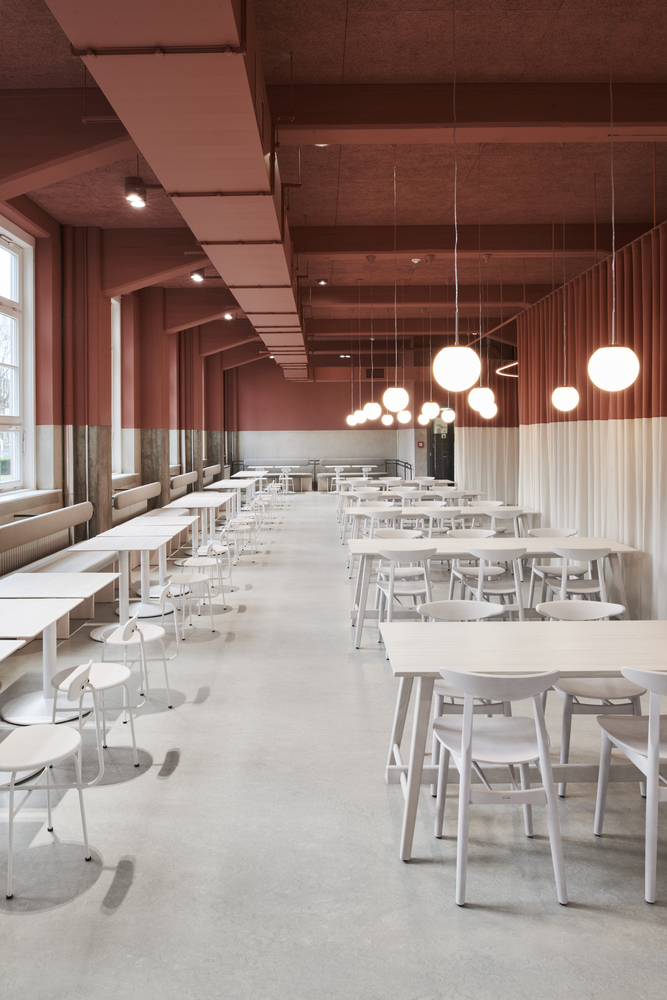
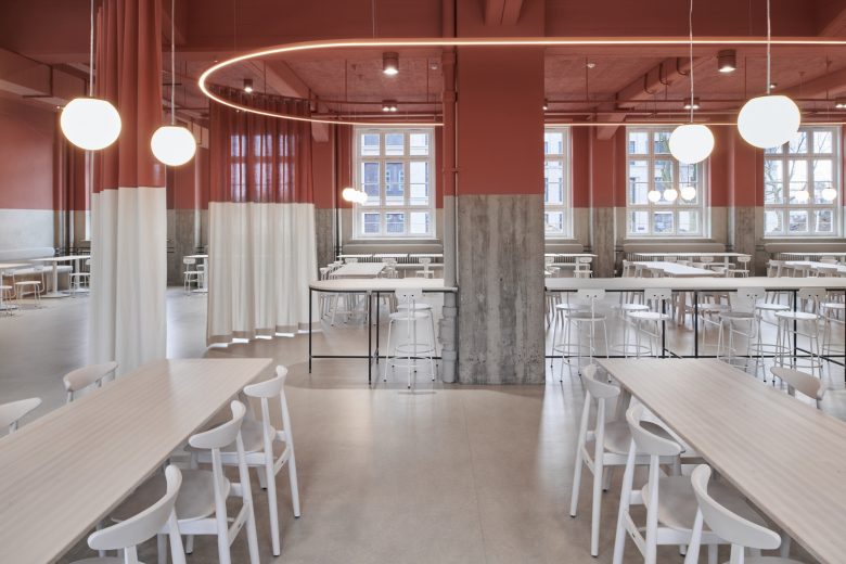
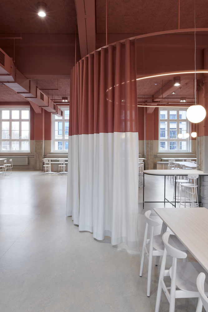
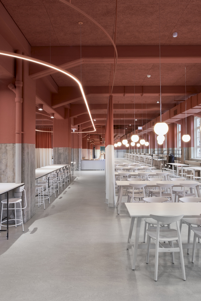
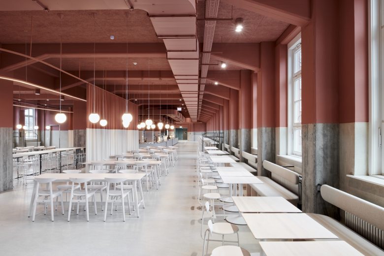
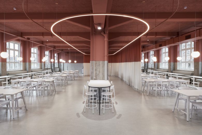
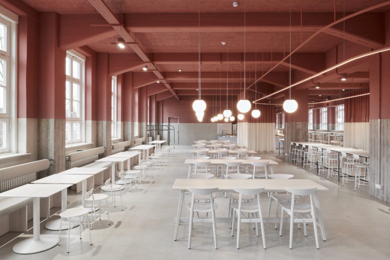
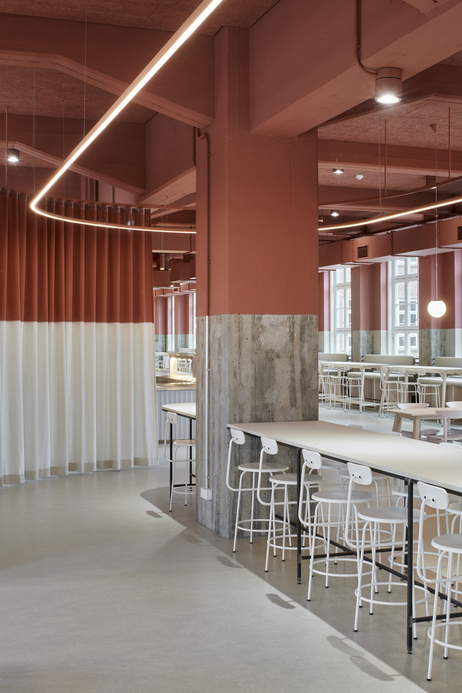
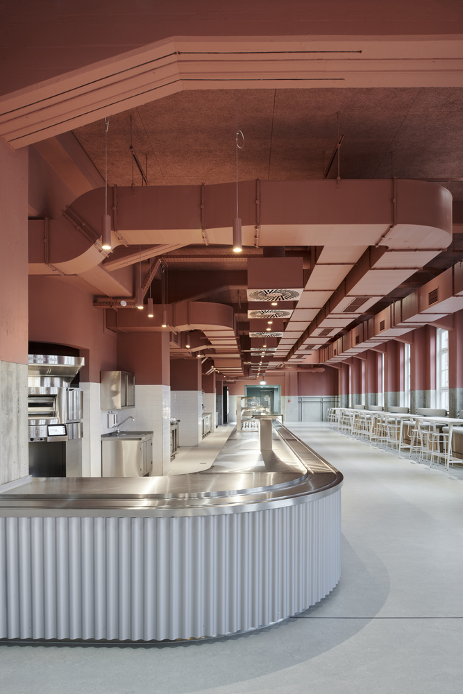
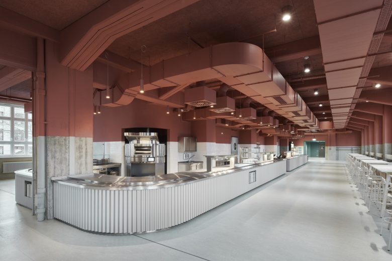
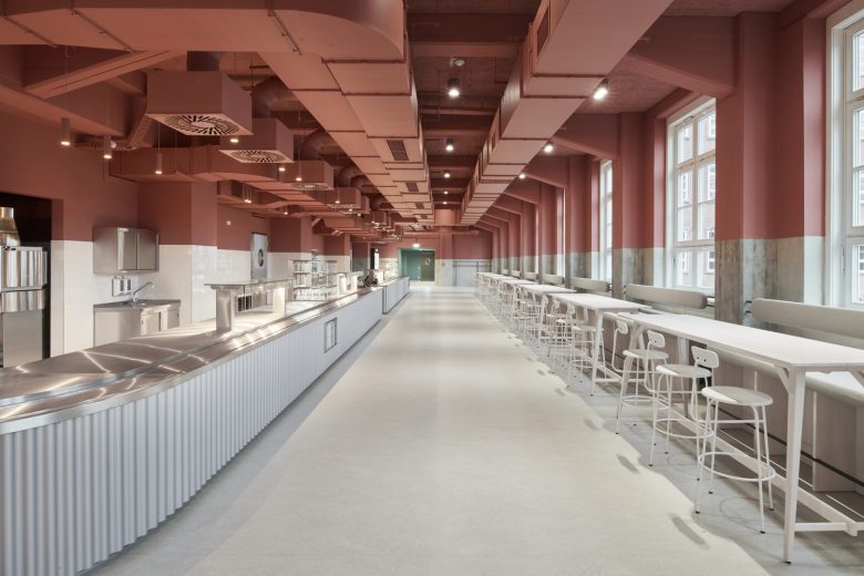
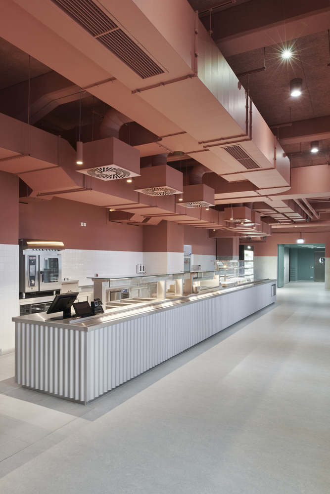
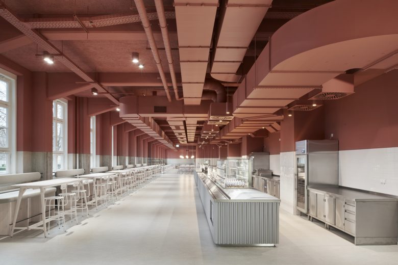
We gutted the entire hall and exposed its essence. Against this backdrop of the existing shell, we created a dramatic horizontal division. The upper segment, which houses the technical installations, becomes a decorative element, while the space below unfolds as a pure, neutral backdrop for human engagement. The ceiling of the canteen is bathed in a warm shade of red that echoes the red bricks of the historic building, symbolically connecting the space with the rest of the building, while the lively lower room appears to have been pushed into it like a stage.
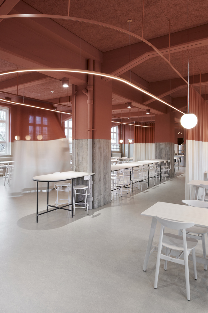
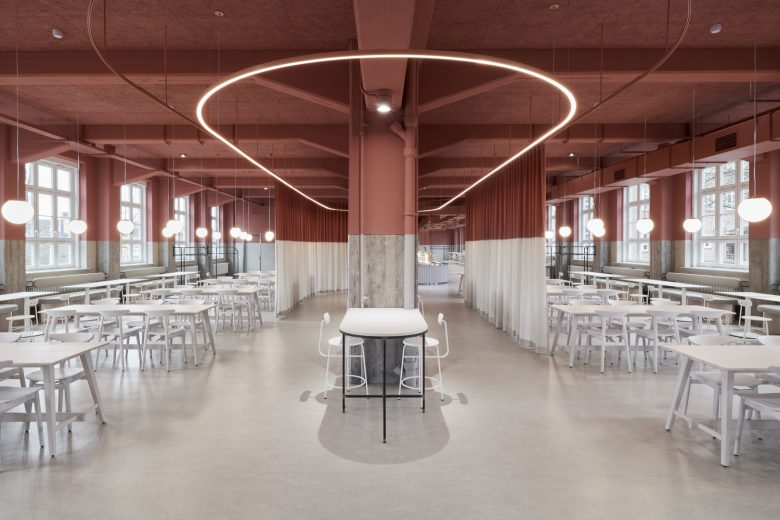
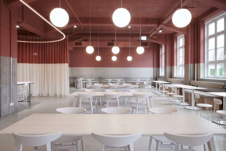
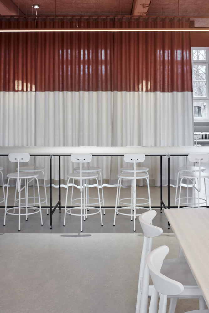
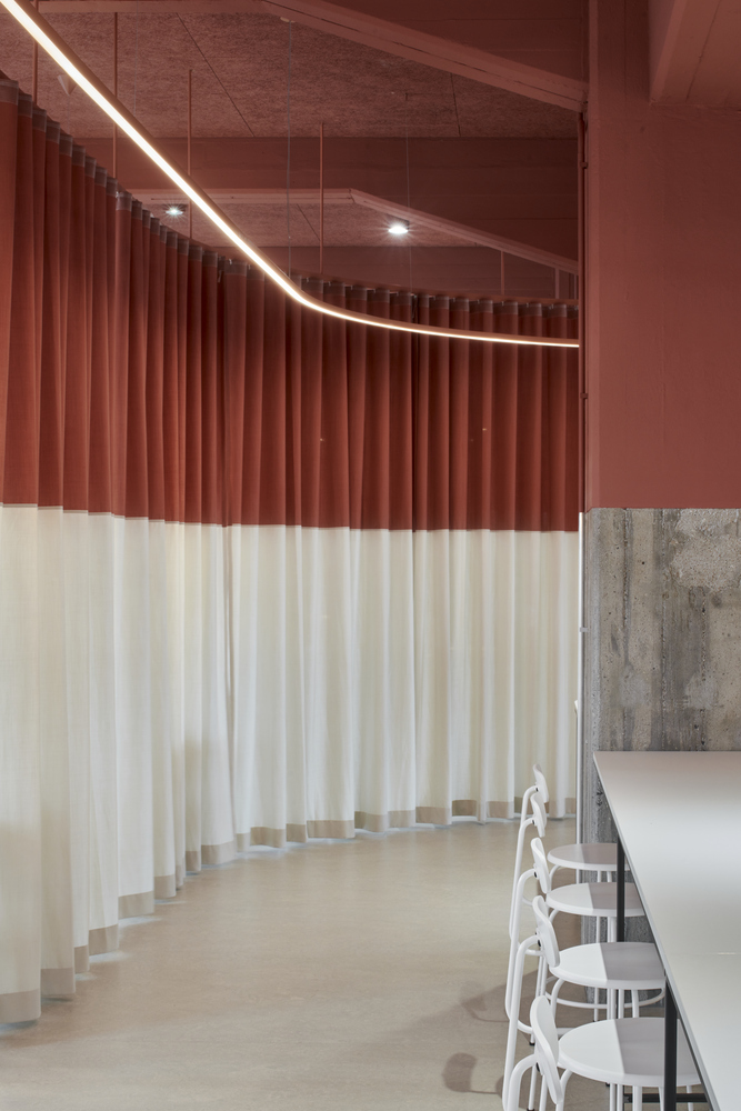
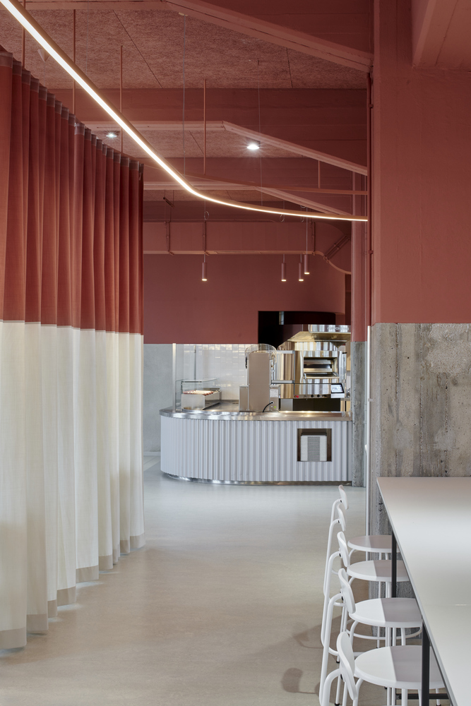
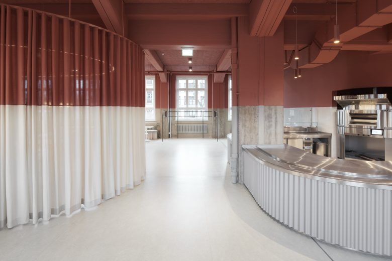
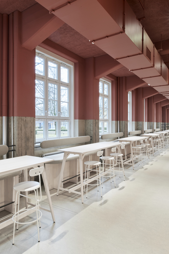
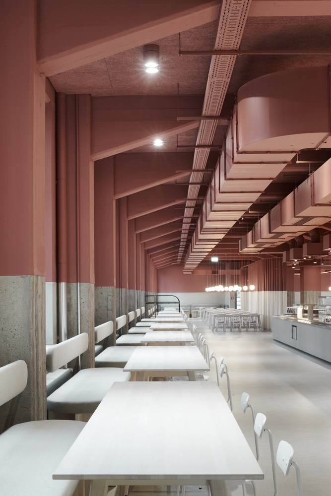
By reversing the weight of the space, the lower part remains bright and inviting, a meeting area for social interaction. The hall is designed around two focal points. High tables for quick meals trace the gentle curve of a metal counter and merge into a long communal table surrounded by a curtain. The folds of fabric mimic the metal cladding of the bar, creating a visual harmony. Surrounding this fabric sculpture is the classic canteen area with our bespoke white wooden tables, above which timeless glass globe lamps cast a warm glow. The rest of the space is enclosed by simple upholstered benches. White wooden fixtures, with oiled steel elements supporting the backrests of the benches, are interrupted by the concrete columns of the façade.
The columns and exterior walls below the color section have been stripped of their old paint, revealing their raw, unadorned beauty. The exposed concrete and plaster surfaces contrast with the soft brightness of the fabric and the fine elegance of the wood. Raw steel profiles run through the room. Their industrial appearance is softened by the meticulous selection of same-tone textiles and the seamless linoleum floor. Steel, concrete, plaster, wood and fabrics form a unique collage of textures.
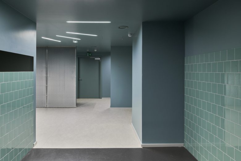
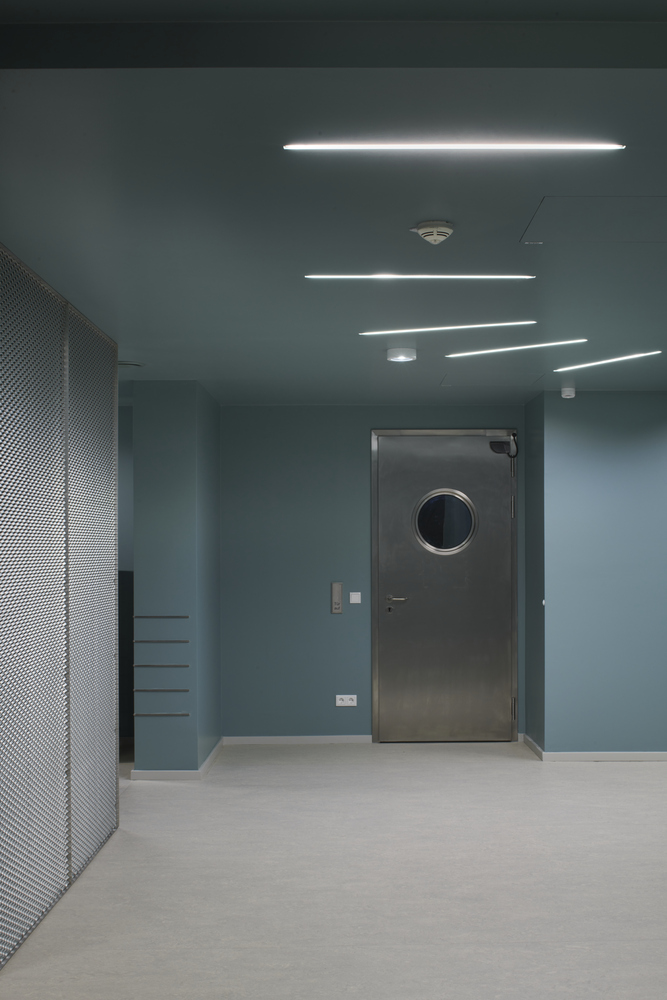
The entrance area provides a final design accent. This space is connected to the existing restaurant by a corridor in a uniform color. Green passageways conceal the tray return area behind metal-clad walls, with material and color choices inspired by the restaurant’s storied past.
The lighting plays a subtle but effective role. In addition to the decorative globe lights, the tables are illuminated by hidden spotlights. The central table is highlighted by a neon installation that fills the curtained room with light. The metal counter and the preparation area are accentuated by tubular metal lamps integrated between the ventilation ducts, combining form and function.
Architects: Tomasz Budnicki, van Baal interior design
Lead Architects: Tomasz Budnicki, Christina van Baal
Photographs: Yves Sucksdorff
Add to collection
