Add to collection

Intro
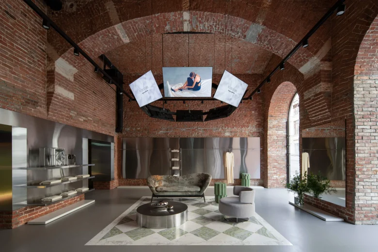
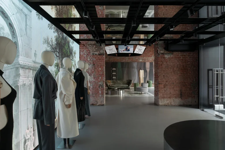
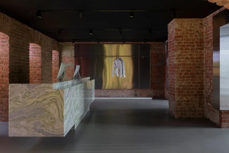
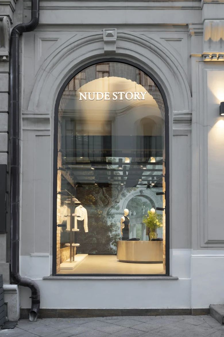
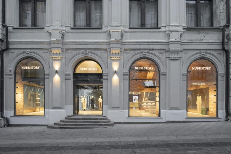
For the store, the brand chose a building dating back to 1870 – A. S. Khomyakov’s profitable house at the intersection of Kuznetsky Most and Petrovka. The architectural solution of the project was based on the texture and color of the brick from which the house was built. We wanted to preserve the historical masonry, all the cracks and other imprints of time, so we restored the material by hand.
High symmetrical vaults and restored 100-year-old brick allowed (both technically and stylistically) to combine in the interior the features of an old Italian palazzo and modern multimedia retail space.
Planning solution
We strived to create a symmetrical and integral composition, characteristic of classical architecture and functionally convenient for the visitors of the store.
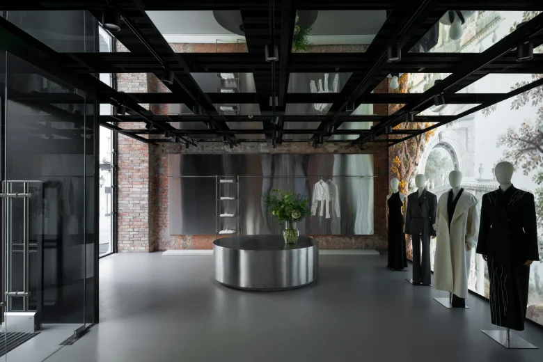
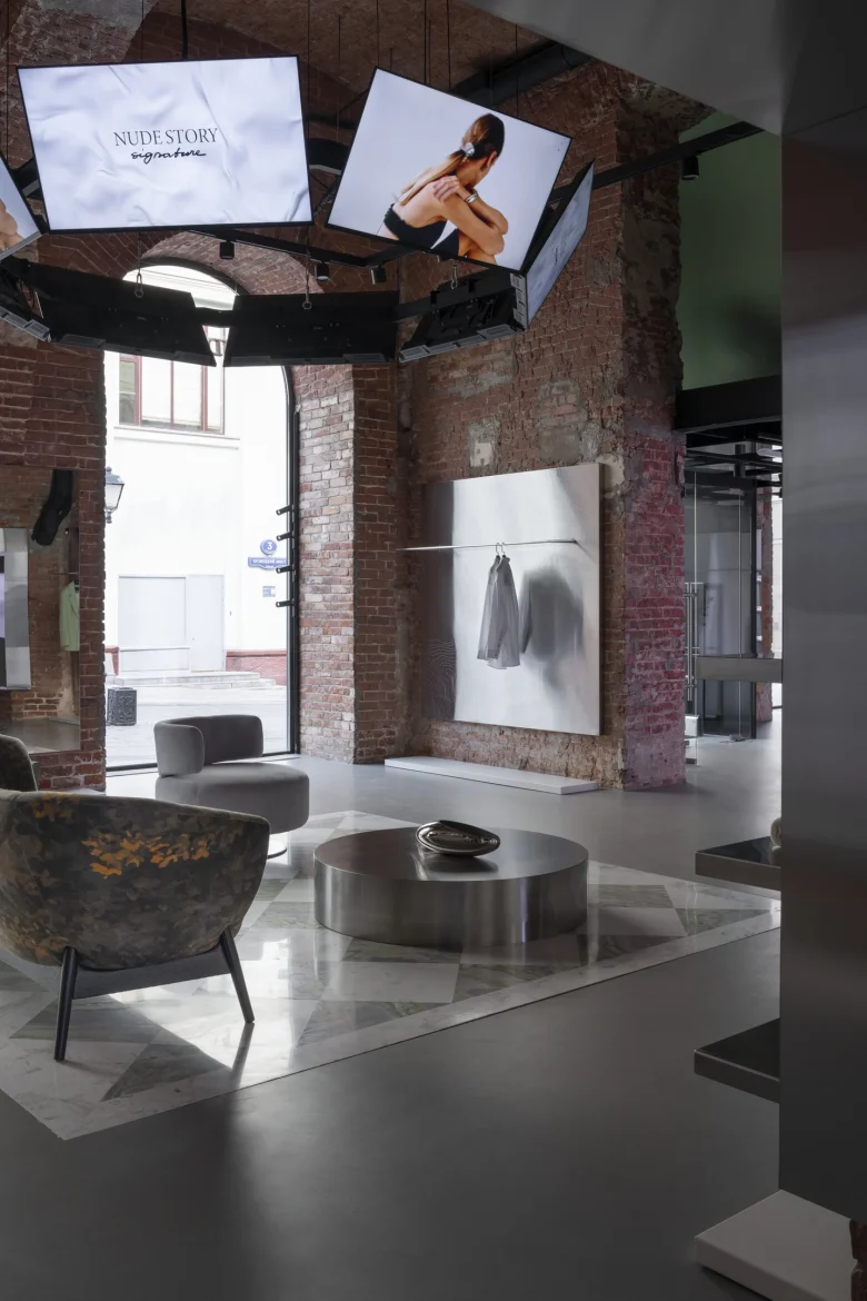
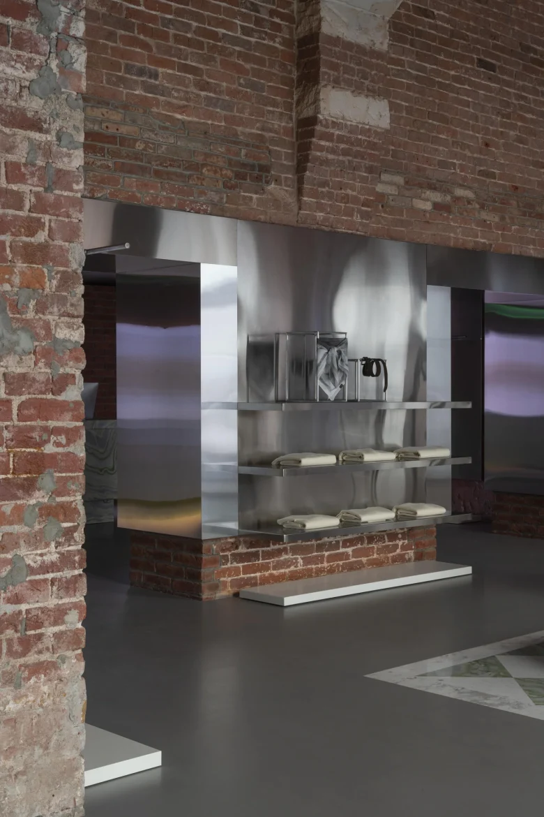
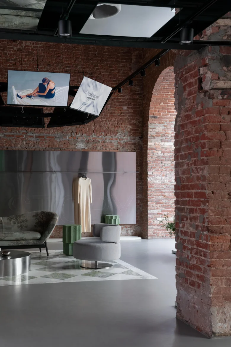
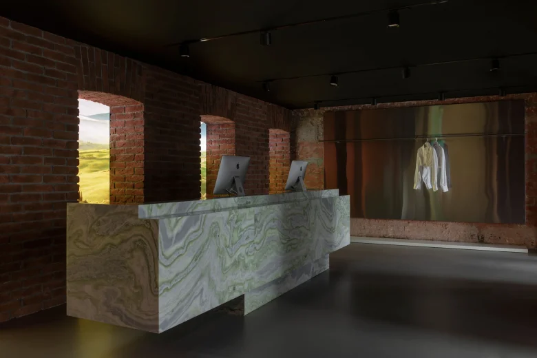
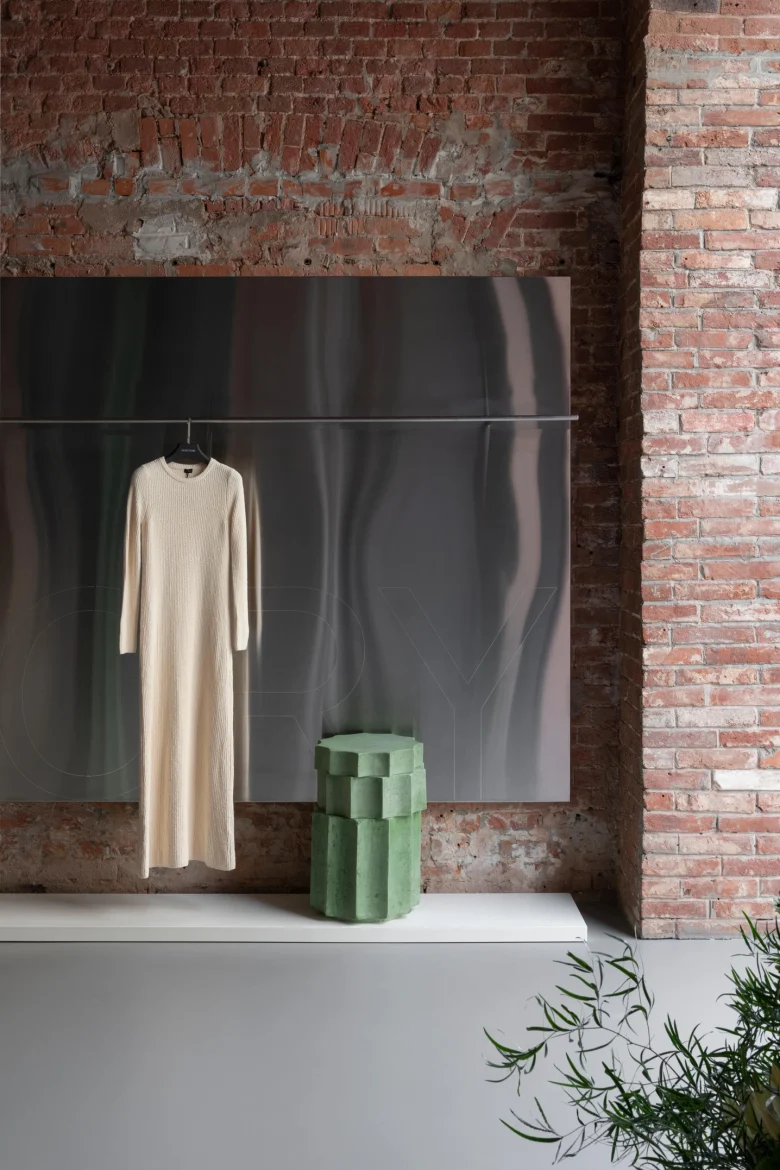
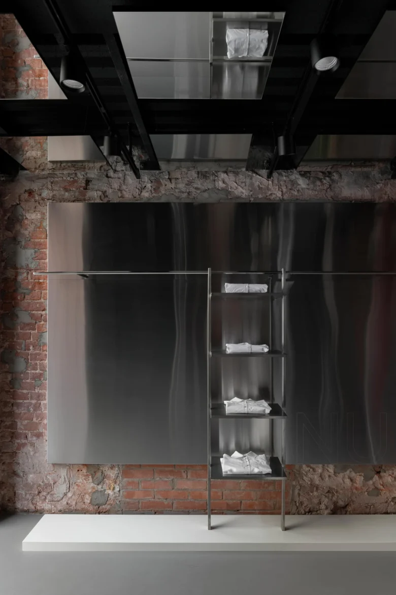
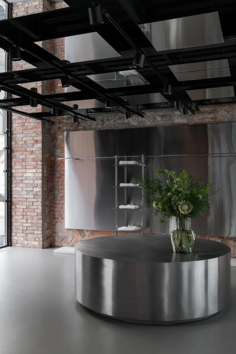
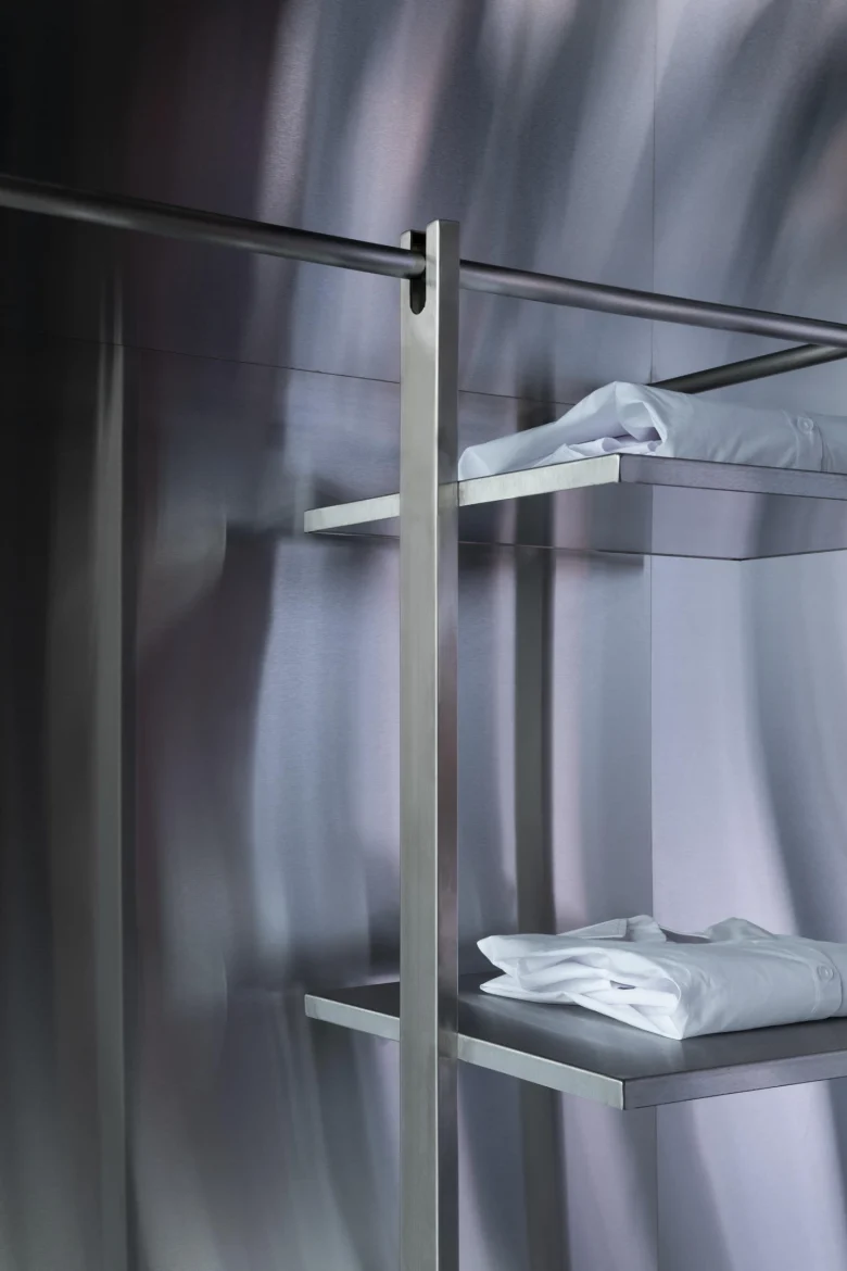
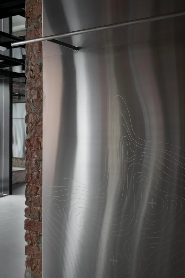
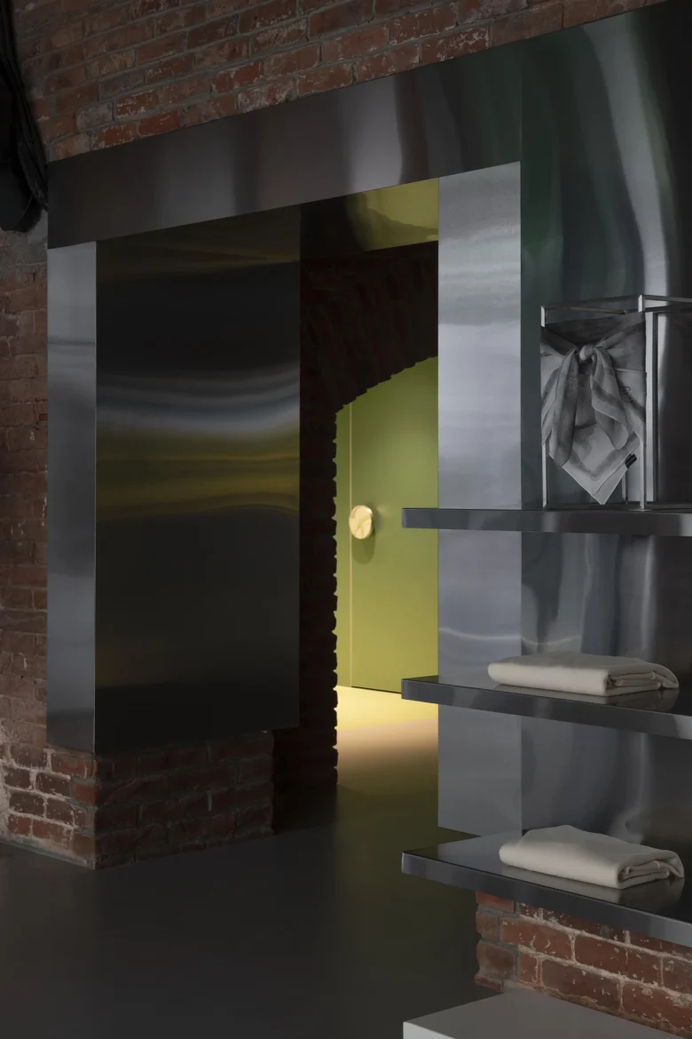
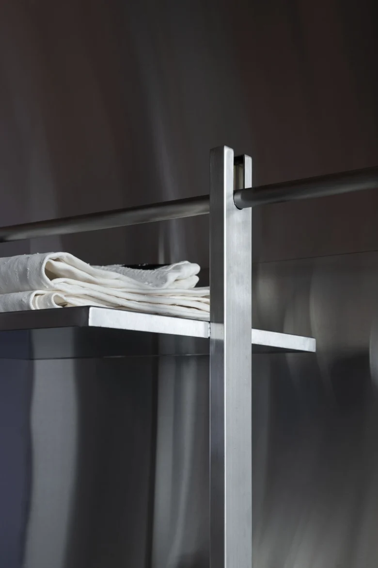
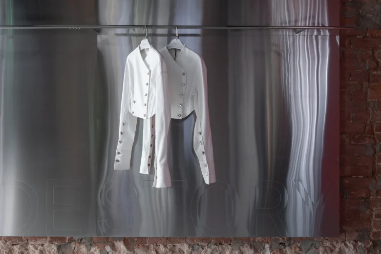
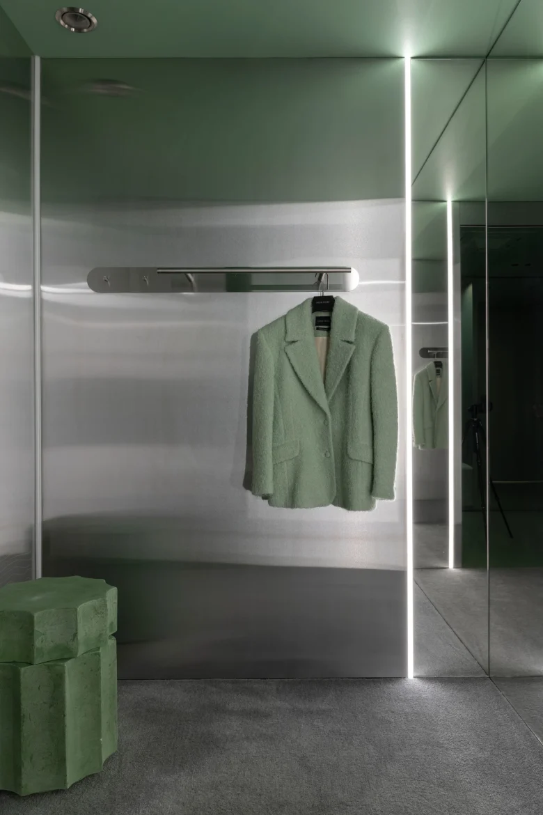
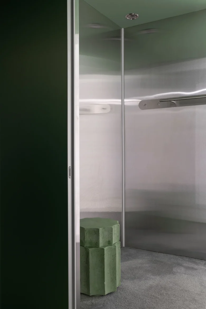
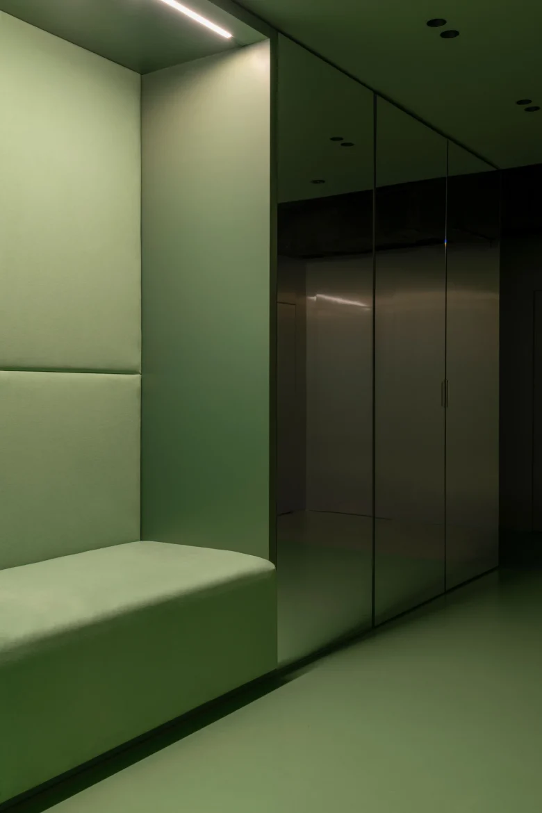
Thus, the center-forming element of the main hall was a stone “carpet” on which the waiting area is located. The texture of stainless steel sheets that cover part of the walls, as well as the glowing surfaces of LED screens in the window niches and above the carpet refer to traditional lighting solutions. At the same time against the background of shiny steel rails with clothes are clearly visible, and the screens become an effective sales tool.
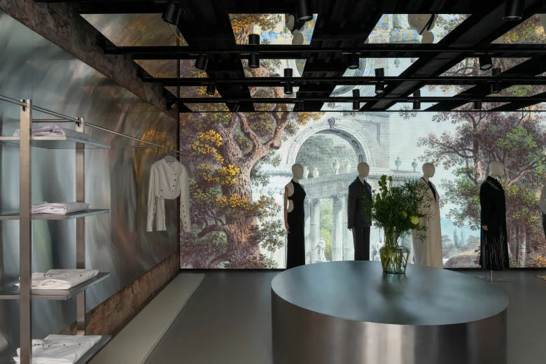
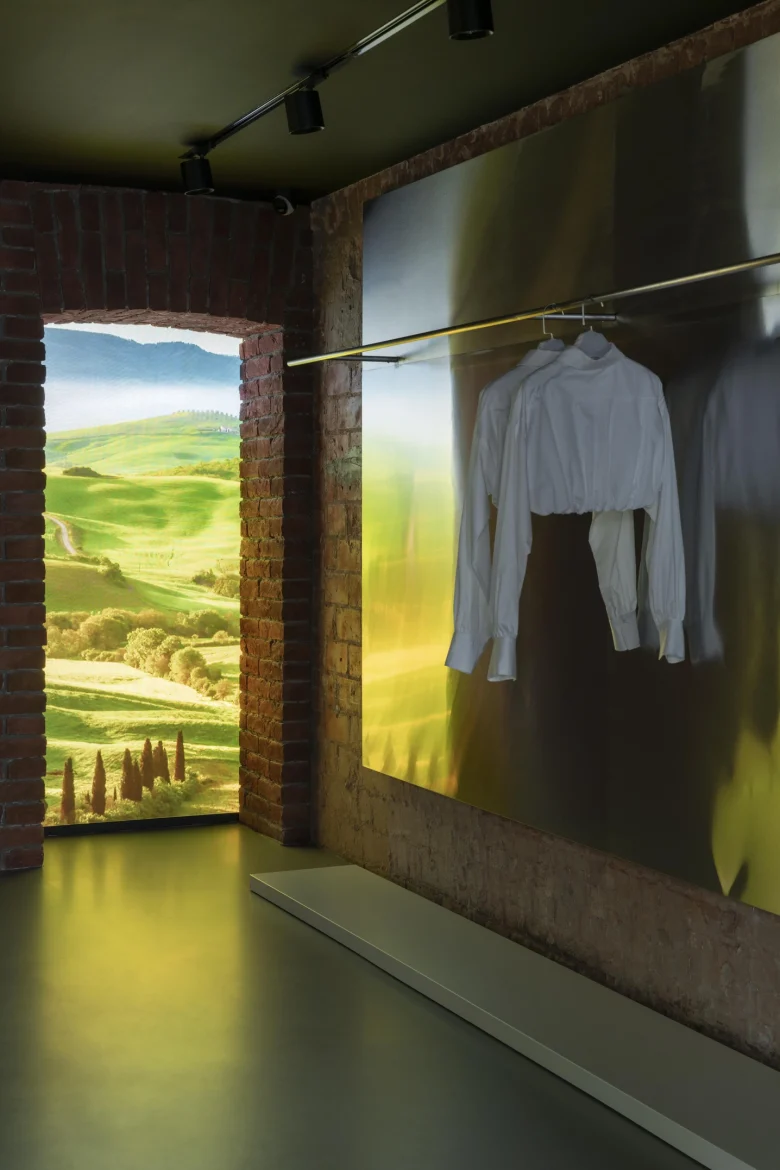
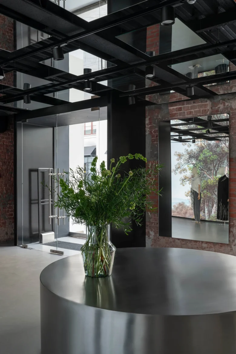
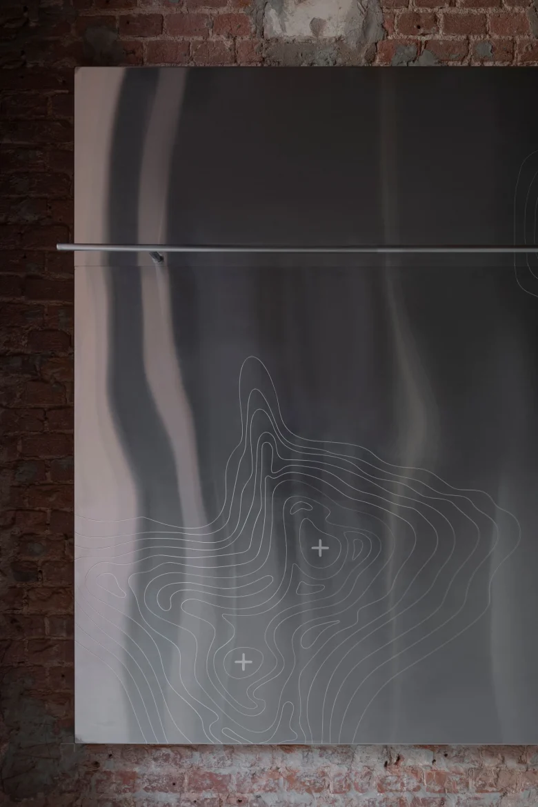
A large full-width screen balances the texture of the old brick and becomes a portal to Italy.
Basic idea
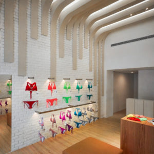
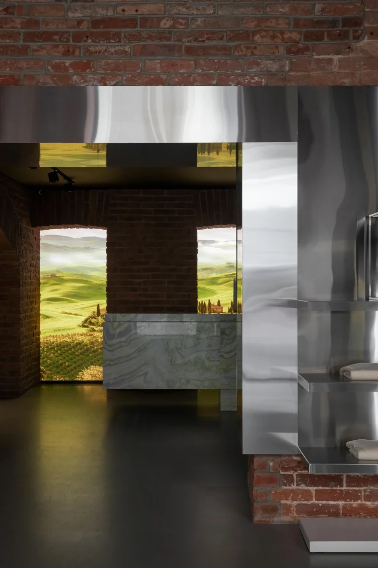
The brand uses Italian fabrics in its production. Based on this fact, we decided to create a modern variation on the theme of Italian palazzo architecture – with its classical compositional symmetry of vaults, windows and floor patterns. The look and layout of the space allowed us to combine in its design the aesthetics of a fashion house and a historical museum, modernity and antiquity. A full-wall screen directly opposite the entrance to the store not only attracts the attention of passers-by, but also allows visitors to be transported to the fields of Tuscany or another part of Italy with the help of broadcasted images – to be on a small journey, while remaining in the center of Moscow.
Finishing materials
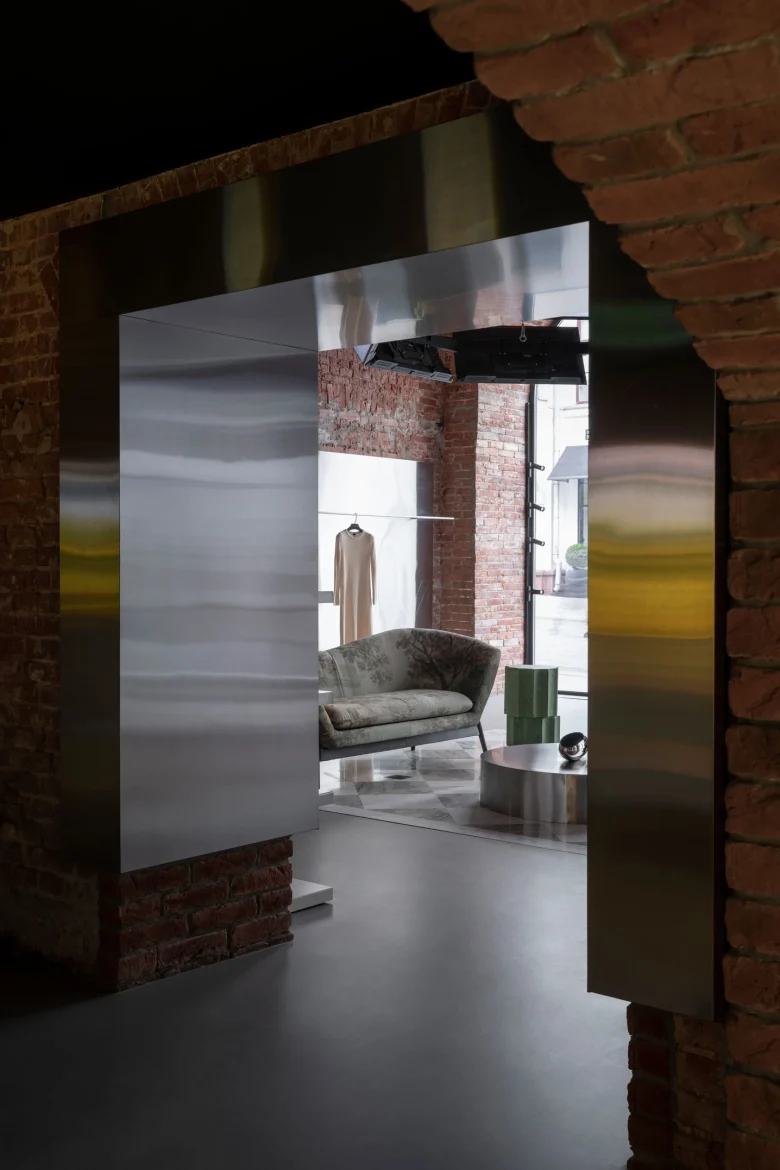
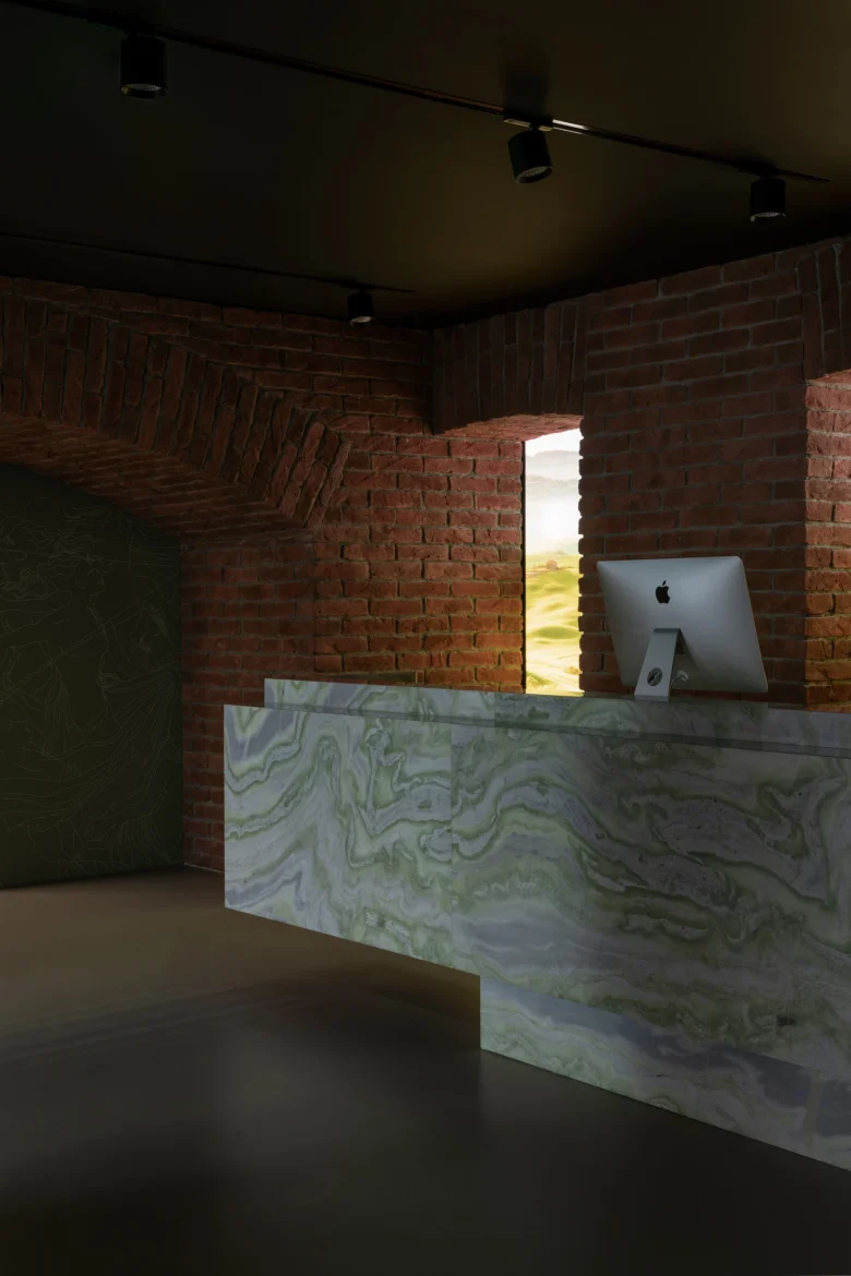
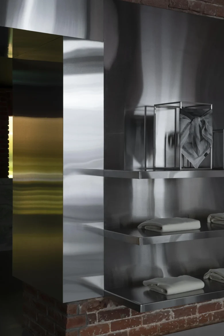
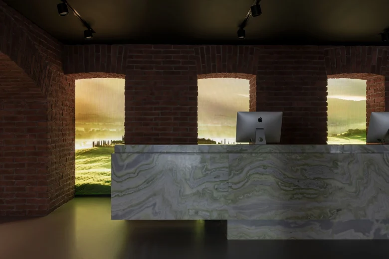
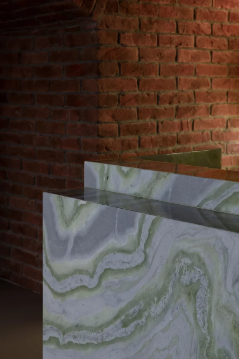
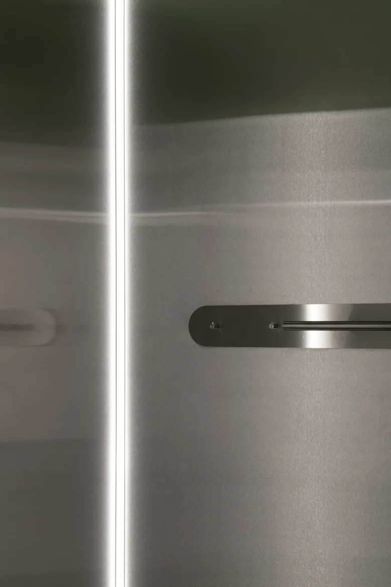
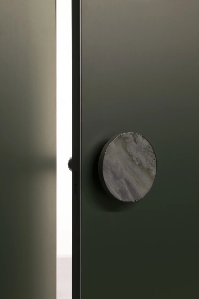
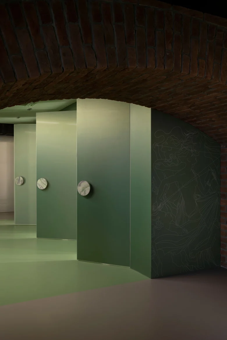
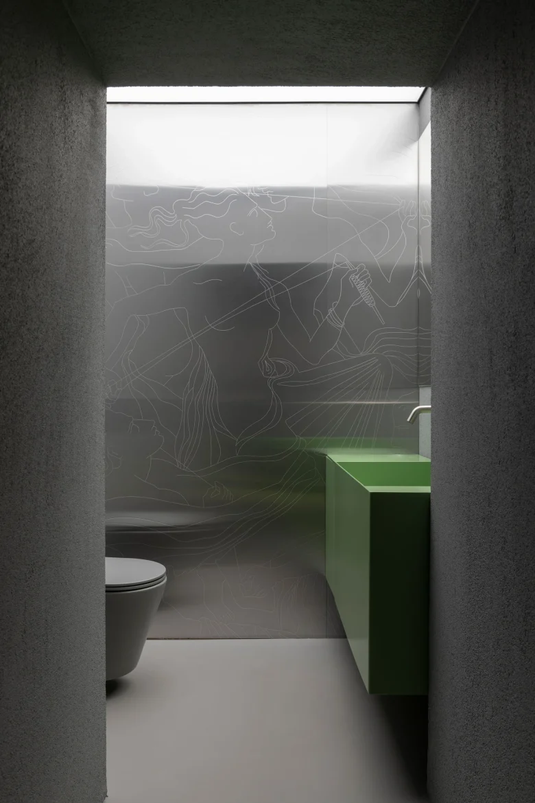
To create an expressive contrast with the brick texture, we also used brushed stainless steel, natural onyx in the decor of the checkout area, and images of antique frescoes in the fitting room area.
Local engraving in the style of graphics of the current collections of the brand was added to the clean surfaces.
Color palette
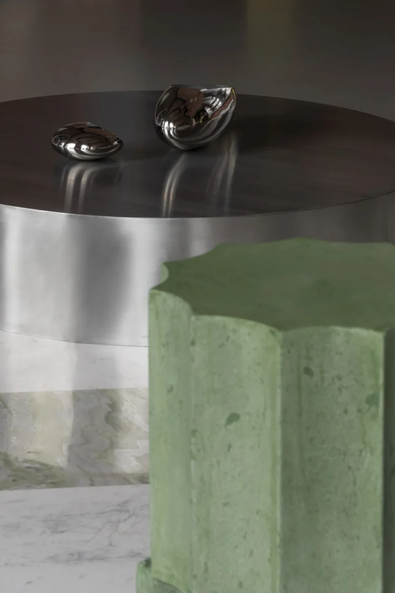
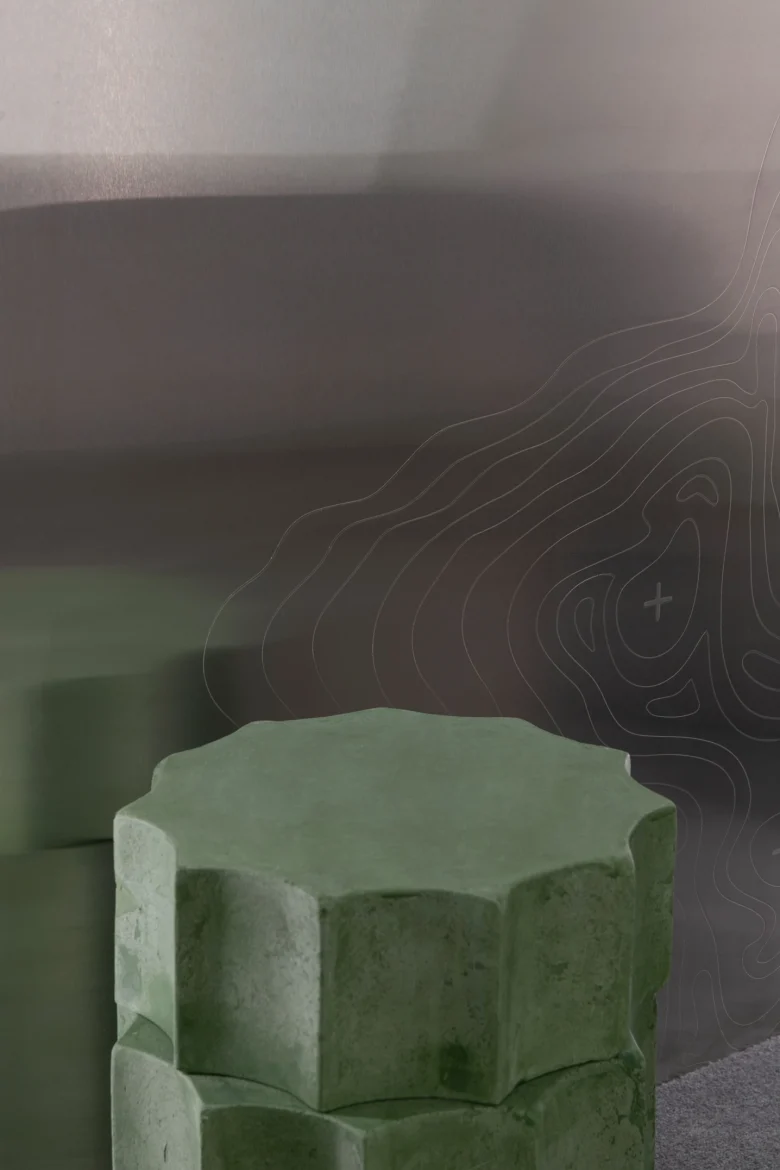
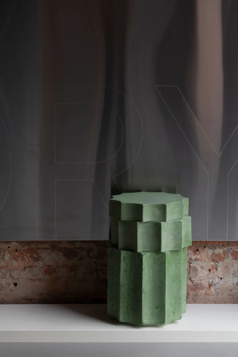
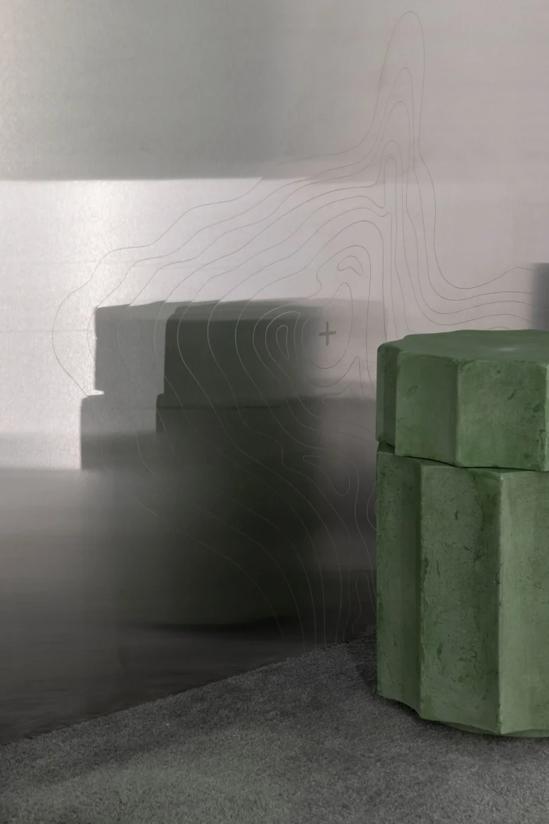
It took us almost two months to find a natural stone that would match the color and texture. We chose onyx because its green shade perfectly matched the red-orange bricks, steel and decor of the fitting room area. But we were unable to find stainless steel with a greenish tint, so we had to experiment and invent a new material that no one had ever worked with before.
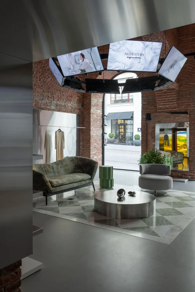
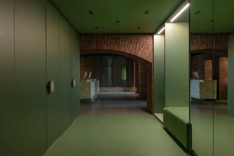
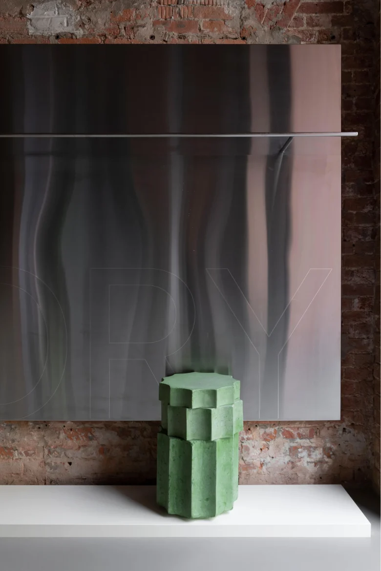
The green color became not only an accent in the interior, but also a reference to the first store of the brand on Petrovka. Besides, it is an important color in the culture of Tatarstan, the native land of the brand’s founders.
Furniture
The palazzo concept is complemented by a classically shaped sofa in the lounge area. It is hand-lined with fabric that resembles ancient tapestries. As a basis for the print on the fabric we took an antique fresco created with the help of AI.
The theme of historical heritage and culture of antiquity was continued with tables in the sales area and fitting rooms in the form of fragments of columns – a signature green shade.
Technological solutions
An important role is played by media panels for brand content, organically integrated into the space. The niches for LED screens became the existing window openings in the checkout area. And the vaulted ceiling of the main hall was decorated with a whole chandelier made of media panels.
The effect of the large screen inside the store, visible from the street through the transparent doors, is enhanced by the mirrored ceiling.
Add to collection