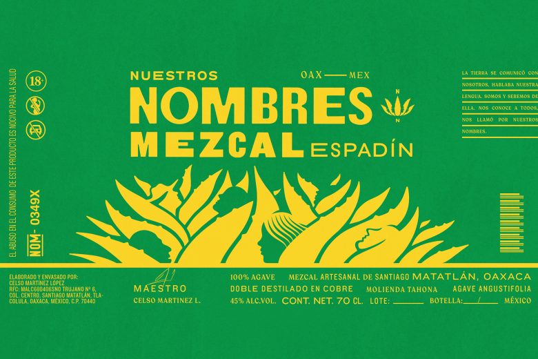
The land spoke to us; it spoke our language.
We are, and always will be, a part of it.
It knows us all—it called us by Our Names.
About
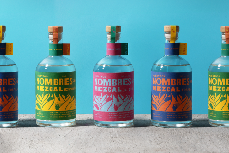
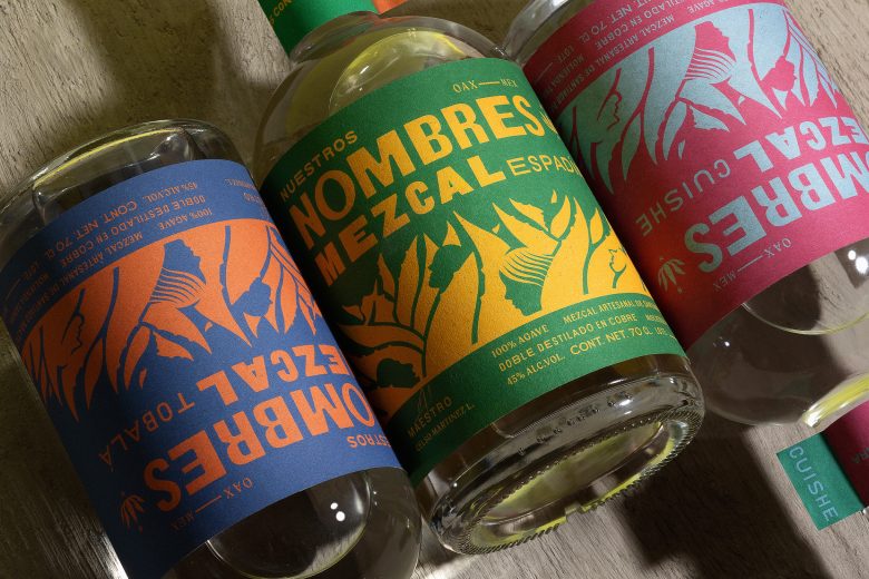
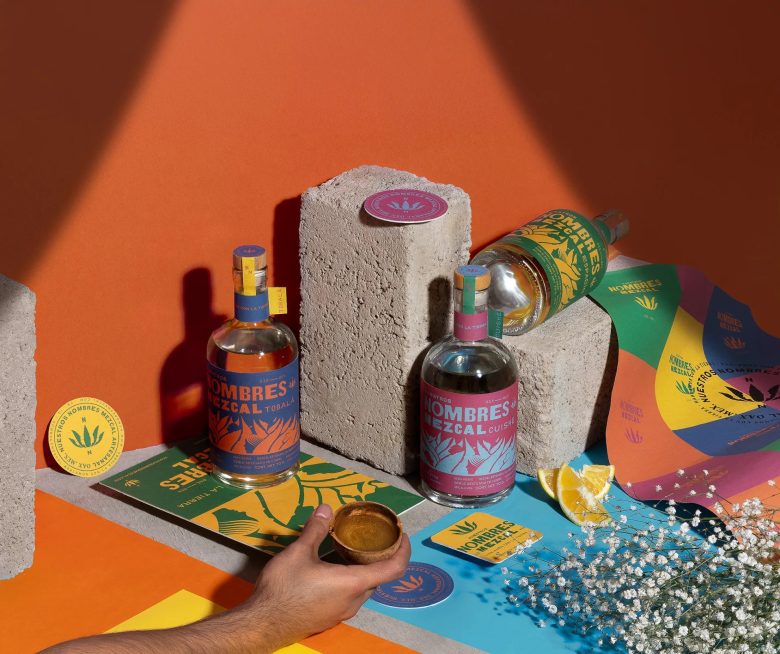
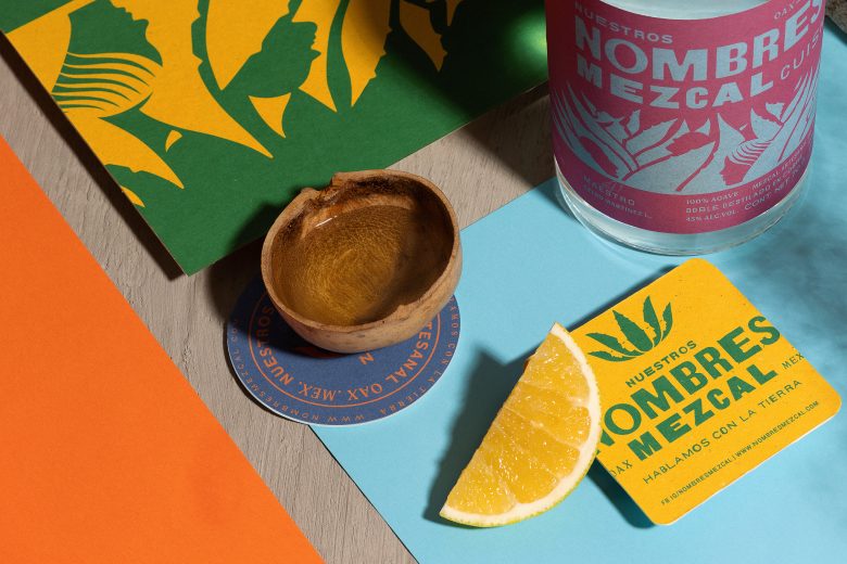
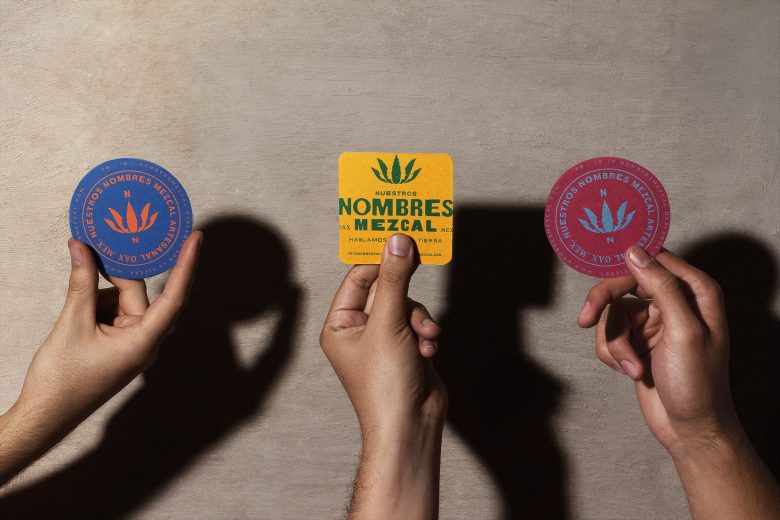
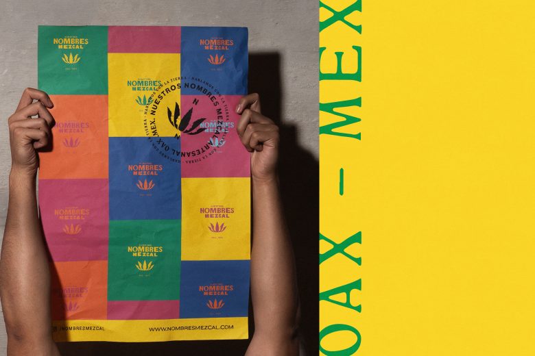
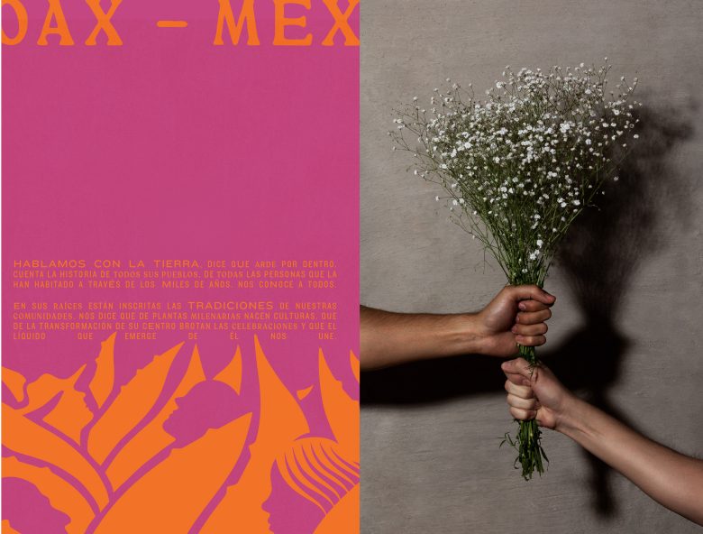
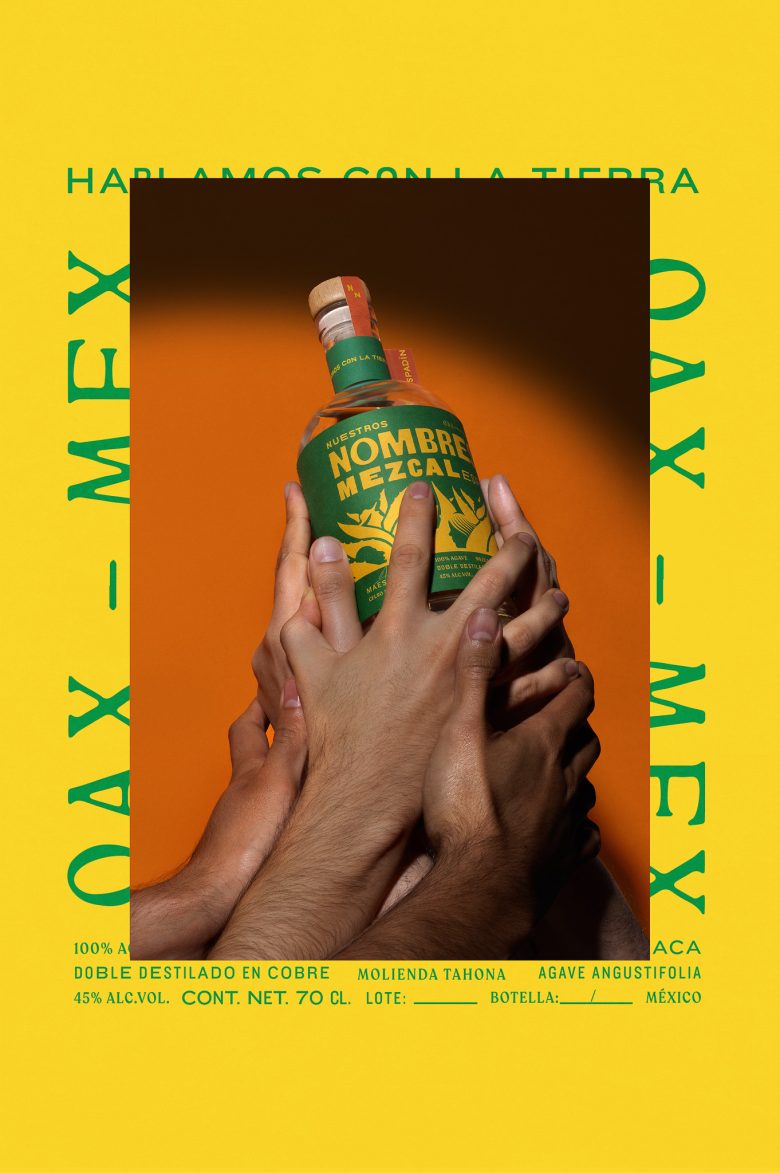
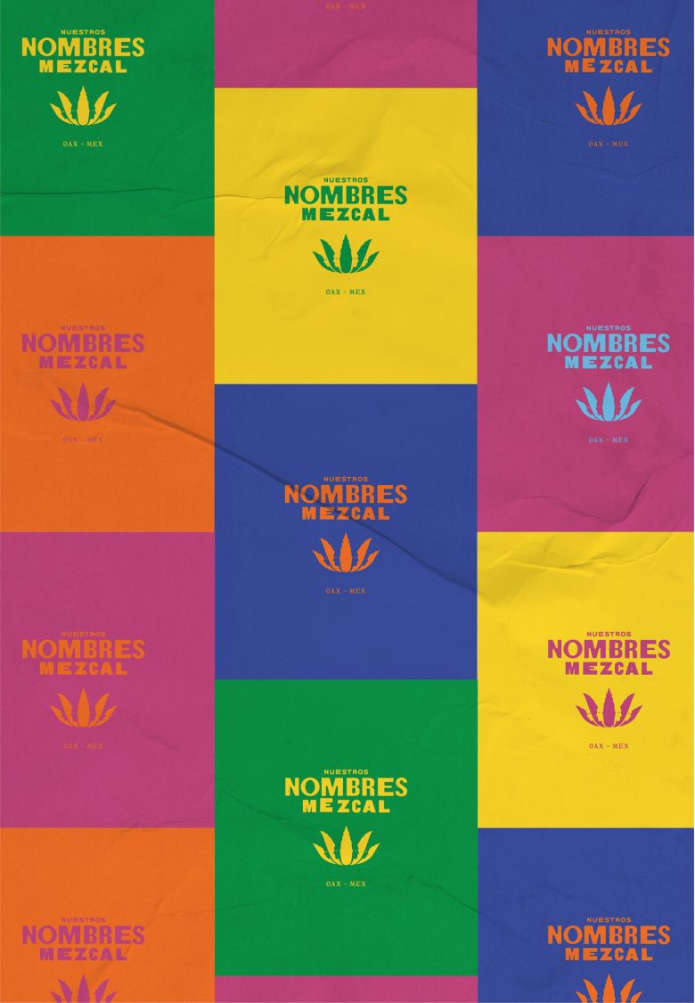
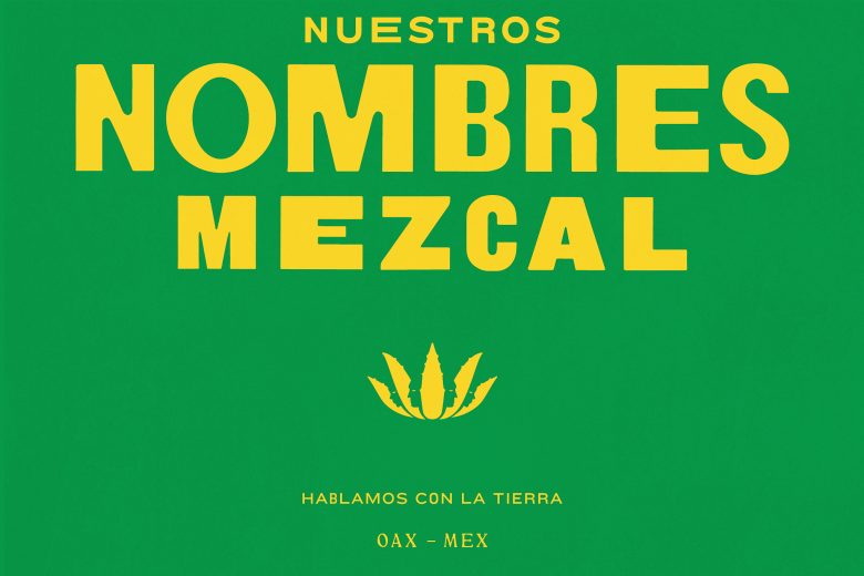
Nuestros Nombres Mezcal (“Our Names”)is a brand built on identity—both personal and collective. Inspired by the deep connection between the people, the land, and the craft, it embodies a visual system that speaks through bold typography, vibrant color contrasts, and elemental iconography. The design system draws from Oaxaca’s cultural richness and the visual language of Latin American collective graphic art, where bold compositions, strong typographic statements, and vibrant colorsserve as tools of storytelling and communal expression. Each label balances simplicity and depth, featuring agave as a symbol of heritage while integrating contemporary graphic elements that highlight the diversity of mezcal.
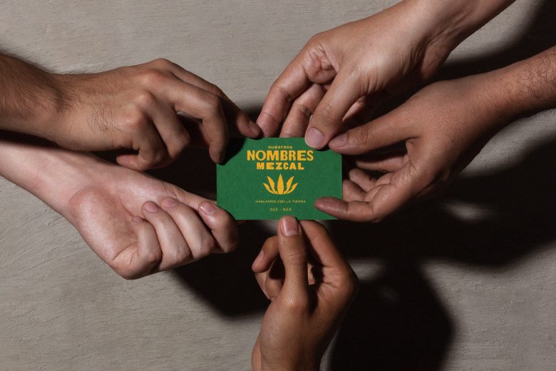
Beyond a visual aesthetic, Nuestros Nombres is a reflection of voices—those who shape the land, the process, and the narrative behind every bottle. A brand that acknowledges the past while looking forward, rooted in community and expression.
Art Direction: Mario Higinio HGNO Ballesteros
Design: Toro Pinto
Copywriting: Olga Villegas, Karen Vizcarra
Photography: Caro Ballesteros
Add to collection
