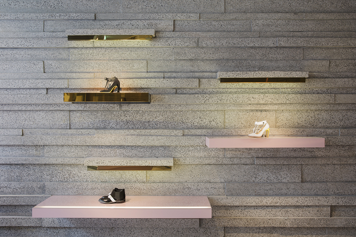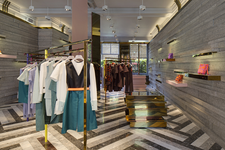
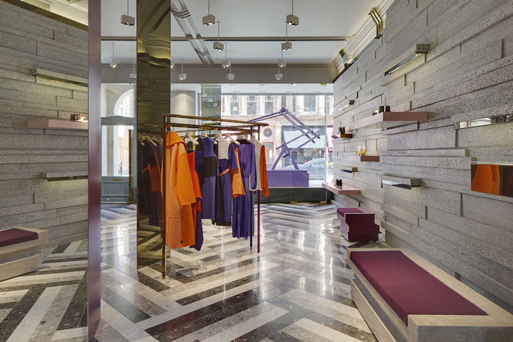

The design concept for the new Roksanda Ilincic shop in London’s Mayfair has been inspired by the collection – drawing on the play of geometries and symmetries. The site is a grade II listed building and in order to preserve the historic fabric of the existing space, the shop is a like a box within the original frame. As visitors enter, the former shop window remains intact, and a new glass screen with an inner entrance marks the contemporary intervention. The window display acts as an interim space between old and new. The walls comprise staggered concrete slabs that repeat as forms for the plinths.

The layering is slightly irregular, giving the impression of a richly choreographed three dimensional pattern. The floor is a composite marble herringbone parquet. Towards the rear, there is a glass wall, which mirrors the glass screen at the front of the shop. The overall colour palette is neutral, with single bursts of colours or mirroring for some of the shelves and rails, which snake around the room, to guide visitors through the space.

The free standing units are made out of glossy lacquered joinery, rose gold stainless steel and concrete and provide display plinths, till and seating. The existing columns are wrapped in angular diamond shaped casing, made from a softly reflective rose gold polished stainless steel. Downstairs, the VIP and office spaces are a mix of vibrant blocks of colour and soft finishes – to contrast with the ground floor shop space. The walls are fabric panelled and each room has its own colour – ranging from yellow, beige, pink, purple and maroon.
Design by Adjaye Associates
http://www.adjaye.com/projects/retail-commercial/roksanda-ilincic/
