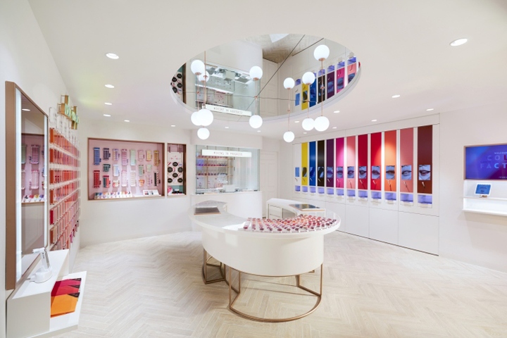

Personalisation and experimentation are at the heart of D&P’s transformation of Etude House. Dalziel & Pow has transformed the flagship store of South Korean cosmetic label Etude House to reflect its new brand positioning. Unveiled in May 2017, the Myeong-dong flagship store, is presented as an interactive beauty destination, the “House of Color Play”, where customers can be creative with cosmetics. Bringing a sophisticated, confident attitude while staying true to the brand’s playful spirit, it expresses Etude House’s refreshed “Sweet Dream” philosophy. The enhancements include digital interactions, a revamped store façade and a cohesive brand identity for Etude House (part of Asian beauty conglomerate Amore Pacific).
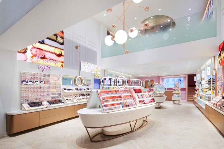
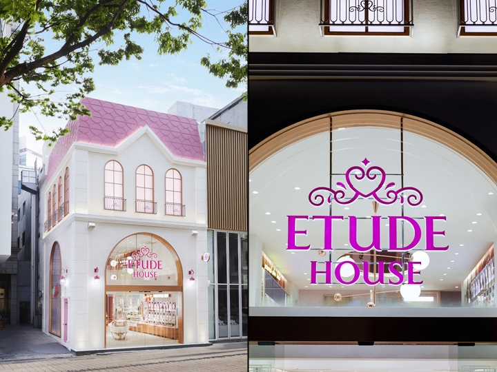
The Myeong-dong flagship store offers a brand experience over three floors. Complementing the refreshed façade are the sleek, on-trend and contemporary interiors that instantly wows customers entering the store and offers a glimpse of the mezzanine level. D&P devised a layered approach for the retail experience principles: essential touchpoints reflect the core store offer for target customers, while signature touchpoints were designed to elevate the Etude House experience above and beyond its beauty retail competitors. Filled with colour, charm and fun, the store has the feel of a real home with a blend of classic and modern details. Though the iconic pink roof has been retained, Dalziel & Pow introduced a secondary palette to balance the brand’s trademark pinks.

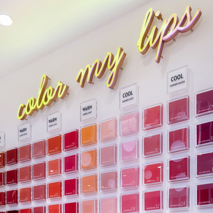
An eye-catching pink door has been installed on the side of a façade, now a popular photo spot for tourists in Myeong-dong. POS and signage have been simplified and clarified, while signature motifs based on hearts and circular patterns were built upon. On the ground floor, customers are encouraged to explore all Etude House products, share looks and socialise around an oval mid-floor table that’s haloed by a modern lighting feature and illuminated wall mirrors. Key Etude House décor details such the parquet floor and Georgian panels have been mixed with more contemporary fixtures and materials. The mezzanine level introduces a Personal Studio offering, My Colour Finder and My Color Draping services for finding each customers’ most suitable shades.
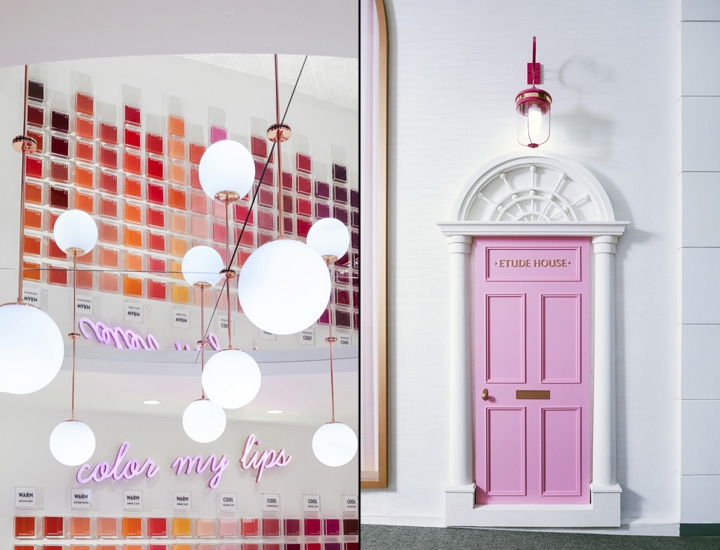
New ‘Find your Look’ demos empower and educate customers, adding a unique Etude House twist by including skincare to the how-to guides. D&P introduced nine signature looks for this section, with beauty experts on hand to demonstrate and advise. Digital is also a strong part of the Etude House experience, with expanded product stories and immersive tutorials. For example, girls can find out their exact skin tone using a specialist face colour scanner. Even more personalisation and play is delivered on the second floor with the Color Factory concept. Customers can blend bespoke lipsticks at the My Lips Bar using cutting-edge beauty technology. They can then select a favourite lipstick case and have their name engraved on the packaging.
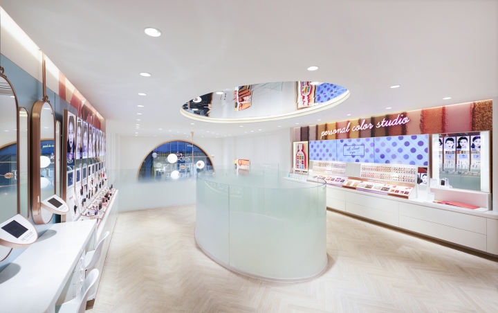
The result is a totally individual product to take away and treasure. Helpful hints and tips permeate the whole store, sharing simple beauty advice in the brand’s distinctive tone of voice, while a strong Loyalty and Gifts offer rewards customers in fun and engaging ways. Recognising the constant presence of social media among its core customers, Etude House also features an enticing Snap & Share space. Etude House, Myeong-dong is emblematic of the brand’s steady evolution over the years, becoming more sophisticated and contemporary with every new phase while targeting customers in their early twenties. The store is currently out-trading the rest of the Etude House retail estate, a clear sign of the power of engaging design.
Design: Dalziel & Pow


Add to collection
