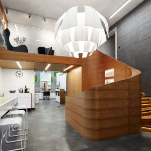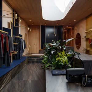


The creation of the concept for the stationary and book store “Athena” has as it’s objective to cacth the visitors attention from their first contact with this place. With refrence to Partenon, temple dedicated to the goddess Athenas, the façade is imponent and striking, presenting doric elements, from the greek architetonic style, keeping it’s modern appearance.

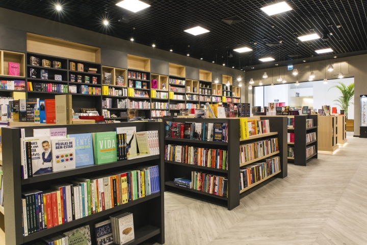
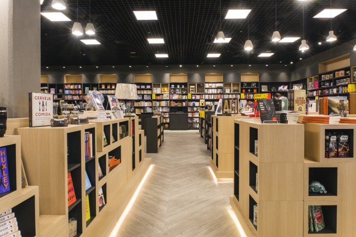
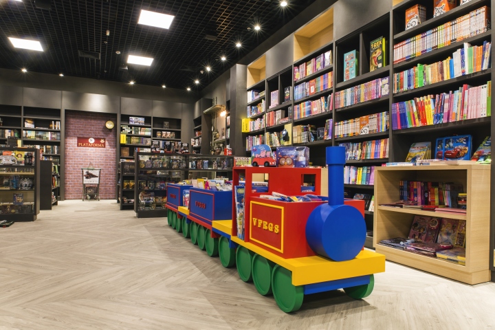
Two big openings composs the access and make the store visible from all anglos. Flexibility and organization were the premises utilized for the development of the store interior. Neutral colours serve as a background for the products to be seen as the charm and colour of the store.

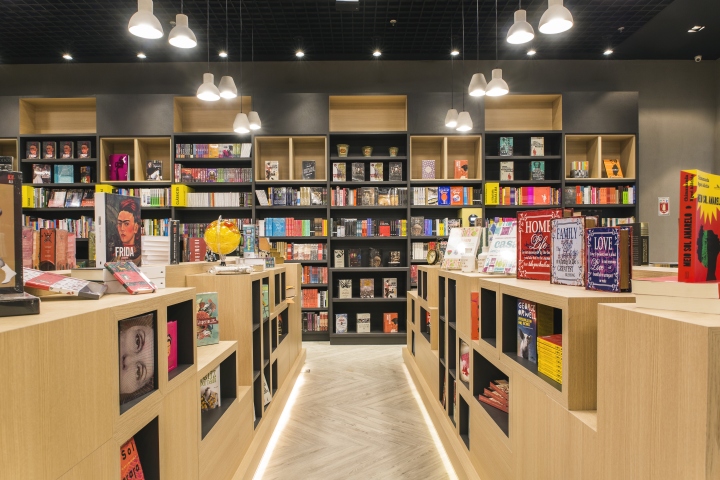
As you enter the store, central islands with light, highlight the copies of the best sellers and more popular books, attracting the visitor to begin his experience there. These islands were thought of as modules which could be grouped together depending on the necessity of presentation.

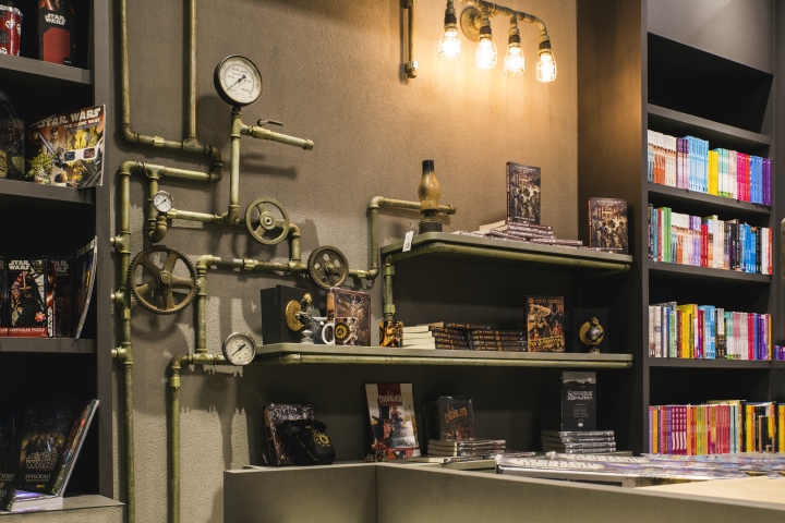
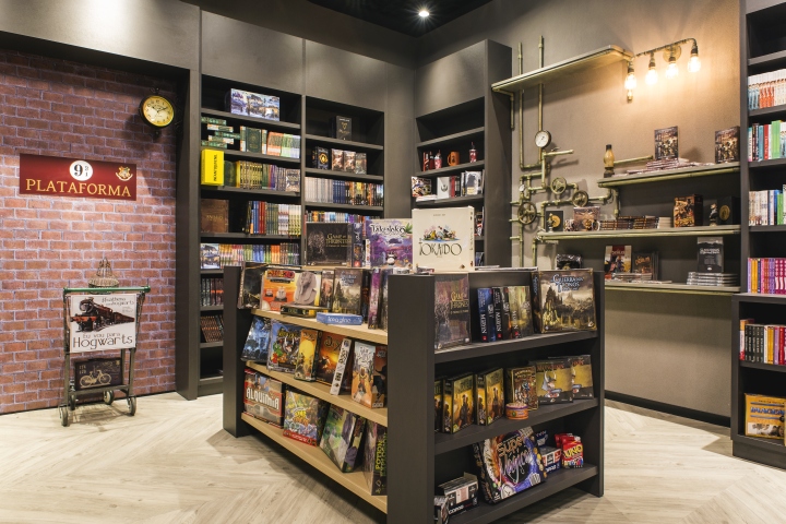
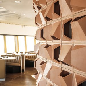
The furniture was thought of as helping the determination of different spaces, with the creation of some elements, which refere to examples of style in each sector. Niches at higher levels help in highliting products and bring moviment to the furniture.

Panels emit diffused light to the room together with spots and suspended lighting which highlight the periferal shelves and central islands, making the environment intimate
and cozy.
Design: Stephanie Gerchmann, Graziela Gavioli / Balé Arquitetura
Photography: Gabriel Santini Pompeo
