

Already one of Chile’s leading department stores, Paris saw an opportunity to reposition themselves within their market as ‘The Destination Department Store’, and be known for service, fashion and style. With Chile’s continued economic growth, and its consumers’ increased awareness of global brands such as Topshop, Zara and H&M, the need to elevate Paris’ position was heightened.

A combination of fashion editing, the introduction of new brands and a more exciting shopping experience will help differentiate Paris from their competitors and become synonymous with Chile’s development by targeting the needs of the emerging, and more affluent, professional middle class.
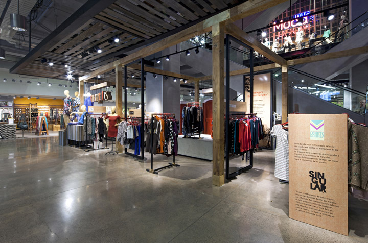
We were appointed by Paris in late 2011 to design a new womenswear concept for their Costanera store in Santiago. The brief was to create an ‘ownable’ and distinct brand personality for Paris that would create standout in a rather homogenised marketplace, and position them as the leader in women’s fashion.
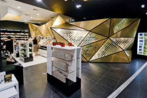
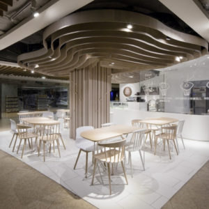
We worked to unify the look and feel of the department as a singular statement, while creating a flexible architecture that could accommodate any number of brands. We sought to use an extensive varied mix of natural, rich, and urban finishes and textures to enhance and add personality to the store, as well as creating individual distinctive looks for the areas within the department. Using distressed and exposed details we created an urban feel which is complemented with rich high-finish materials such as brass, copper and golden mesh. These combine with experimental finishes to showcase a contemporary, eclectic and theatrical premium experience.

The departments are sub-divided into different areas – classic, casual, youth fashion/denim and lingerie – each of which has its own distinctive look and feel. Lingerie feels feminine and
romantic through use of full-height freight cut screens, white ash timber cladding and high-end dropped lighting, whereas the denim department is a strong young urban space created through use of distressed timber planks and stencil colour overlays, wrapping from floor to wall.

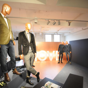
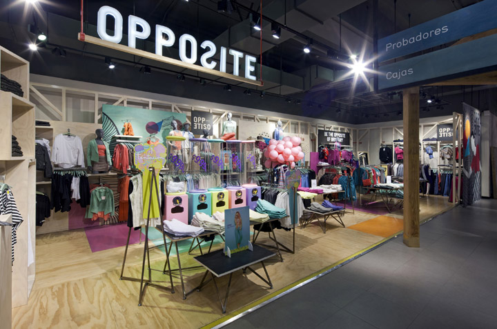
As well as bringing structure and control to the sub-brands, we were briefed to re-brand Paris’ youth fashion label ‘Opposite’. The design is bright, bold and playful, and includes a new logo design, illustration and a new family of fixtures. A bespoke chain curtain was commissioned to create a dramatic entrance to the space.

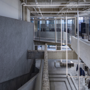
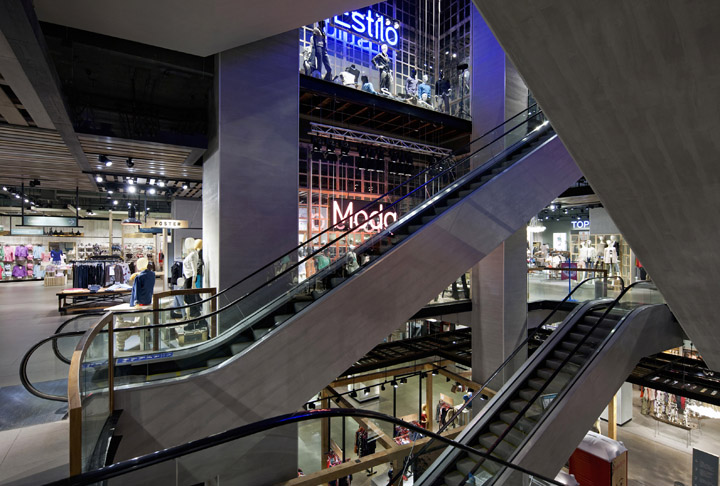
The main feature of the whole store is a huge atrium feature that runs through the heart of the building. Large internal windows on both sides are used as a showcase for seasonal VM and
demonstrate to the customer which department is on which floor. Overall low levels of ambient lighting overlaid with dramatic theatre lighting, super sized neon letters and ‘Vitra Algues’ all add to the drama. The customer can stand in the basement and look right the way up through the store to the top floor. ‘Green walls’ create dramatic features at each of the five mall entrances.
A series of patterns and textural finishes were created to identify key service touchpoints and make these areas recognisable to the customer. Destination cash desks feature large expanses of concrete, with a concertina system of patterns as the backdrop. This ‘language’ continues to the fitting rooms, with oversized panels at the entrances, finished in a gold trim, giving a feeling of luxury. Each room has beautiful wallpaper and each curtain is hand made, reinforcing the incredible attention to detail.

The store creates an experience comparable with any around the globe. Following its opening in July 2012 the Costanera womenswear floor has become the most successful in the whole Paris chain.
Designed by Dalziel and Pow


Add to collection
