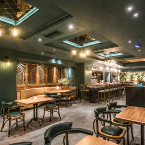

This restaurant stands out as a tranquil oasis in one of the bustling districts in the city. It was the designer’s intention that this eatery would not only interpret, but also rise above its buzzing environment and the diverse local food culture, and to speak for its unique culinary triumph. The designer inspired the owner to adopt those very elements of a dairy farm rather than any eye-catching yet out-of-place decorations in design layout. Through spatial arrangements, customers would enjoy a moment of rest and freshest food available with its subtle, natural settings. Free from over decoration, the goal was for each customer to experience a relaxing environment like entering a farm.

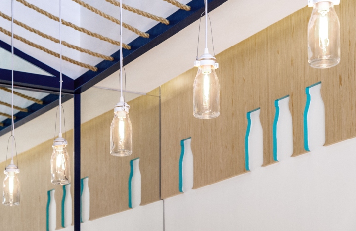
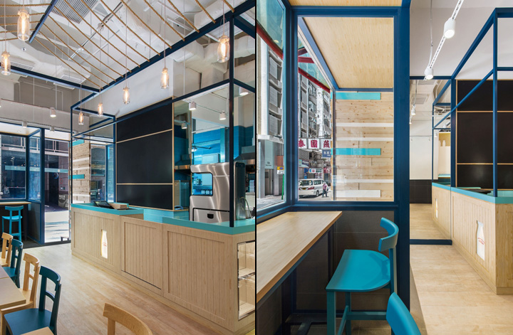
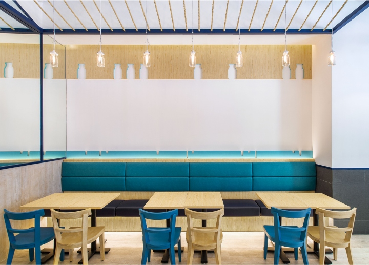
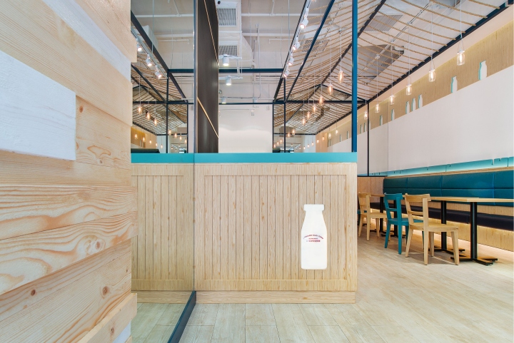
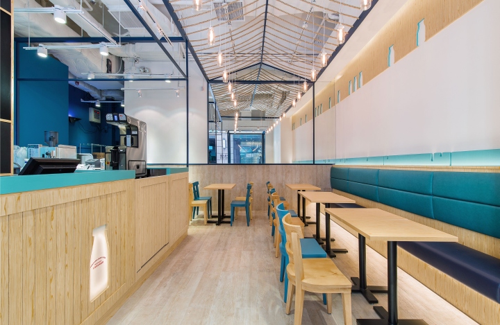
The design approach begins with the basics to match the restaurant style and to become perfectly interwoven with its environment throughout. It was intended to introduce subtle dynamics in the minimalist layout, reminiscent of the farm hut for livestock. Its underlying structure is expressed by the ropes commonly found in farms. The organic pattern on wall traces the outline of milk bottles and water droplets. Also referencing the natural landscape are the sky-blue booth seats and walls, as well as fences of varying hue throughout the restaurant, strategically placed to create multiple layers of experiences. Together with the canary yellow tone of the wall and desks, the result is a sun-lit natural landscape within the complex neighborhood that is both youthful and historic, taking the customer’s perception back to the functional fundamentals of design.

Material selection is kept natural and simple without comprising the attention to details. The interior appears well-lit with sunlight with lighting fixtures made of actual milk bottles. The designer has also deliberately organized individual spaces to contrast the lively glamour on the outside against the serene restaurant interiors that speak through its aura instead of decorations. The design aims to offers a peaceful corner on the busy street to enjoy before and in between work hours, satisfying both the stomach and the mind.
Design: Joey Ho Design Limited
Photograpy: Dick Liu
