![](https://retaildesignblog.net/wp-content/uploads/2016/01/Barbon-design-packaging-by-PELTAN-BROSZ-300x300.jpg)
![](https://retaildesignblog.net/wp-content/uploads/2012/07/Artease-Cafe-identity-by-Splash-Productions.jpg)
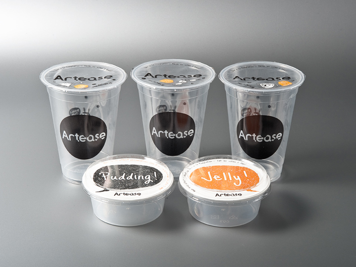
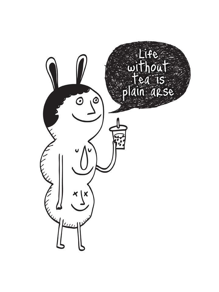
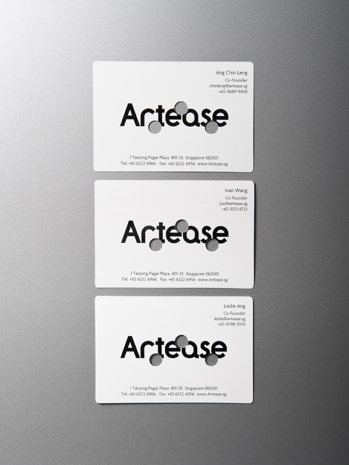
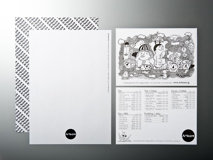
With a cheeky tagline like that, who can resist being part of the fun? Three punched-out holes in the logo recall the tapioca ‘pearls’ that give bubble tea its name. The irreverence shows up too in the made-in-Singapore mascot and illustrations. We have helped create a truly local rendition of the Taiwanese-originated beverage – that’s the Artease difference in a crowded market.
Designed by Splash Productions
![](https://retaildesignblog.net/wp-content/uploads/2012/07/Artease-Cafe-identity-by-Splash-Productions-04.jpg)
![](https://retaildesignblog.net/wp-content/uploads/2012/07/Artease-Cafe-identity-by-Splash-Productions-03.jpg)
![](https://retaildesignblog.net/wp-content/uploads/2012/07/Artease-Cafe-identity-by-Splash-Productions-02.jpg)
Add to collection