
Neelkanth Jewellers Store by 4D, Bangalore – India
posted by retail design blog on 2015-07-31
Bengaluru
Add to collection

Neelkanth Jewellers:
A jeweler is an important part of family occasions and there is a tremendous amount of trust and respect for the family jeweler. In Bangalore, the Neelkanth name is synonymous with tradition and quality in gold, diamonds and silver. The store has been in existence for over 35 years and has a loyal clientele which always returns to the store to make purchases during special family occasions as well as for festivals and weddings.
Brand brief:
Having established itself as a trusted family jeweler it was felt that Neelkanth Jewellers would now like to make a foray into silvery jewellery since demand in this category was growing. Though the store did have a silver jewellery section there was a need to create a separate and distinct identity for silver. The design brief also stated that the environment created needed to make the customer feel comfortable and pampered. Here he/she could take their own time to browse through the items on display in a one-of-a-kind ambience and completely take in the pieces on display leading up to a purchase and the eventual feeling of pride in owning a piece from a classic lineage.
Design strategy:
The design strategy was simply this – create an ambience where the customer feels welcomed. It was also important that in this ambience every silver article would be displayed effectively and with charm so that the customer could admire the intricate detailing of each piece. Ample space was also a pre-requisite so that the customer did not feel crowded in and the elegance of the pieces on display was not compromised. Jewelry buying is a collective process and one that needs patience and ample space so that each piece can be judged from all angles.
Store design signature:
The theme of the brief was that Neelkanth Jewelers wanted to express the thought, ‘You deserve the best’ to every customer who walked into the store. Every carefully chosen piece in this store was exceptional in both design and quality and that needed to come through clearly. The inspiration behind the store design would be the classic pieces on display as well as the type of customer who would be a regular here. He/she would be someone who enjoyed a premium lifestyle and was comfortable and at ease around luxury items. This was the key to the art gallery style of interior design. Additionally, this style of display endowed each item with a distinctiveness which enhanced its value in the eyes of the customer.
Store front design:
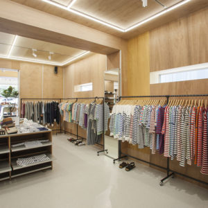
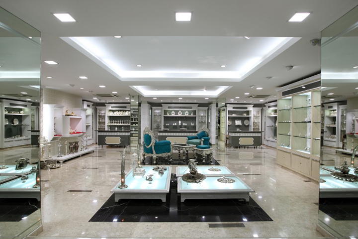
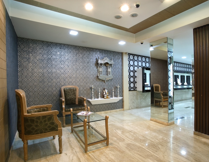
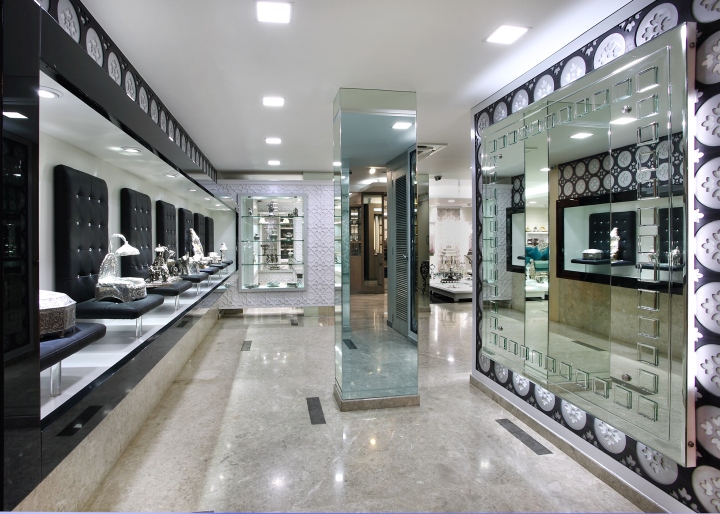
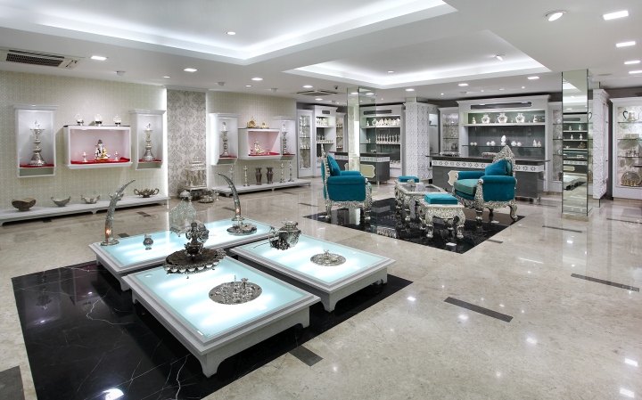
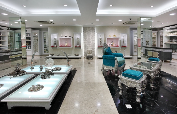
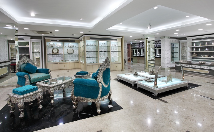
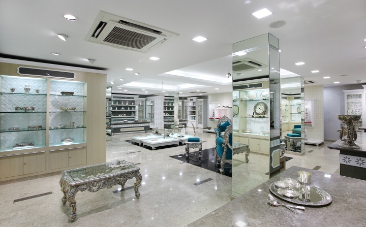
Since this was going to be an extension of an existing store and not a separate store, it was felt that a gallery style would be best. The silver articles would be displayed in rows in a specially styled platform with dedicated lighting which would highlight each individual product. A seating lounge was placed adjacently, where customers could relax and browse through product catalogues. Here the customer would feel comfortable discussion the merits of a piece with an informed store assistant. The buying process would thus be much more satisfying.
Store interior design:
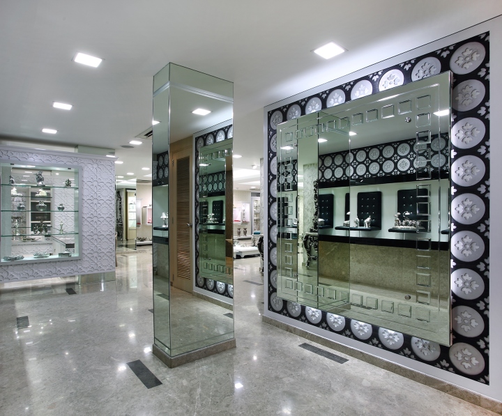
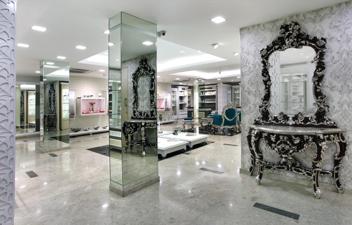
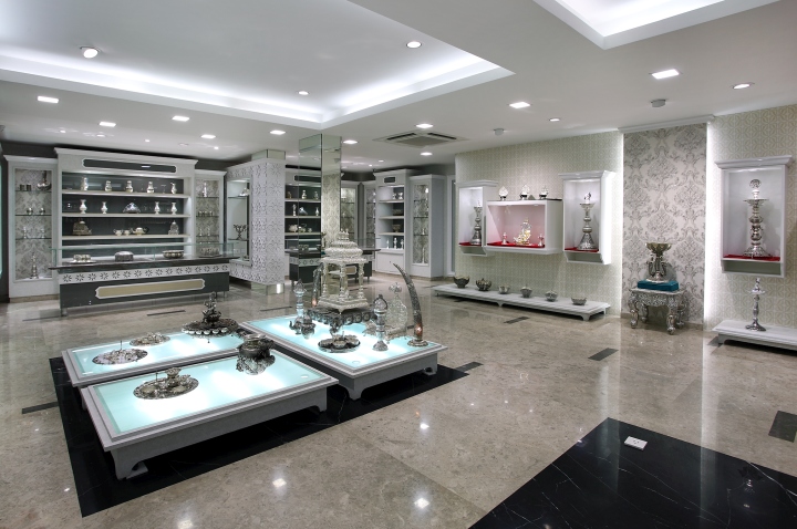
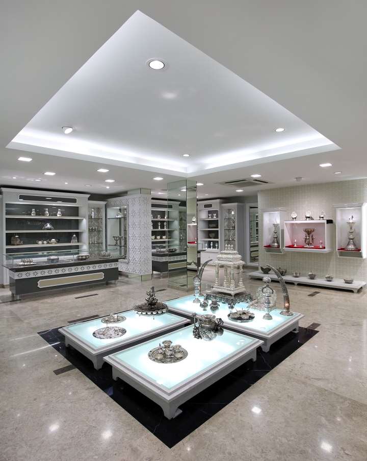
The interior of the store was therefore, a combination of luxurious living space and boutique gallery. The color tones were muted grey and white with different types of material from texture paint to wall paper, painted glass, carved panels and contemporary designed cornices. The combined effect showcased the designs beautifully. The floors were made with highly polished silver grey and white marble highlighted with black marble patterns, all intended to channelize the flow of customers. The direct and indirect white lights added a burnish to the silver items on display, while the ceiling design blended perfectly with the floor pattern. The strategic use of different levels highlighted and toned down specific areas and added some ‘drama’ and mystery to the overall environment.
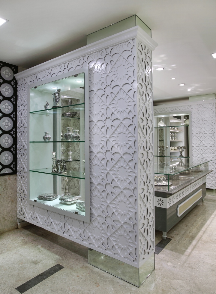
The right type of lighting can make the product a hero and turn a store into a place where the customer’s senses are heightened. This in turn influences buying decisions. Keeping these in mind LED lights have been used freely. A combination of individual lights built into shelves and in the fixtures completely lit up the products, almost like they were bright stars in the grey sky. Lights have been used on the floor as well to continue the dramatic feel giving life and a dramatic touch to floor articles like silver waterfalls, lamps, etc. The furniture added the right touch of luxuriousness with a distinctive pearl white look amidst the backdrop of polished grey to highlight the fine detailing of the products. Even the counters carried this look. A delightful touch was the use of uneven sized niche displays balanced out by a contemporary feel allowing the more expensive items to be staged and shown to advantage.
Innovative use of materials and finish:
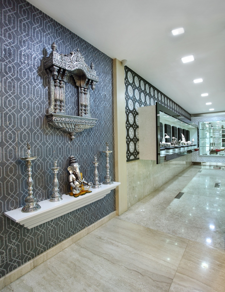
Unlike gold, silver has a glitter and sheen of its own hence it became necessary to use material carefully so that the sheen was not subdued and the products were always shown well. The liberal use of partially finished white marble with inlay, engraved double layered jollies with paint finish, dual tone wall papers and fabric in the highlighted areas, painted and white frosted glass have all been used carefully so that the sheen is not lost. In fact, these materials have given the items on display a special depth which makes the buyer feel like it is worth every rupee of its value.
Lighting:
A significant part of good design is lighting. In this project, the liberal use of LED lighting gives the products a distinctive edge. It also highlights without being garish and doesn’t add anything unnecessary that would make the products appear unnatural.
Store zoning and layout:
Since the store area was limited to 1500 sq. ft. it was important that all products be shown in a manner that nothing was lost or ignored. Starting with the entrance where new arrivals and large items such as a mirror stand and statuettes were displayed the store was then divided into sections for gift articles, jewelry and furniture. Within these sections too, there were differences since heavy furniture needed to go against the wall while corporate gifts had to be displayed differently from other gift articles. Every article was comfortable in its own space and almost ‘belonged’ there.
Visual merchandizing and display:
Since each product has its own appeal and own story, visual merchandizing is almost in-built into the product. The associated props could then become characters in the story of the product.
A sense of drama aids the buying process, so the visual merchandising by adding to the display story gave each item, even the smallest and simplest ones, a reason to be purchased.
Shop fitting design:
All furniture and design for the interiors almost mimic the products. This clever use of design is done to ensure that the product remains the cynosure of all eyes. Always.
Design: 4D


Add to collection