Add to collection
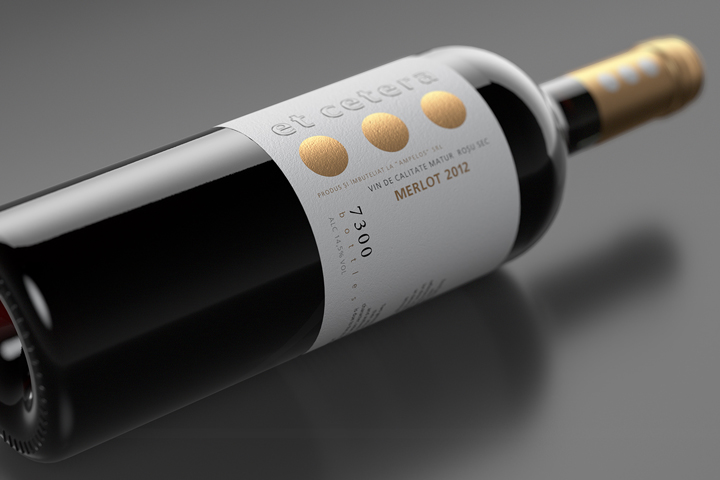

While working on this project the team had to maintain an already well-known design with all its recognizable elements. At the same time, it was necessary to highlight the unique and exclusive character of a certain product line. In order to do so, the agency’s specialists have introduced a set of changes that made the overall look more neat and classy, while using an already present set of graphic elements.
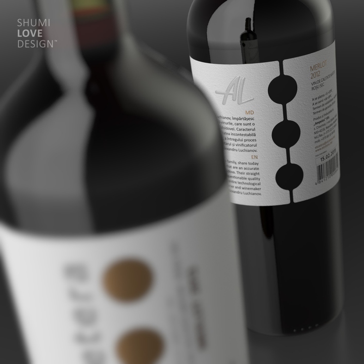
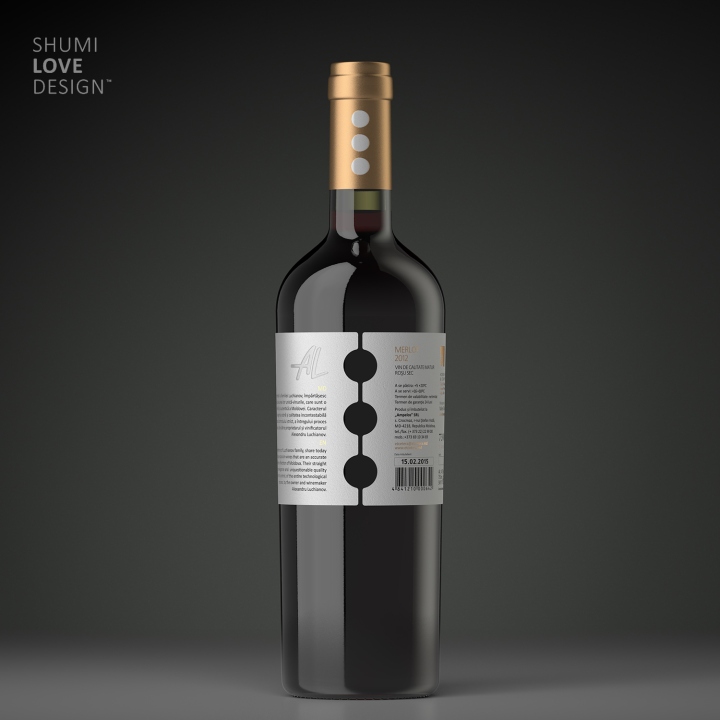
First of all the overall length of the label was extended in order to wrap the bottle entirely and increase the useful space for placing information. At the same time, the overall style remained intact while the main graphic elements were processed with special post-printing techniques in order to emphasize their visual impact.

The main stylistic element of the brand – the sight of ellipsis – was used several times in different zones of the package in order to amplify the brand’s recognizability. Besides the central part of the label, where the sign is executed in gold foil stamping, the ellipsis is also present on the bottle cap, as well as the back of the bottle, where it is formed by the empty spaces between the edges of the label. This serves as a strong counterpart to the frontal image and amplifies the brand’s impact.
Designed by Shumi Love Design
http://www.packagingoftheworld.com/2016/08/et-cetera.html


Add to collection