
J. Kumari by Ultra Creative
posted by retail design blog on 2019-07-02
Add to collection
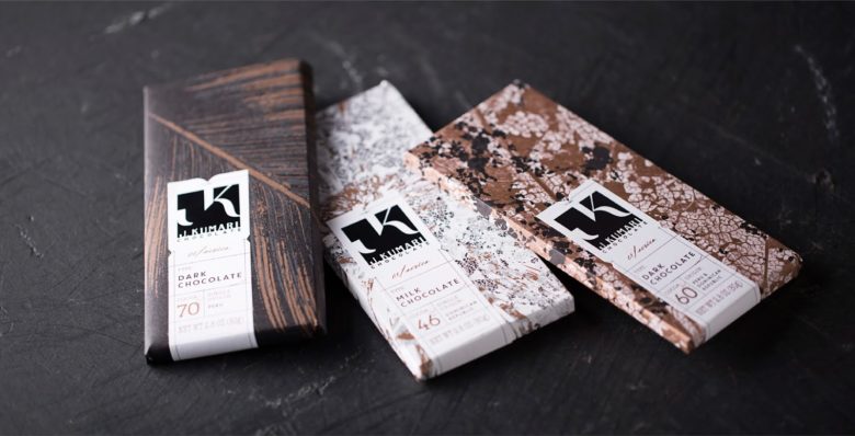
J.Kumari Chocolate, a boutique chocolate studio in Minneapolis, sought an identity that exuded luxury. These high-end chocolates, inspired by the traditional French technique, are not only delicious but also beautiful.
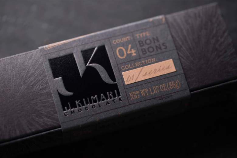
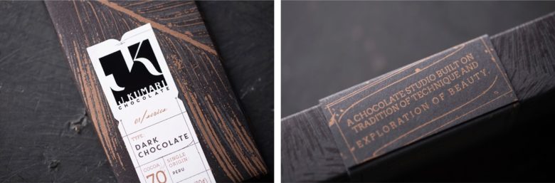
In the brand development phase, careful consideration of the first impression – which Janel Sharma, owner of J. Kumari Chocolates wanted to be a little intimidating – shaped much of the design choices from the use of black on black and metallic inks to the debossed mat foil logo.
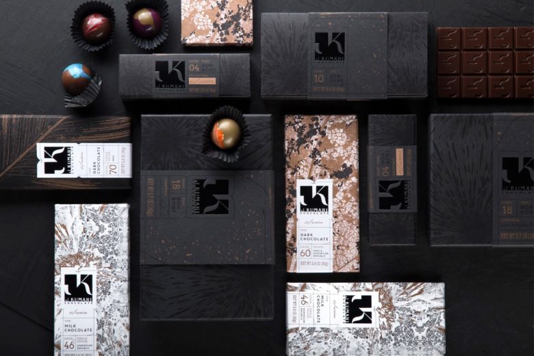
There are three paper wrapped chocolate bars and 3 paper boxes for different amounts of chocolate bon bons – the 2, 4 and 16 counts. All bon bon boxes come with a sleeve over-wrap and chocolate bars have a hand-applied sticker that wraps from front to back.
The overall design takes cues from the natural world’s transformative powers: the rich matte packaging has details of leaf textures and complex crystal formations in shimmering copper. This allows the logo’s glossy black body to shine and provides a backdrop to the contrasting splashy pattern work which is also reflected in the painted artistry of the finished chocolate bon bons.
The resulting presentation feels mysterious, strong, and high-end, reflecting the precision of the craft and artistry of the creations.
What’s Unique?
The logo was debossed with a mat foil. The main “trick” was using minimal colors, black on black and metallic inks to create a cohesive line of bon bon boxes and chocolate bar labels and wraps. The sticker for the chocolate bars was diecut.
Designed by Ultra Creative

Add to collection