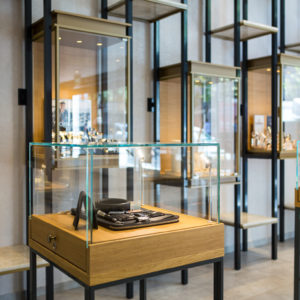
Nestled within Antwerp’s pedestrian-only Green Quarter is the Belgian city’s former military hospital, a neoclassical monument that’s now home to the August hotel. In transforming the listed building and its gardens into a serene hospitality spot, local practice Vincent Van Duysen Architects (VVDA) balanced a careful restoration (in collaboration with Wouter Callebaut Architecten) with an injection of contemporary gestures.
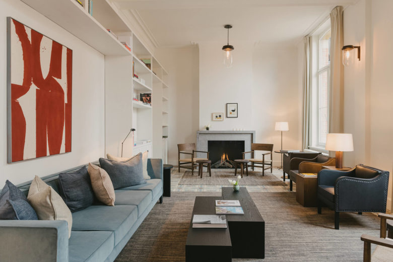
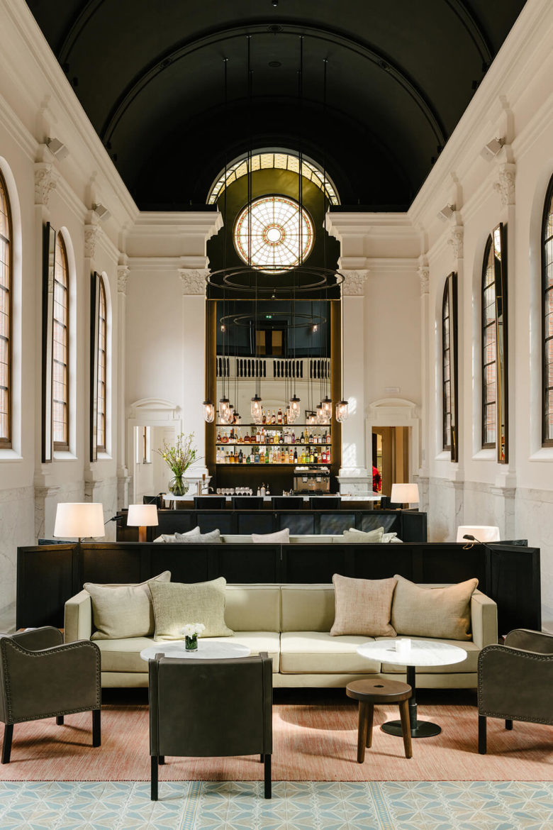
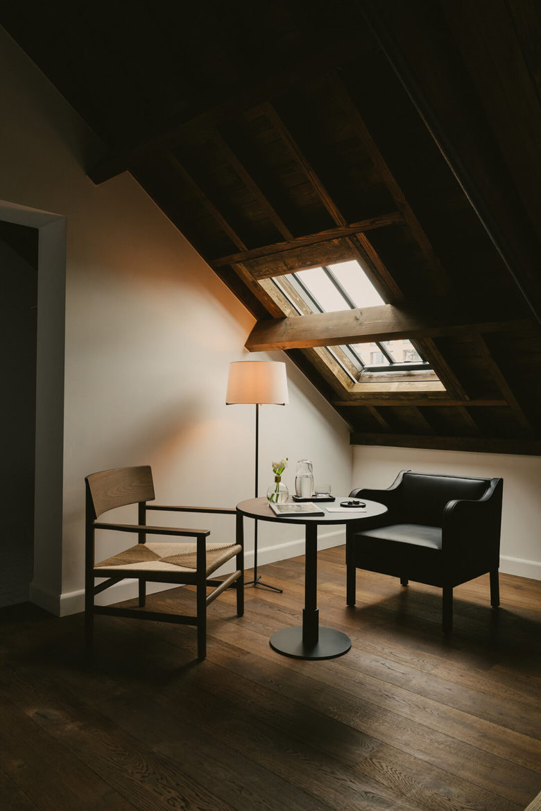
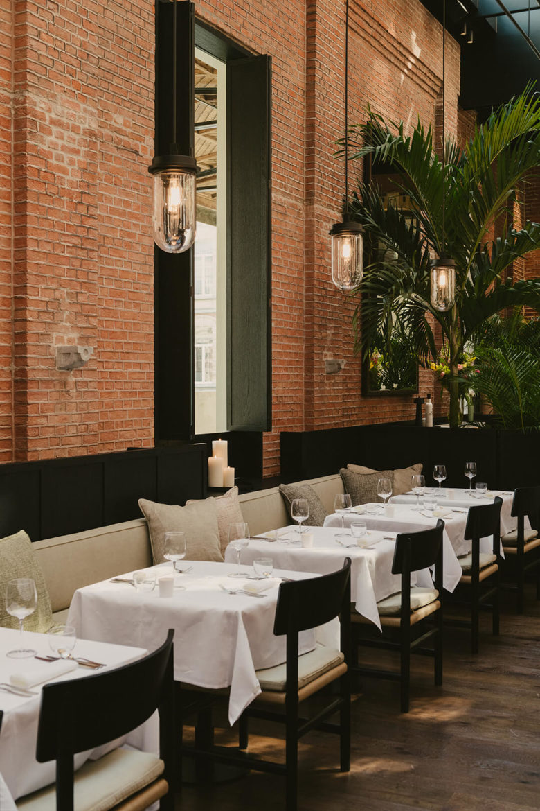
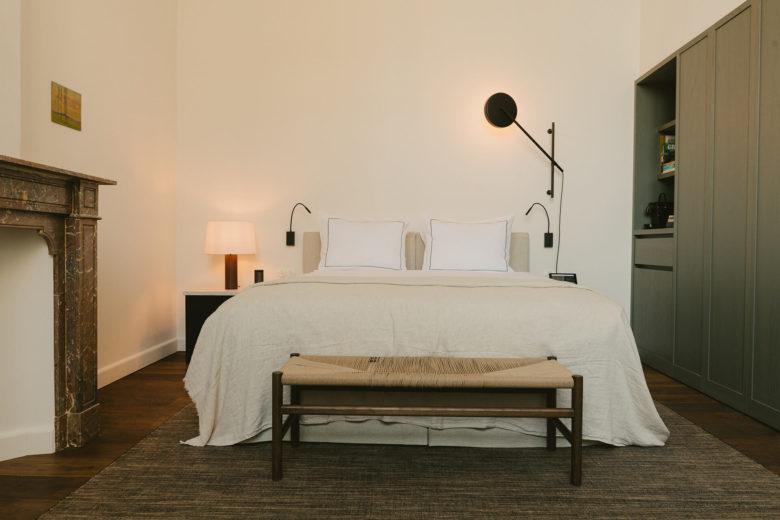
VVDA designed not only the building but the furniture, too. Nearly every piece is unique to the project, manufactured by Molteni&C. ‘The furnishings – including, chairs, tables, armchairs and sofas – were especially developed to provide contrast in the existing space and bring contemporary life to the project,’ says Van Duysen. ‘The furniture is in synergy with the architecture surrounding it.’ Furthermore, the pieces cover the hotel’s every need, from offering guests a warm welcome in the entrance and gathering people in the chapel to establishing cosy dining areas and creating nooks in the bedrooms.
We spoke with Vincent Van Duysen about finding balance, accommodating furniture within interiors and evoking emotion in spatial users.
How does your design balance respect for the past while updating the space for the here and now?
VINCENT VAN DUYSEN: Our strategy was first and foremost to respect the historical DNA of the site and its surroundings and to align with the general principles governing the redevelopment of listed buildings. This was achieved through the restoration of its neoclassical splendour and through the addition of modern architectural elements, suitably upgrading the premises to its new function as a modern hotel. Black components have been introduced selectively to distinguish the contemporary from the classic.
How does the furniture support your design aspirations for the hotel?
Almost everything has been designed tailor-made for the project. This results in an interior with some traditional forms but in a modern way, where everything blends in together. In that sense the chosen materials and features nourish the existing features.
I envisaged architectural settings no longer imposed by styles or trends, but only by beauty. To achieve this, I used natural materials such as natural stone, oak, glass, and linen, and strong and genuine textures from my own culture. I materialize my spaces and interiors with layers of textured materials for a natural glow of warmth, also utilizing softening desaturated colours, which give extra subtlety.
As both an architect and product designer, what is your approach to accommodating furniture within your spatial designs?
I have never thought of interior and product design as being severed from architecture, for me they are all one. I’m an architect and I create spaces for furniture. The space has to be ergonomic as well, because furniture is all about proportion and ergonomics in relation with this natural energy. Craftsmanship, materials and technology are re-scaled; craftsmanship transmits to the visitor a sense of authenticity that informs the way I approach the design of a new product or project.
I read that the space was designed so that guests ‘can still sense the sober, understated life of the convent nuns’. With today’s hospitality guests often looking for lavish experiences, what was the reasoning behind the restraint?
The aim is for hotel guests to feel completely welcome and at ease in a pleasant, hospitable environment; to derive the same kind of joy the former residents felt in worshipping God. Something that I always aim for in my architecture is that once you enter the space you should be momentarily cut off from the world, no matter the typology of the project. It’s about calming down, and being in a space that doesn’t overstimulate the senses so that you can disconnect. In this way my attention goes out to a pureness in aesthetics.
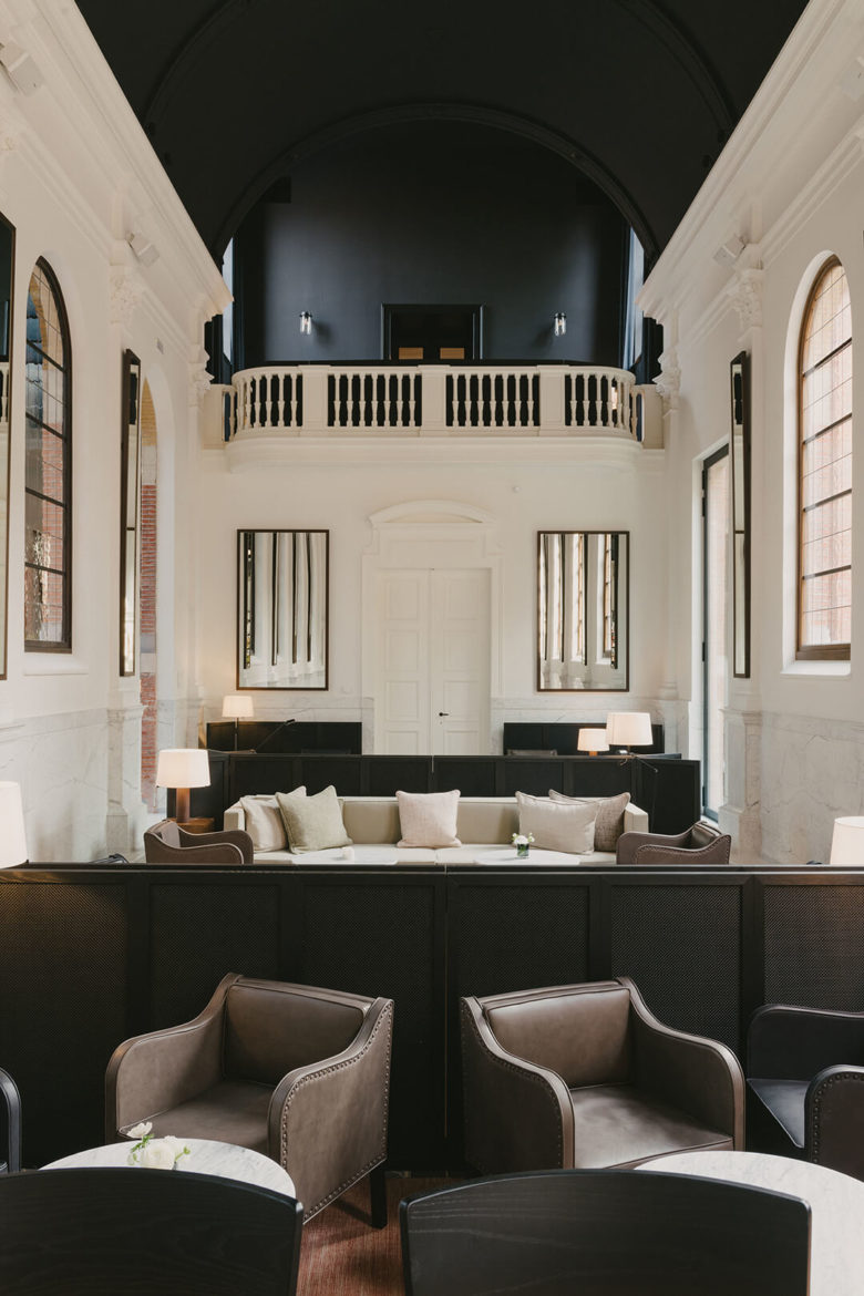
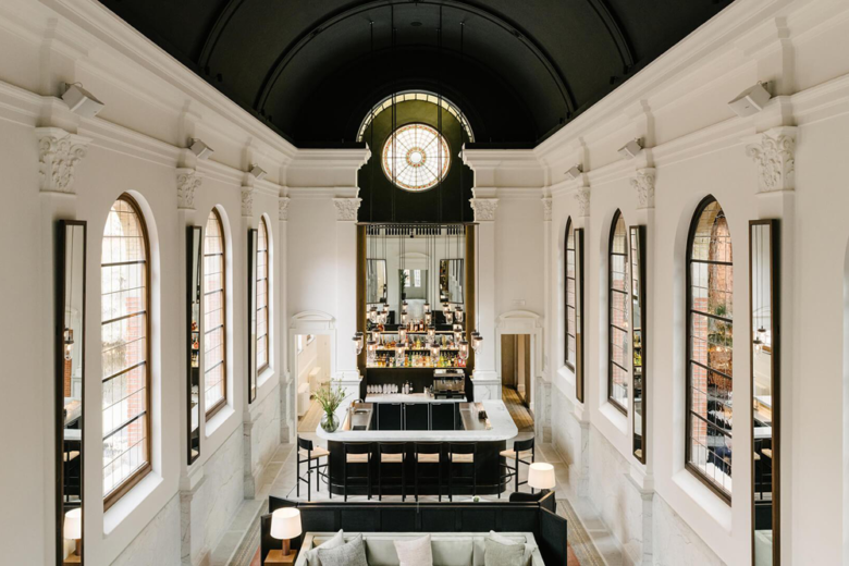
This place has its own soul, there’s a lot of emotion. The chapel especially, because it is the epicentre of the entire hotel. Due to its original function, the nuns’ former private chapel, it has a very specific appearance. This contrast between past and present is the strongest in this space, which now serves as a bar and central meeting in August.
Designed by Vincent Van Duysen Architects & Wouter Callebaut Architecten
Photography by Robert Rieger
