The first McDonald’s in Russia opened on 31 January 1990, on Moscow’s Pushkin Square. But it wasn’t an ordinary inauguration: a sign of improving Cold War relations, an estimated 38,000 Soviets queued for hours outside the new American fast-food restaurant in spite of the high prices to experience something ‘that they might have heard of but never tasted: a McDonald’s hamburger’, writes Voice of America. The location turned 30 this year, and to mark that significant anniversary, Australian practice Landini Associates was briefed to overhaul its interiors.
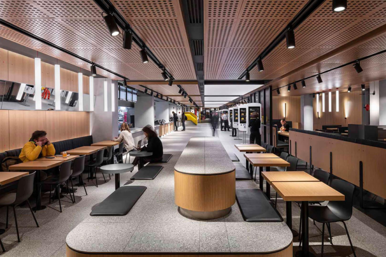
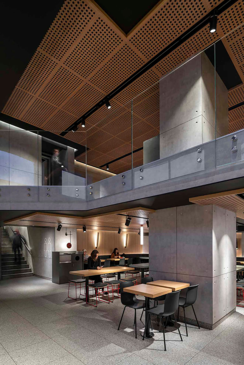
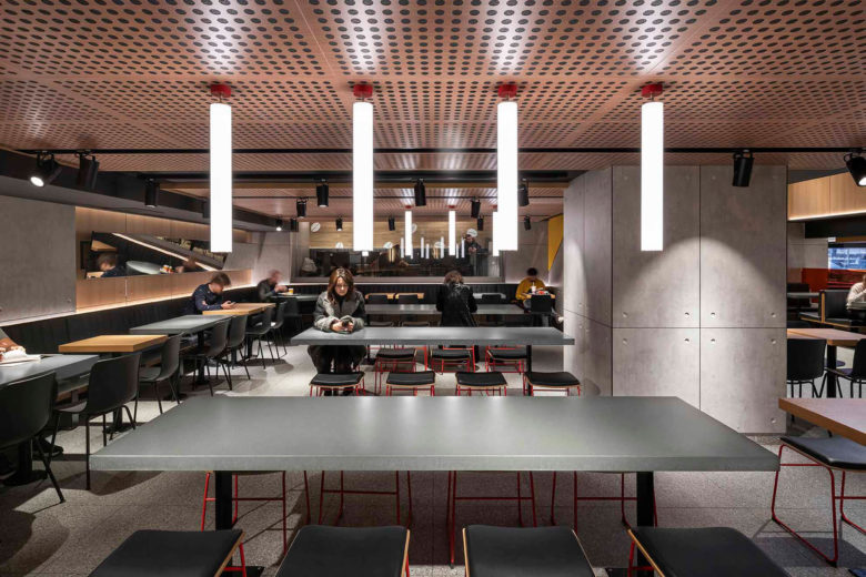
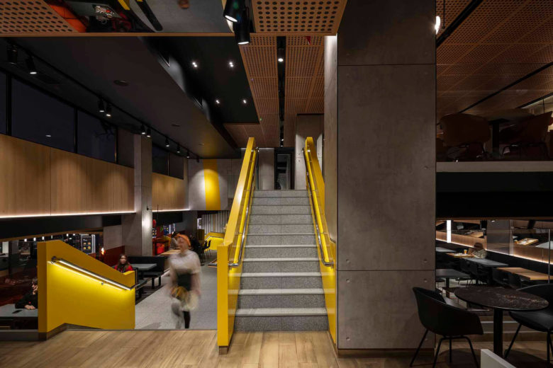
Still one of the biggest McDonald’s in the world – and with one of the greatest guest counts –redesigning the 1,087-sq-m restaurant presented a considerable task for the architectural firm. Landini Associates has worked on many McDonald’s projects globally (in fact, they won a Frame Awards 2020 accolade for Sydney’s McDonald’s Kitchen in the Sky), and the new interiors for Pushkin Square build on a format developed by the practice called Project Ray after the chain’s founder, Ray Kroc. Iterations have been introduced in restaurants across Australia, Asia, Europe and North America. In this case, ‘Project Ray is aimed at offering customers a calm respite from the non-stop action of Pushkin Square,’ explains Landini design director Wayne Cheng. ‘We used a timeless material palette of concrete, stainless steel, oak and glass as a backdrop of “recognizable neutrality” promoting the service, the product, and the people who come to enjoy it.’ To do so, the team viewed their work as an ‘experiment in non-design’.
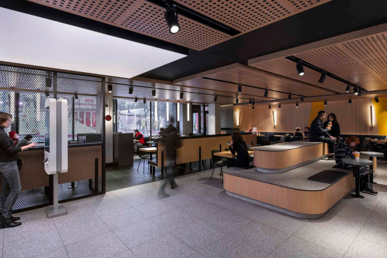
The space is built over three floors, and has multiple connecting mezzanines. While McDonald’s interiors have long been synonymous with bold, graphic elements, the architects and designers took a different approach for the Moscow location. Swatches of bright yellow complement the pared-back material palette, while stylized laser-cut line drawings of the chain’s signature products nod to the heritage of evolution of the brand. To optimize the privacy of customers, mesh screens are utilized in the dining spaces, and new seating systems accommodate families, groups and individuals alike.
For people that just want to grab and go? Interactive self-service kiosks are positioned beneath an illuminated ceiling in the entrance hall, with the traditional service and pick-up points installed adjacent.
Designed by Landini Associates
Photography by Andrew Meredith
Add to collection
