

Add to collection
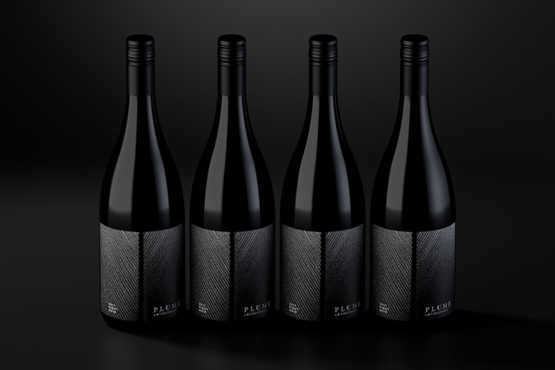
Plume, by Lake Chalice, is a high-end specialty wine designed to celebrate the land and nature that adorns it. The winemaking team had identified a special block of vines that produced small batches of incredible, world-class fruit. With minimal winemaker intervention, the wines are some of the best that have come out of the Marlborough region.
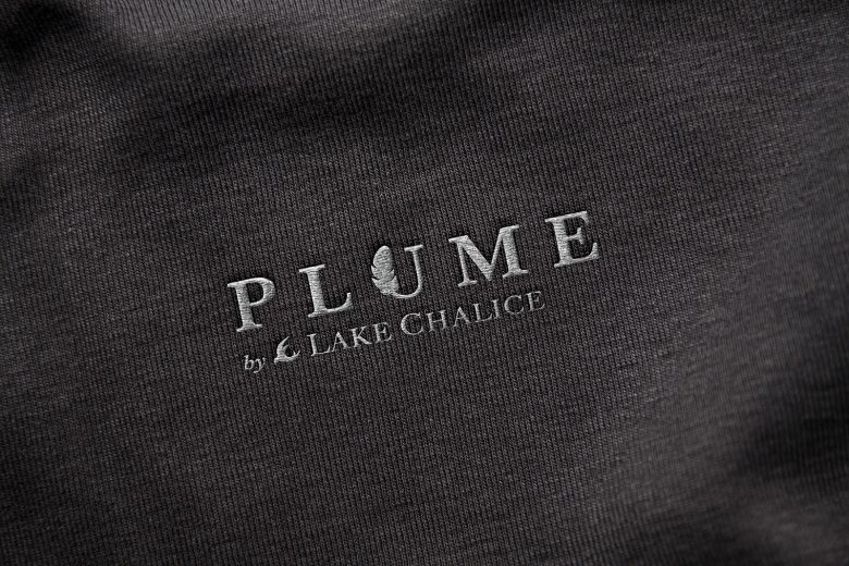
The design idea looked to follow that of the winemaking team. Simple with little intervention. The native New Zealand falcon is the mascot and icon of the brand so it was decided to take a closer look and use the detail of the feathers to highlight the subtle and streamlined wine, but also mirror the vineyard from which the grapes came from.
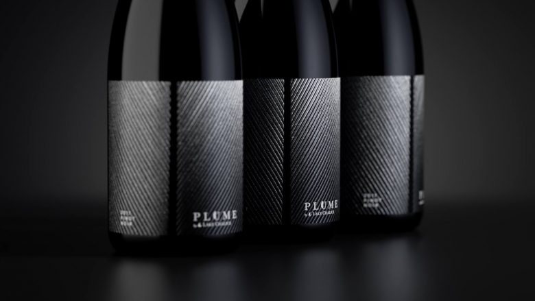
The label is simple in design but complex in print production, where much time was taken to create an effect that would replicate the texture of the feather. This was achieved using a combination of embossing, high build matt varnishes, PMS and metallic inks.
The Plume identity uses the feather as the core idea, but this time weaving it into the typeface. Positioned at the higher end of the Pinot Noir market, it needed to disrupt on shelf but most importantly reflect the premium positioning.
What’s Unique?
The uniqueness of the packaging comes through it’s simplicity and the smart visual analogy between the rots of the vineyard and the lines of the feather. As far as wine labels go it is stripped back, refined but brought to life through the various printing techniques that add the textural element.
Designed by The Creative Method


Add to collection